
Using Canva to maximise the productivity and efficiency of our clients
Read more
There is no single colour system that is suitable for all design projects. The following guide sheds some light on a subject that effects almost every job that passes through our studio.
Colour is one of the designer’s most valuable tools. As well as knowing which combinations produce the most attractive artwork (which is of course a major consideration when we are creating a colour palette for one of our clients), it’s also important that we understand how to effectively apply these colours to assets, whether that be a business card or the homepage of a website. Here, we explain when to use each system and why.

RGB is the system used for describing the colours used in digital applications e.g. websites, apps, smart phones, tablets, digital cameras, monitors etc.
RGB colours are created when combinations of red, green and blue light (the primary colours) are radiated out from a luminous object, such as a screen. RGB offers a wide variety of colours and, because they are produced using light, these can include very bright, vibrant colours.
RGB colours can be referred to using conventional RGB numbers ranging from 0 to 255 e.g. R123 G1 B234 or the Hex (hexadecimal) numbers used in code by web developers e.g. #FF12EE.
Because RGB colours are created using light, they can’t be used for printing purposes. They can be converted to CMYK (see below) for print, but this may result in a loss of vibrancy. Spot colours can be used to retain brightness and vibrancy in print jobs, but their use has limitations (and cost implications).
It’s also worth noting that although RGB is the colour system of choice for screen based applications, every screen will be manufactured and calibrated slightly differently. This means you can’t guarantee that a colour will be displayed the same way on any two devices. As such, you should never use a screen to choose or approve colours.
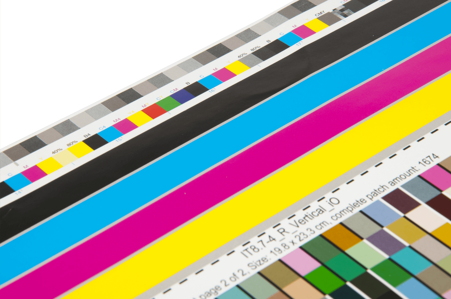
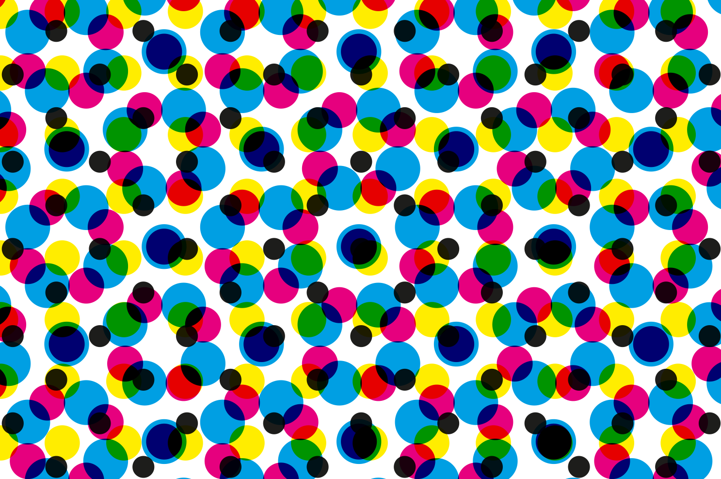
CMYK is a colour system used when creating printed assets e.g. brochures, flyers, posters, stationery etc.
Combinations of cyan, magenta, yellow and black inks (or pigments) are used to create a variety of colours. This style of printing is also called ‘4 colour process’ or sometimes, just ‘process’. Different printing methods can be used to apply the inks to the stock (paper), but the most popular printing methods (lithographic and digital) both use this system to describe their colours.
The range of CMYK colours is limited by the light reflecting properties of ink and paper, so they can’t replicate the brightness of their back-lit, screenbased, RGB alternatives.
CMYK colours can be viewed on screen, but as with RGB colours, the accuracy of this representation depends entirely on the quality of the viewing device (monitor, smart phone screen etc). It is also inevitable that there will be a difference between the way a CMYK colour appears on screen and in print. For this reason, it is sometimes advisable to request a hard proof (a printed sample) of your item before proceeding with a full print job; this can give you the opportunity to make any adjustments if necessary. A printer will be able to explain the differences between the various proof options available.
Bear in mind that each printer’s press and each printing method will differ slightly. Frustratingly, this means you can’t guarantee a CMYK colour will be reproduced in exactly the same way twice. The only way to guarantee exact colour matches across a series of print jobs is to use universal spot colours.
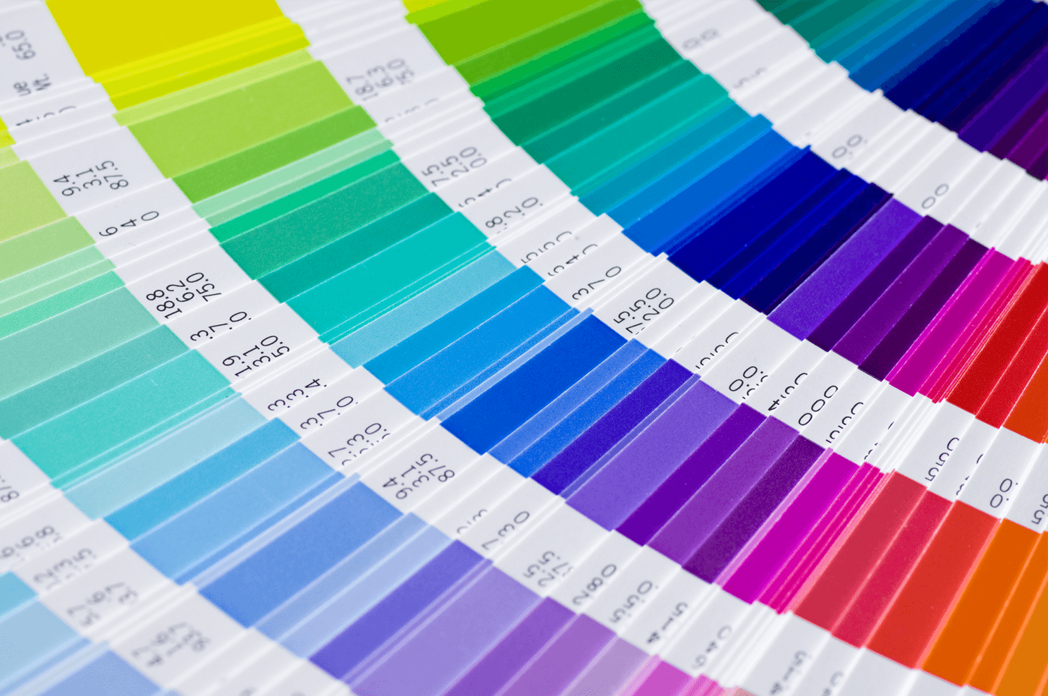
Spot colours (sometimes called solid colours) are pre-mixed inks that are used when creating printed assets e.g. brochures, stationery etc.
Unlike CMYK, spot colours can be specified using a universal reference system e.g. Pantone, to ensure accuracy of colour across a number of print jobs or applications. Because the system is universal, colour consistency can be guaranteed regardless of which printer produces the job.
Spot colours are printed using lithography, and this combination produces better coverage than any of the CMYK printing options. It creates denser, more consistent results and this is particularly noticeable in large areas of a single colour. Spot colours are not suitable for reproducing full colour imagery, but a combination of CMYK and spot colours can be used to achieve the highest quality results for each element of your artwork.
As well as accuracy and coverage, another advantage of spot colours are the special inks available. When a particularly vibrant (or even a metallic) colour is required, Pantone spot colours can provide better results than CMYK.
One of the limitations of universal colour matching systems is the number of colours available. Pantone currently offers 1,677 colours, and although this might seem like a lot, it is relatively restrictive when compared to the thousands of possible CMYK combinations.
Using spot colours can increase the cost of a print job, but they are undoubtedly the most reliable way of creating accurate colour results and maintaining the consistent appearance of your print.
The science and technology behind colour processes is infinitely more complex than this guide is capable of conveying. These bullets points give a basic overview of the subject and if you have any more questions contact us, we’ll be happy to help.