Eight years, four events, one partnership: what it really means to be Team England’s digital home
Read more
Following the launch of our new website, we have also updated how we communicate offline.
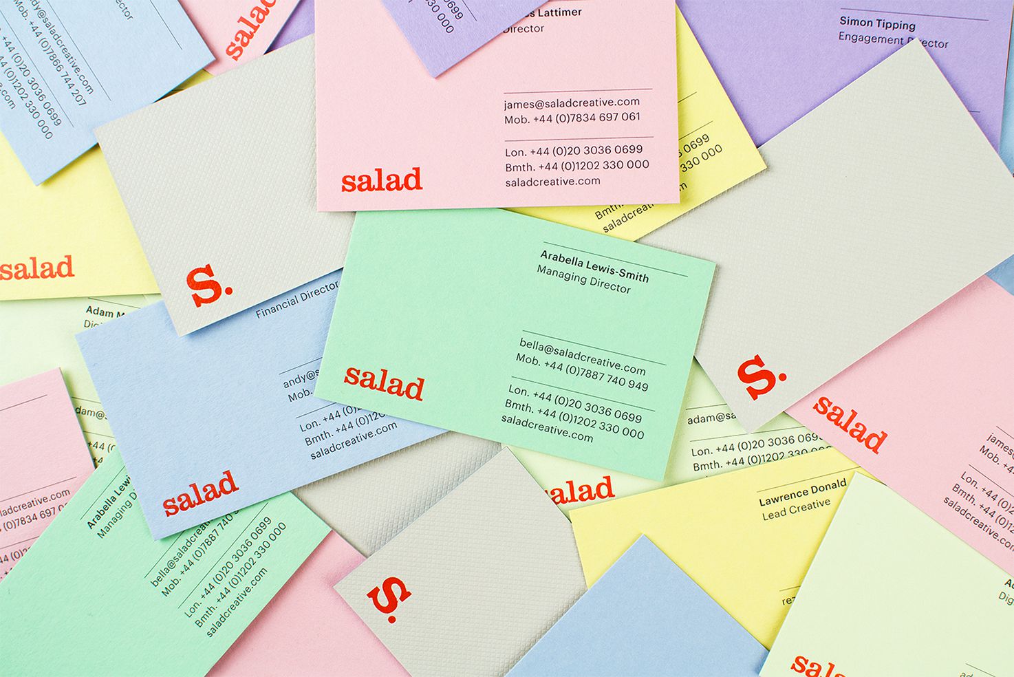
The new Salad website is more than just a fresh platform to display work, it is the launch of a new direction for the brand. Whilst still retaining a strong sense of personality, our language, style and strategy have grown up. So, alongside our digital presence, we have begun to translate this new style across our printed assets too.
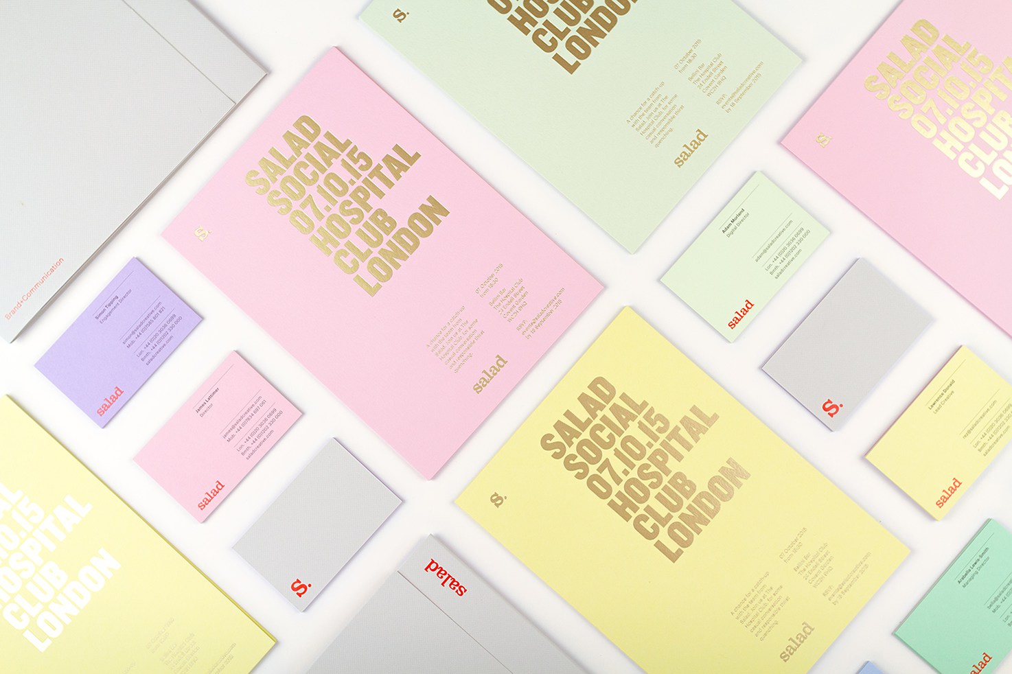
With the introduction of a bright red as our main accent colour, our playful side is conveyed through a selection of paper colours and textures. Each of our business cards has a different coloured reverse, which is duplexed on to Gravure Embossed pale grey Colorplan. This grey is used as a base for all our printed communication.
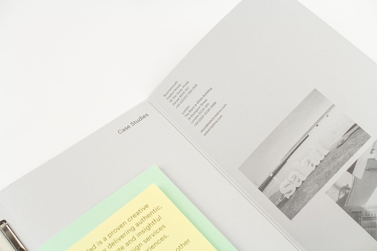
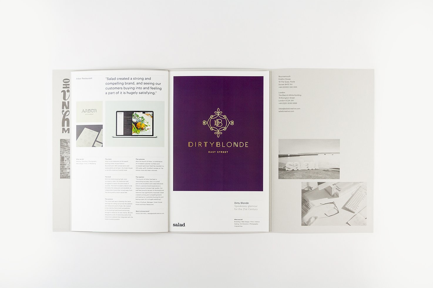
Something not to be underestimated is how vital a set of case studies is to our armoury. Our job is to solve problems, and by telling the story of challenges faced and solutions delivered, the case studies can focus on communicating how effective working with Salad is.
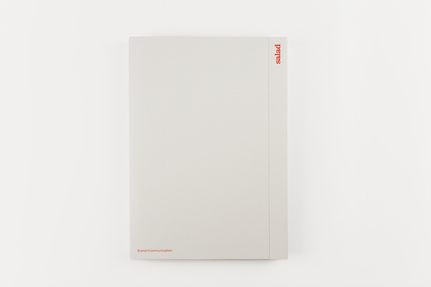
We needed to create a format we could adapt to each client, rather than a one-size-fits-all solution. The challenge we faced was creating elements we can print in-house, which still result in a document we are proud to present, so we cheated, kind of. With the addition of a set of coloured tip-ins, a litho printed outer folder and some pretty neat fastening clips, we are able to print individual case studies and bind them in a folder in the studio.
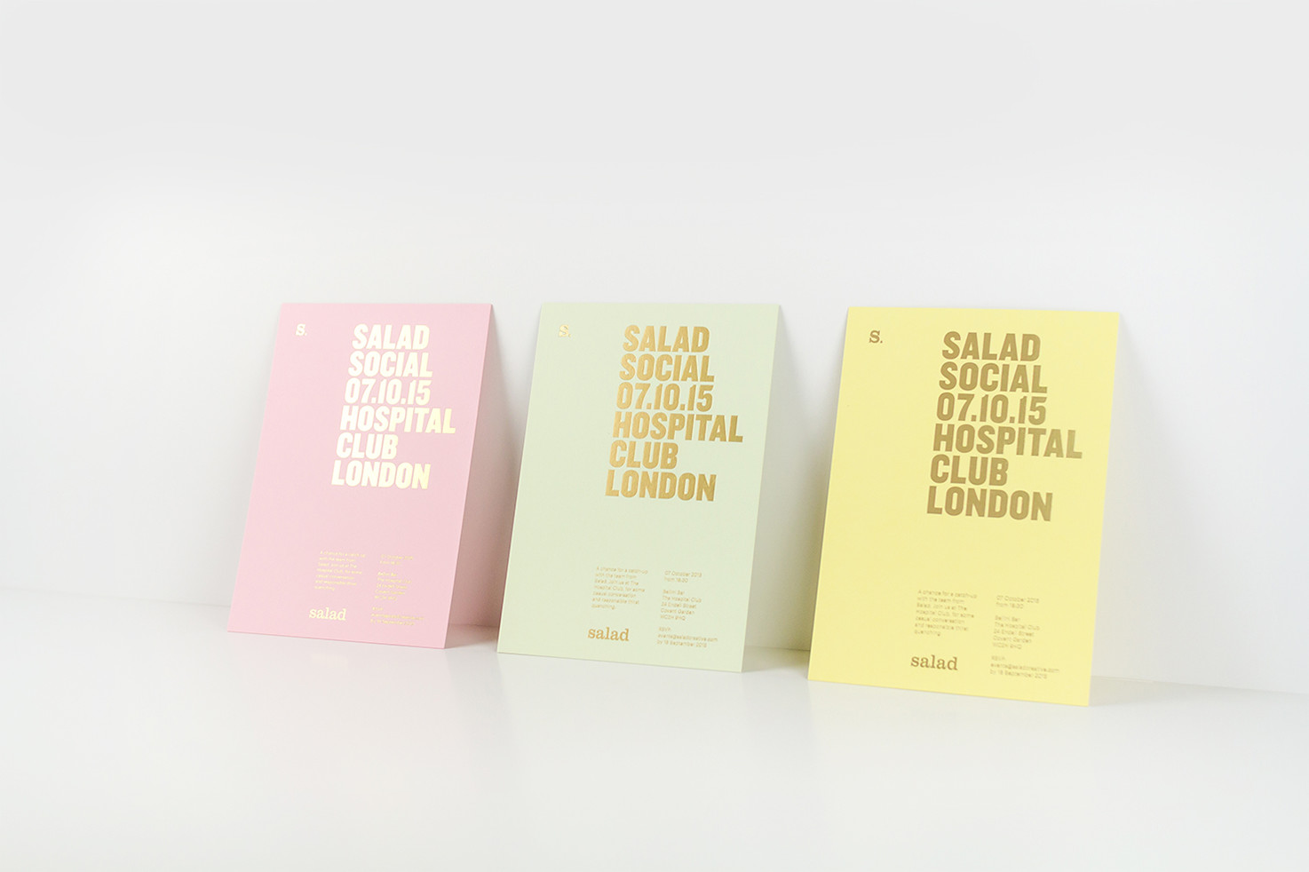
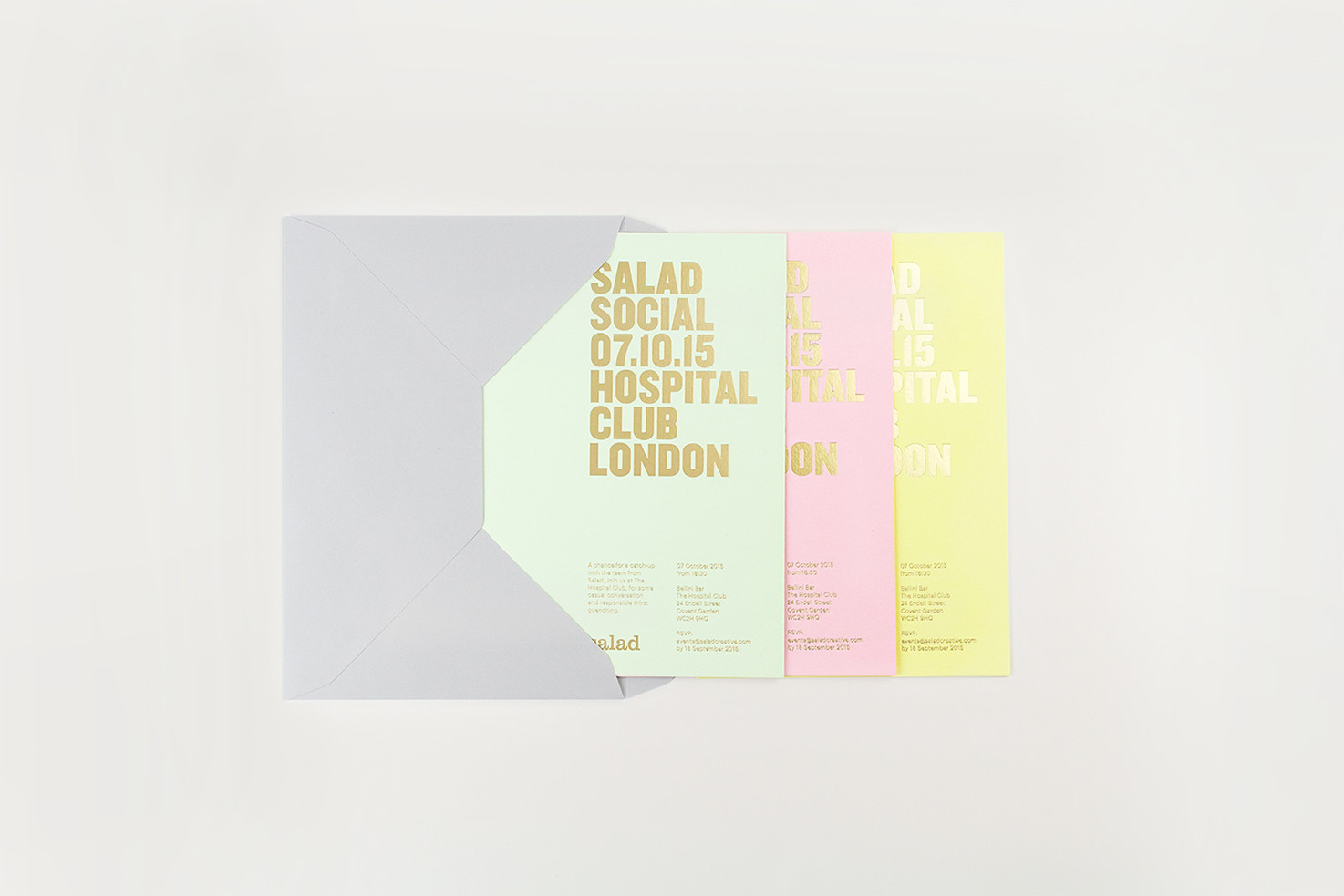
October 7th marks the date for the third Salad Social, our quarterly event in London. Historically, we have opted for a simple email invite, but there is something much more personal about receiving an invitation by post — not to mention a good excuse to utilise those colours again.
It doesn’t end there. We’ve got a long list of assets we’re working on, so keep an eye out for updates in the near future.