
Eight years, four events, one partnership: what it really means to be Team England’s digital home
Read more
Responsive web design is the biggest shift that we have experienced for creating websites. In the latest issue of Web Designer Magazine, Adam, Tom & Brandon share their experience.
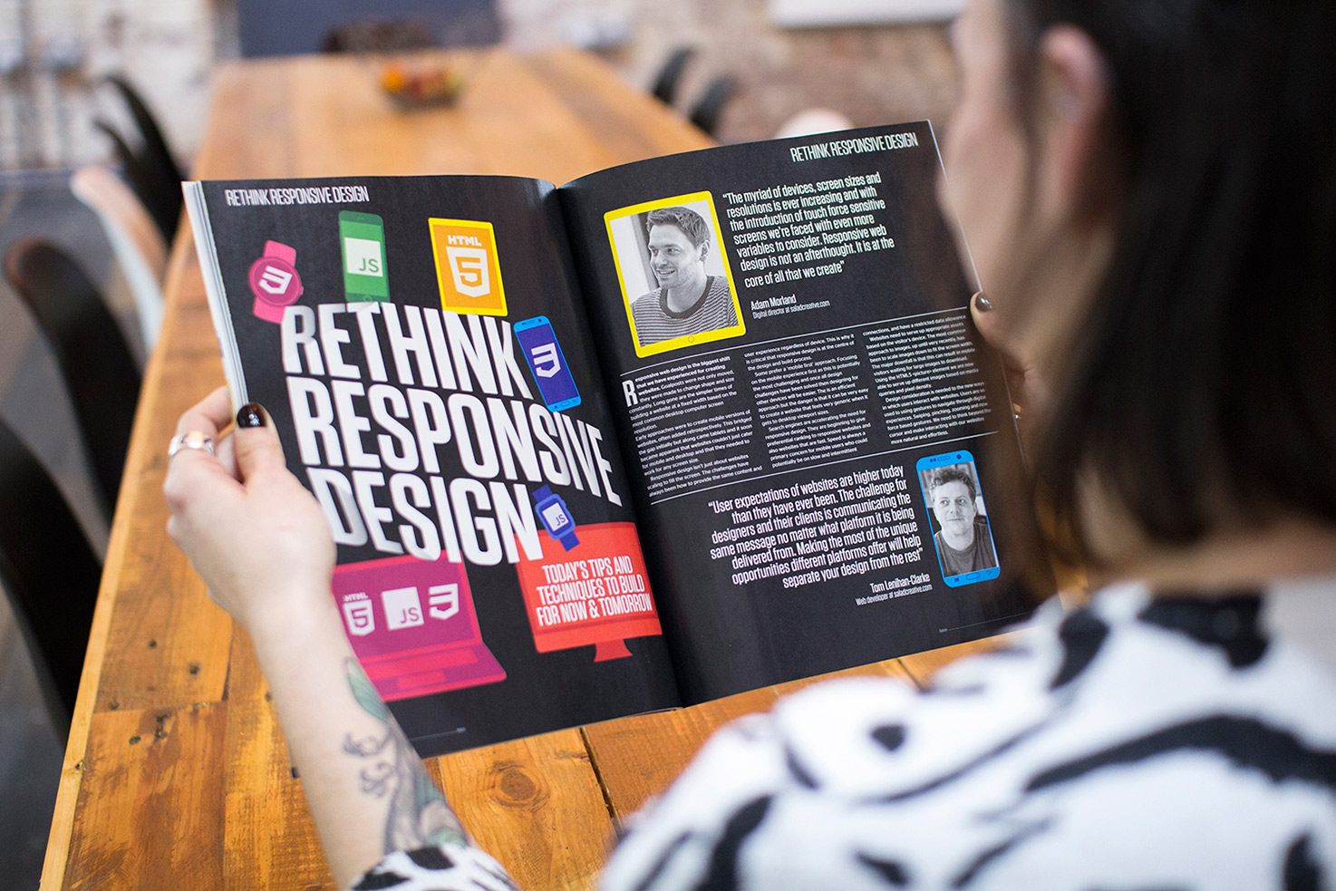
The myriad of devices, screen sizes and resolutions is ever increasing and with the introduction of touch force sensitive screens we’re faced with even more variables to consider. Responsive design is not an afterthought, it is at the core of everything we create.
User expectations of websites are higher today than they have ever been. The challenge for designers and their clients is communicating the same message no matter what platform it is being delivered from. Making the most of the unique opportunities that different platforms offer will help separate your design from the rest.
Phones
The impact of smartphones on the way we build websites has been seismic. Research conducted by GlobalWebIndex advises they now account for over 45% of online activity amongst 16-24 year olds, which is huge.
Phablets
These phone/tablet hybrids offer large scale screens, typically between 5-7 inches measured diagonally, and cellular capability that is extremely appealing to those who rely on one device for all their communication and browsing needs.
Tablets
Tablets have been around since 2010 and marked a turning point in the post-PC era. Many light PC users have since adopted them as a replacement for their PC or laptop and by now there is widespread consideration for tablets during design and development of websites.
UX is how a person feels when using a particular system and UX-led design is based on how a user will react. UX can encompass a lot of factors, some that are controllable by the people designing and developing the website and user preferences.
The user’s experience is key because they must be able to easily navigate around a site, make decisions and understand how to use it. Therefore, if a site is designed poorly then it could affect how a user interacts with it. A site developed with UX in mind doesn’t necessarily have to be the best looking – as long as it’s easy to use, intuitive and offers accessibility then it’ll enhance the overall usability.
UX-led design is often seen as a luxury more than a necessity, Now, with the evolution of devices and more ways to access the internet than ever, the interaction between the user and the website is vital in order to entice them into going further. UX-informed design also means that you would be able to point the user in the direction that is most beneficial to you, be it towards the product you are selling or towards a vital piece of information or page.
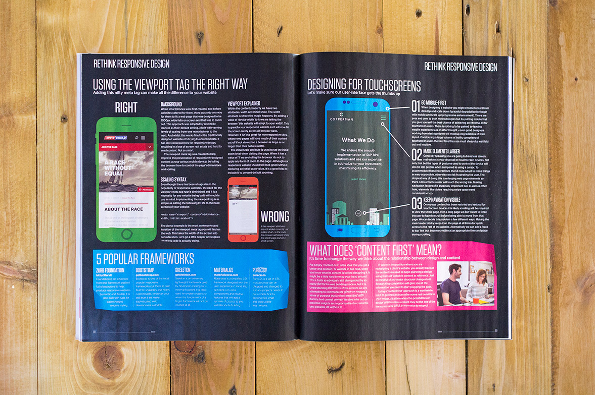
Mobile users often require quick access to the internet under processing and network speed constraints, so fast performance of your web page is key. The problem is how to display crisp images across all platforms without the excessive download requirements high-resolution images bring with them.
HTML5’s specification allows you to change source based on selected breakpoints, giving you greater control over how and when your page’s images are displayed. To work, the picture element needs at least one <source> and an <img> tag included in the code. Each <source> contains a ’srcset’ attribute that specifies the image URL to be used by the browser if that source’s edit attribute is true; if it isn’t that source is ignored…
To read more, pick up the issue 256 of Web Designer magazine in WHSmith to read the full article.
Do you have any thoughts on the importance of responsive design? Tell us more!