A long-term, people-positive partnership to continually evolve brand, identity and website
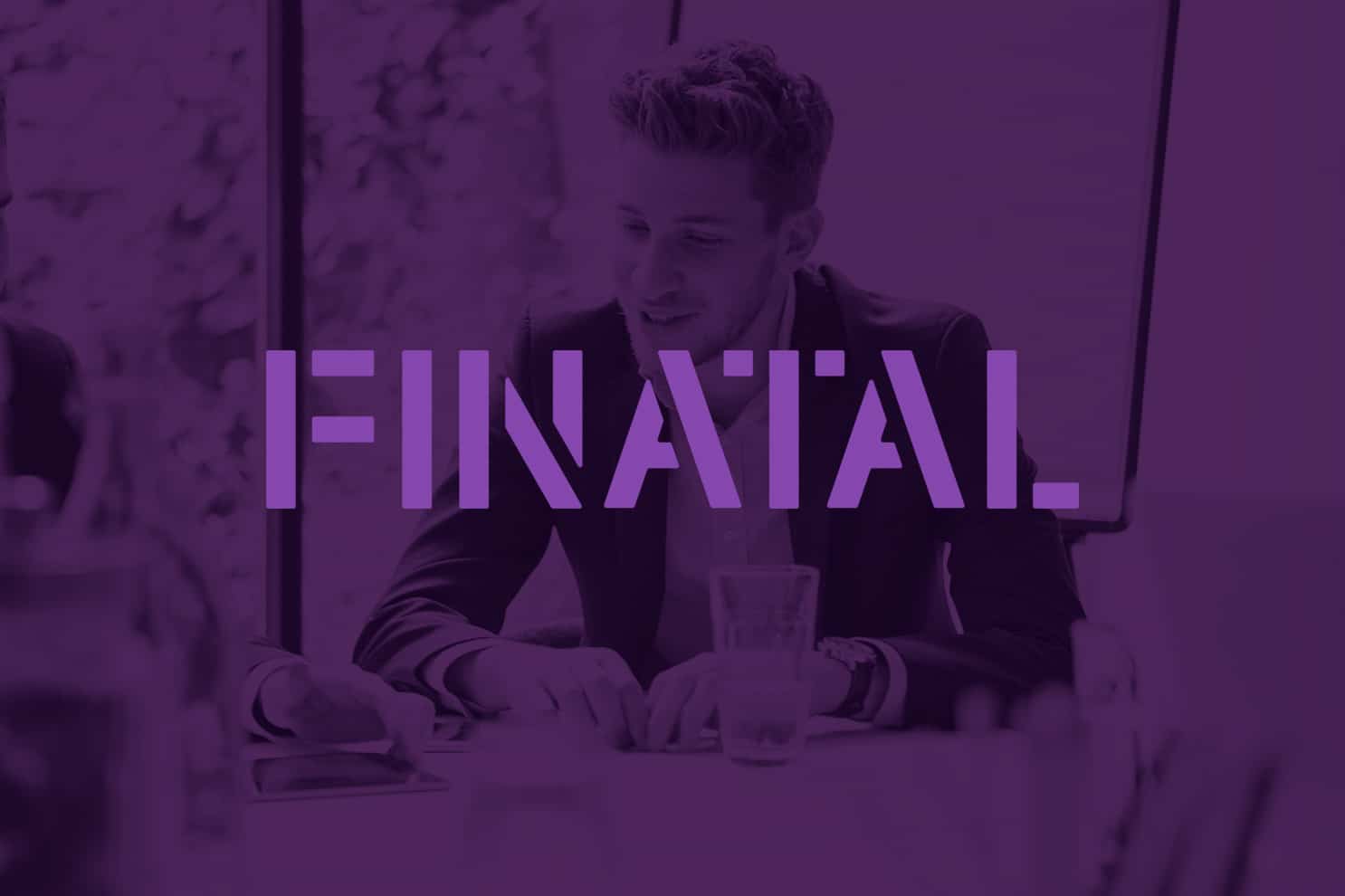
Finatal’s brand identity and website was no longer appropriate for their target clients and their positioning was hindering further growth. The CEO was clear that he wanted an identity that was strikingly different from their competitors and would really differentiate them in their busy marketplace. They commissioned Salad to first rebrand the business, and then to design and build a new website.

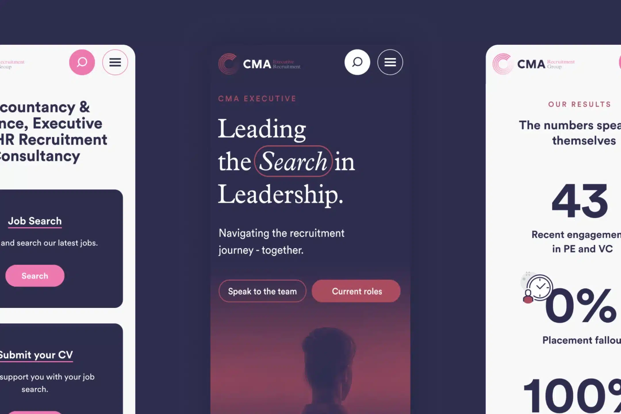
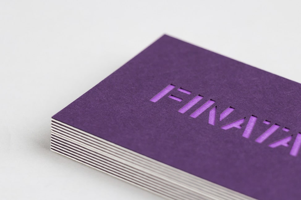
Using their close links with the financial industry as a starting point, we explored mathematical symbols during our initial research phase. From these graphic marks, we developed a bold stencil logo which, combined with a strong purple colour palette, creates this distinctive identity. The contemporary styling establishes Finatal as a fresh-thinking company and sets them apart from their competitors.
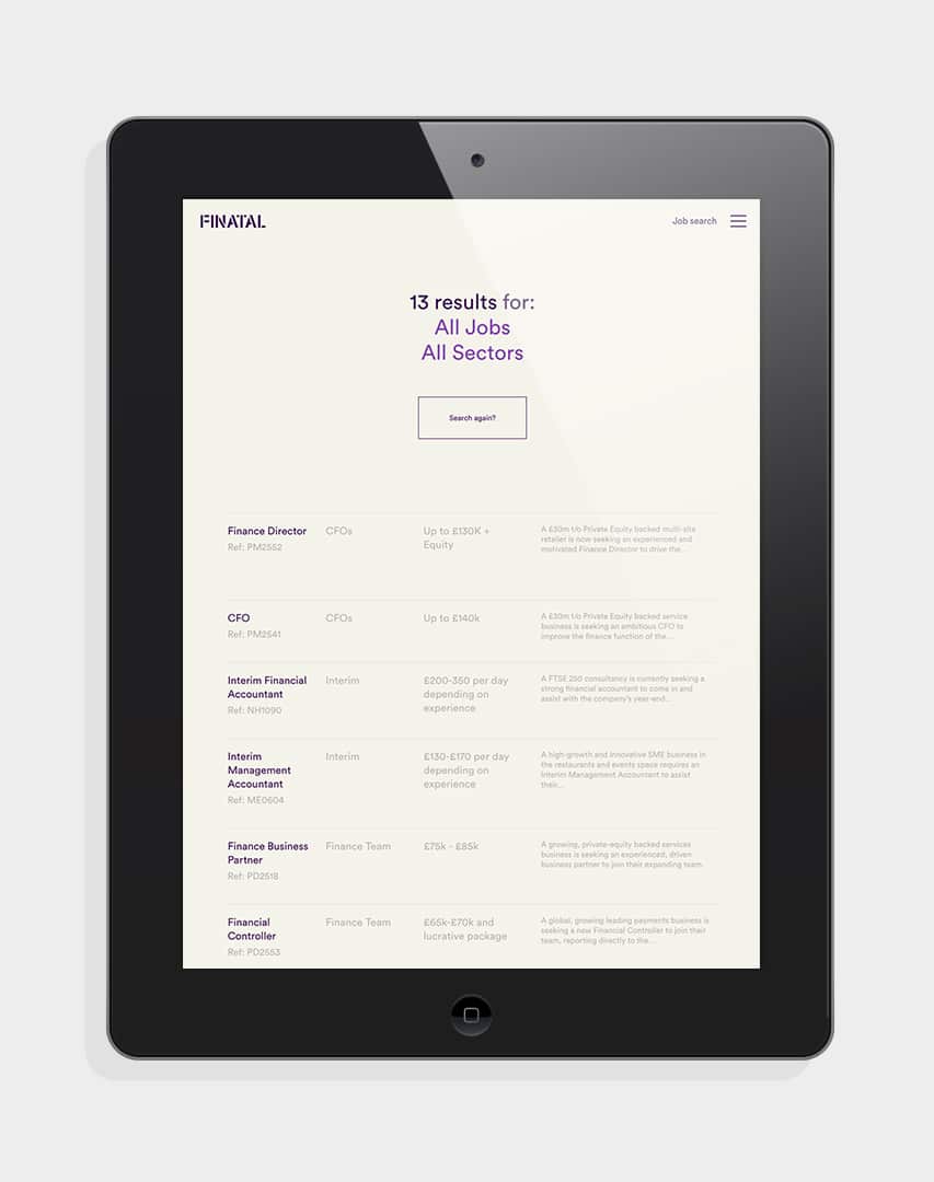
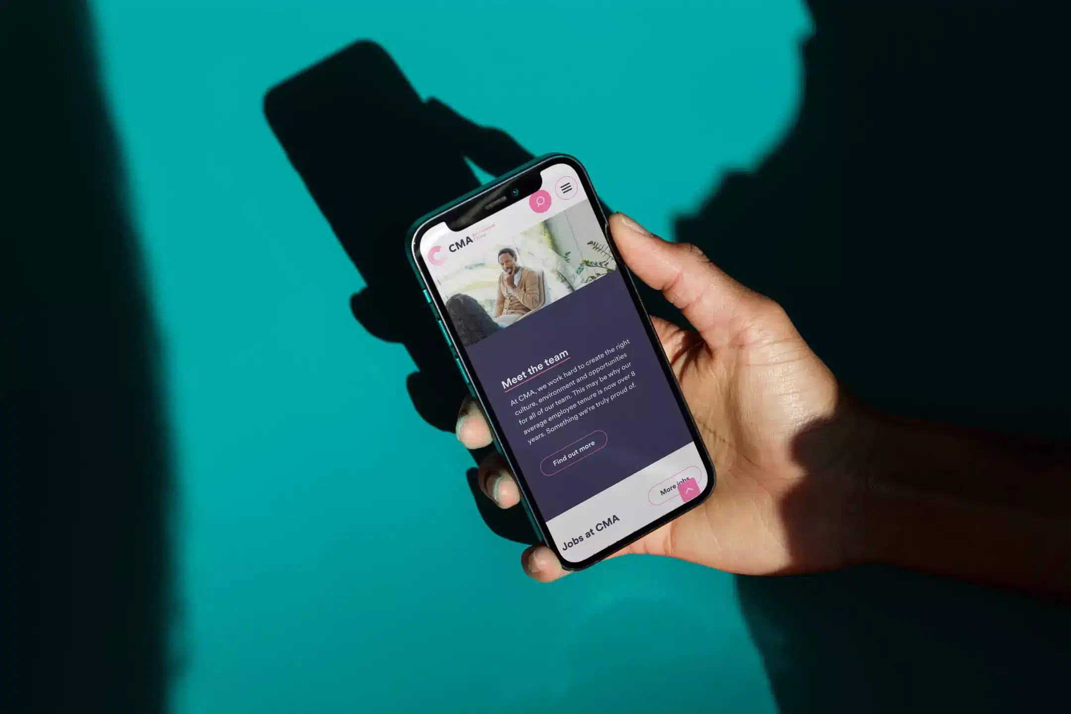
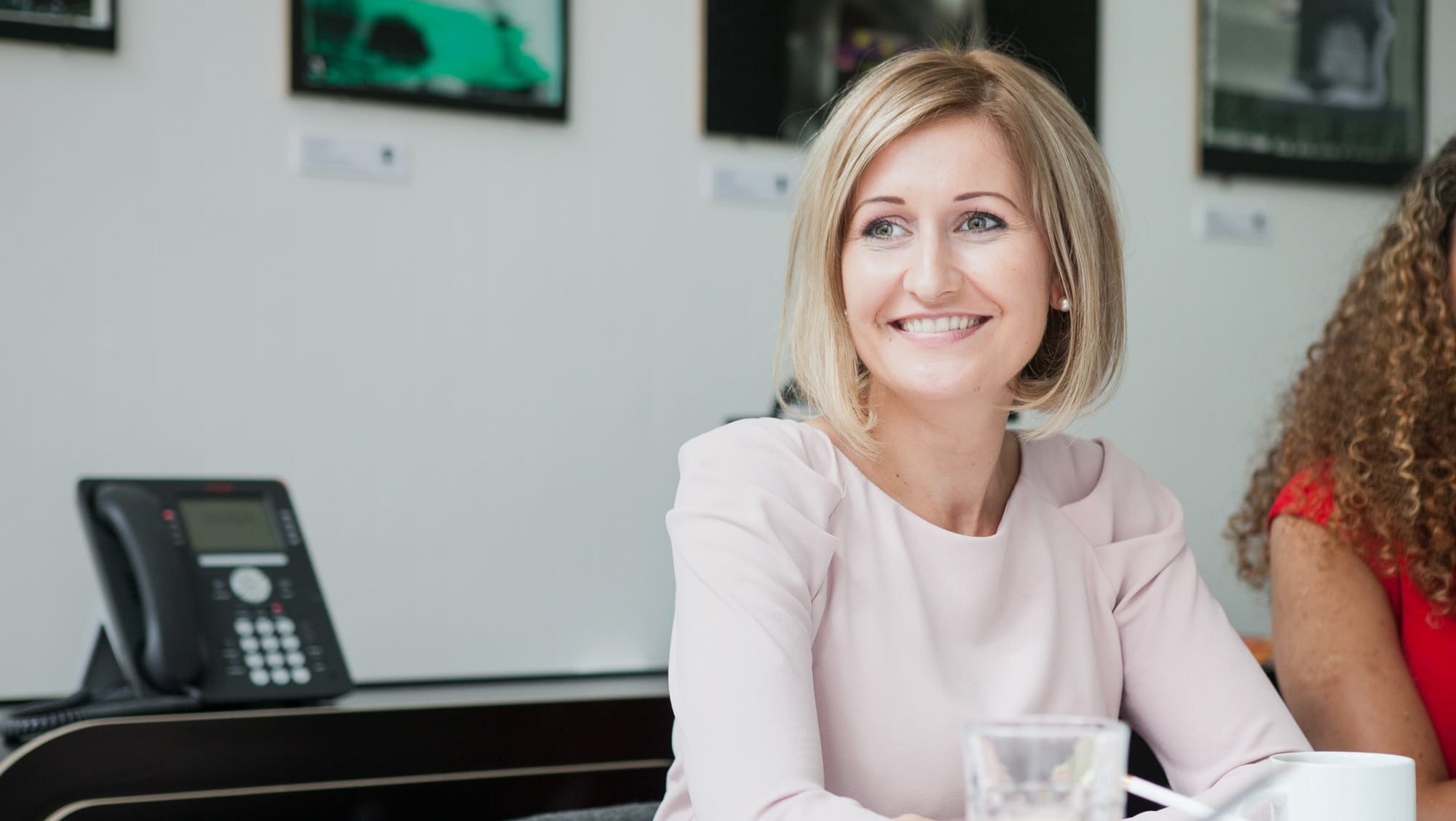
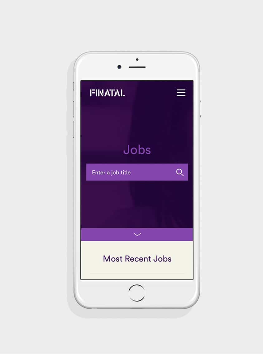
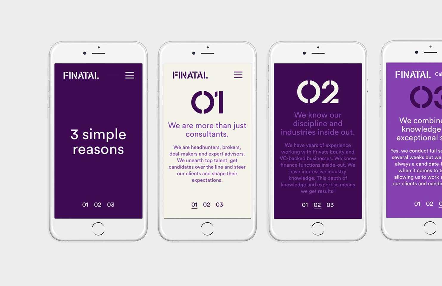
The new fully responsive website utilises powerful copywriting alongside bespoke photography to produce a visually stimulating and immersive experience. Simple and intuitive, it speaks directly to their client base and uses smart filters to speed up the search process.

The results have been superb across all measured metrics – the new site has seen a 134% increase in average session duration, a 57% increase in the number of pages per session, and a 48% decrease in bounce rate.
“From our first meeting, Salad really understood my vision for Finatal and have developed a striking new brand that is already starting to achieve this. We are really getting noticed, and have already opened doors with new clients.
Furthermore, as well as a marked increase in enquiries from our new website, we have noticed a significant improvement in the quality of the candidates we are attracting, which improves our internal efficiencies a great deal.“
