Enriching our employer brand by developing the voices that make our business
Read more
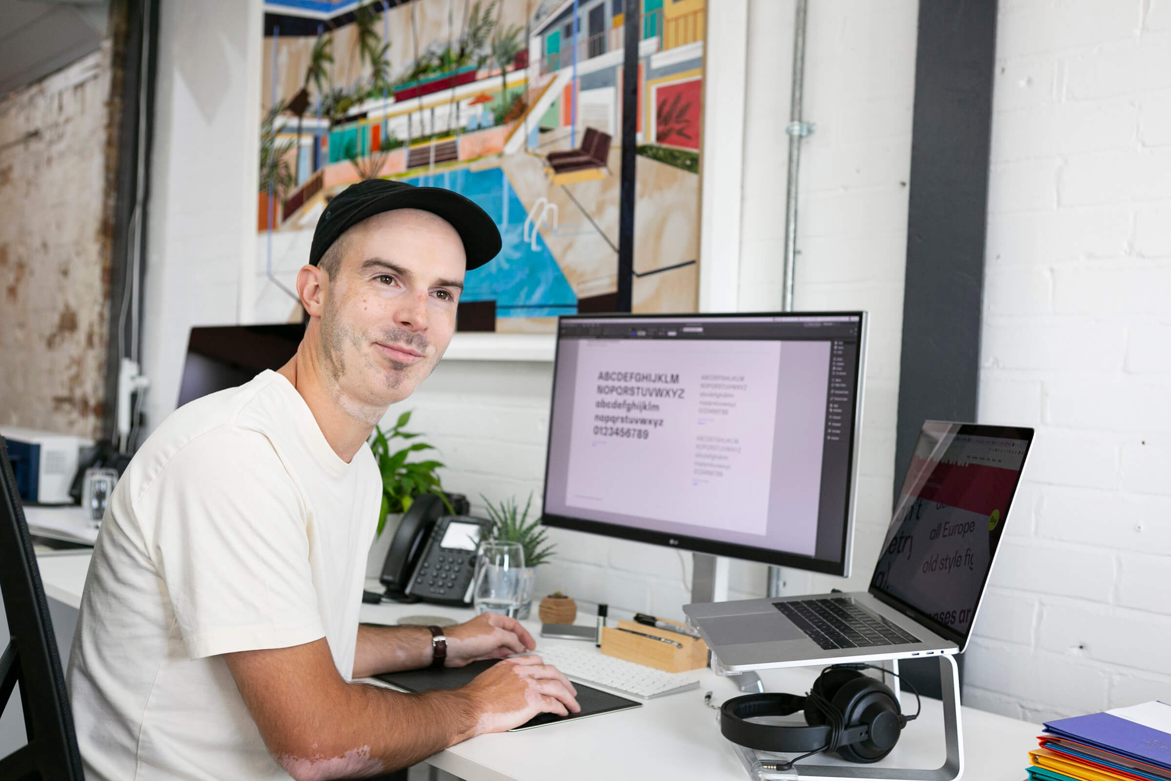
In the first instalment of our Beautifully Effective® series Jon, our Head of Design, gives his view on how Beautifully Effective® helps anchor creative work by highlighting the problem that needs to be solved and establishing the boundaries to work within and push against.
There’s nothing more terrifying to me than a blank page. I love the way an artist can create something from nothing but I need a problem to solve and a challenge to overcome. I need boundaries to work within and push against and that’s why Beautifully Effective® has become so central to the way I work.
Whether I’m looking at the big picture, translating the brand strategy into a new visual identity or delving into the detail of a digital project, pushing pixels around a page, I use Beautifully Effective® as my yardstick. It’s become ingrained in my thinking as a way to judge all of the big and small decisions that are made as part of the design process.
For me, it’s become a really helpful tool to help remove subjectivity. Projects can become fraught with personal preferences, whether with clients, colleagues or even just ourselves. Using Beautifully Effective® as our measure we can avoid getting caught up with likes and dislikes. Ultimately it’s about the audience. Does it speak to them and deliver on the brief?
Having recently tackled our own rebrand, I was reminded first-hand of the challenges our clients face during this process of trying to remove individual preferences from the decision-making process. It’s this distance I’m normally afforded that I have a renewed appreciation of.
A recent project where this really played an important role was for the Passenger brand identity. Using the murmuration phenomenon as a visual metaphor, we were able to reflect on what the strategy work had uncovered as it talked to so many core facets of the business; sustainability, mass transport and data. Although there was the inevitable back and forth on various details of the branding, this underlying concept that was so rooted in the objectives of the business, it provided an anchor for the rest of the visual identity. When this foundation is in place, the project is set up to succeed.
The word beautiful can conjure up ideas of something quite soft, elegant, and even feminine, but in this context, my interpretation is much more about whether it does the job it needs to do. Even if it is bold and brash, it can also be beautiful.
Beautifully Effective® isn’t just concerned with aesthetics, it’s the little text shortcut that saves you a few seconds every day, or the app which is a complete game changer. Removing friction is a big part of how successful a design is so we need to evaluate every detail. Does it serve the project or is it a distraction?
There are plenty of occasions when aesthetics are important, not least within a digital environment. We respect well-established UX patterns but we are always looking for opportunities to challenge expectations and create something which stands out or does something new.
My job is, often, to take all the complexity and thinking that has gone into the brand strategy or website planning and distil this down to something that can be communicated in a clear and compelling way. This is so often best achieved with simplicity and that’s what I love about Beautifully Effective®. Amongst the mission, vision and values we hold at Salad, these two words are what I return to, time and again. I can grab them and apply them to every part of my role. Whether crafting bespoke typography or briefing a photographer, Beautifully Effective® speaks to everything we do.
Short of getting it tattooed on my knuckles (good job it doesn’t fit!) Beautifully Effective® has become my mantra.