Eight years, four events, one partnership: what it really means to be Team England’s digital home
Read more
E-Cigarette Direct were one of the first businesses to establish themselves in the vaping industry in 2008. Their Halo products were producing mediocre sales figures and we identified that their branding and packaging was a major contributing factor.
The Halo brand had been in the market for over a year but sales of the range were not meeting the expectations of the team. The problem? the branding was holding them back. Instead of positioning Halo as part of an aspirational lifestyle, the brand was designed quite tastelessly (no pun intended).
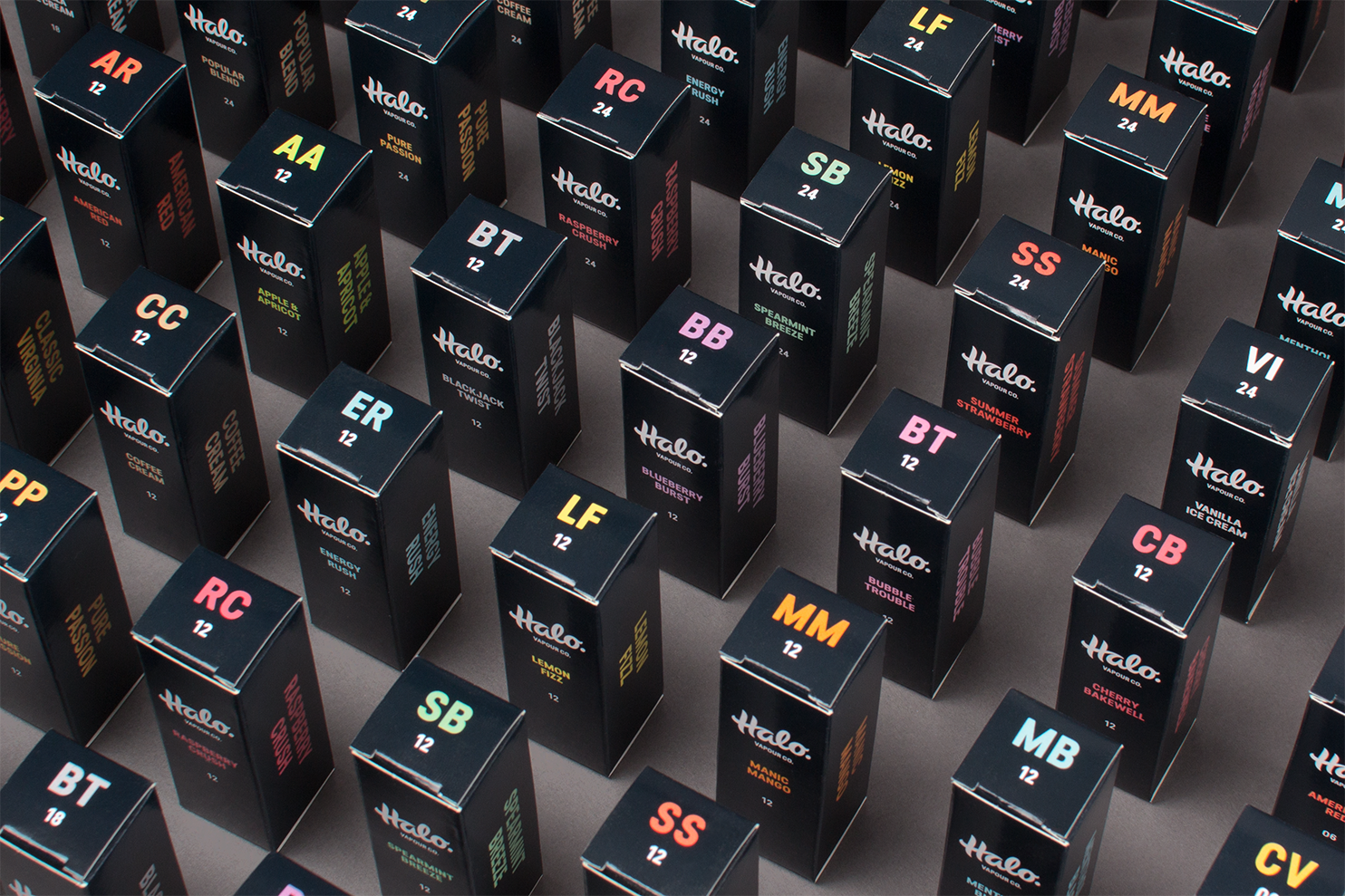
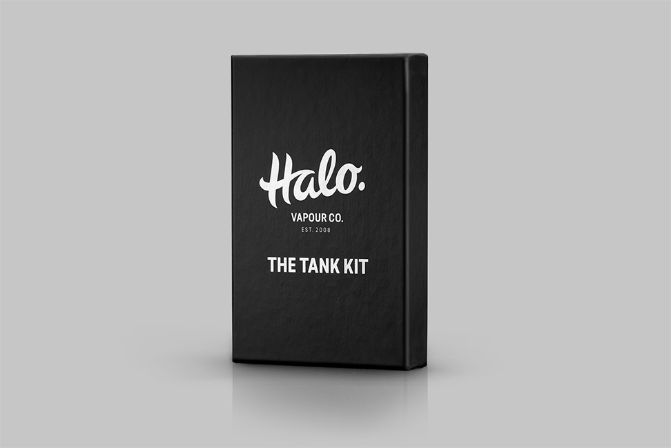
To help increase uplift, we were tasked with rebranding and positioning Halo to create a stand-out identity in an increasingly cluttered marketplace. Following the rebrand, we then needed to develop a packaging concept to match the new quality of the Halo brand. One of the key challenges of this project was to create an identity that retained impact and shelf appeal, even when reduced in size to 15mm – the available space on a bottle of e-liquid.
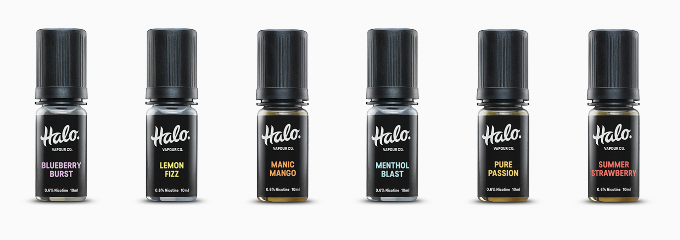
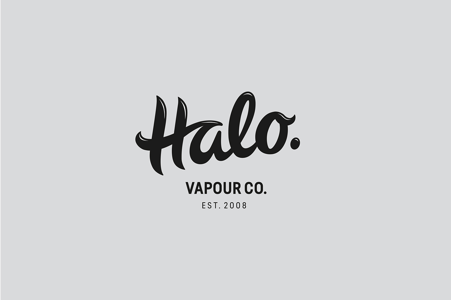
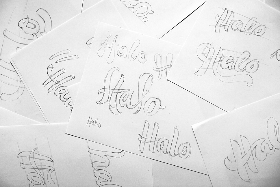
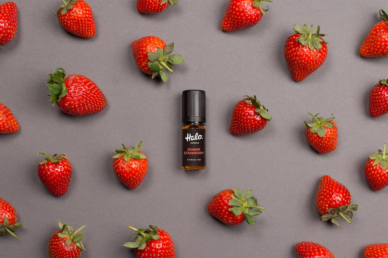
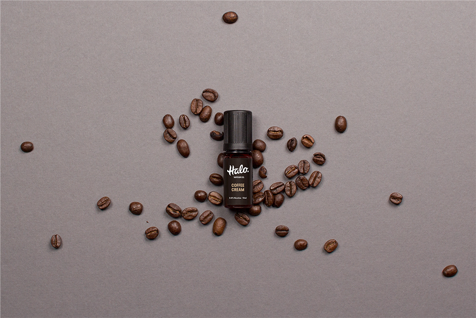
Inspired by the fluid shapes of vapour, we created a hand-drawn logotype with wispy, smoke-like characteristics. The soft curves give the logo a friendly feel whilst the gentle upwards movement emphasises the vapour qualities. The more feminine qualities are balanced out with a predominantly black and white colour palette and bold supporting typography to create an identity with a big personality and broad appeal. Even at small sizes.
Using accent colours to help differentiate the flavour variations, we also introduced flavour and strength abbreviations on the tops of the boxes so that they could be quickly identified. With over 80 combinations required, this has proved to be a small but effective visual tool.
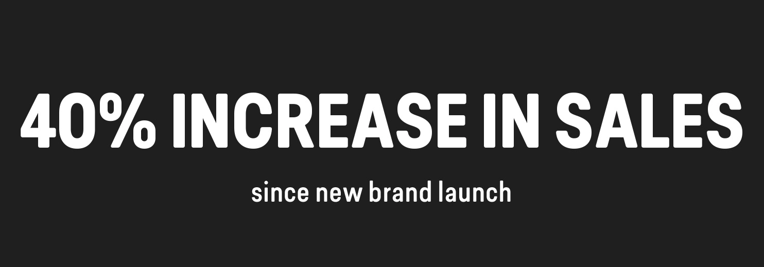
Halo has been a huge success, and has had an immediate impact in terms of brand awareness. Crucially, this has had a direct impact on the bottom line as a result. During the first three months after launching the redesign, sales were up over 10% and since launch the brand has enjoyed a total uplift of 40%, and sales are continuing to rise.
“The original Halo brand had been conceived when we were still a small company with predominantly family members involved. At the same time, we realised that most of our competitors had brands that we felt were too narrow in definition, and appealed to a loud but small segment of the market. The rebrand had to achieve a dynamic look and feel, one that could stand out on small packaging, a brand that was both with the times but could stand the test of time, and one that would have broad demographic appeal.
It was a pleasure working with Salad and their friendly, brilliant team. When it came to presenting the designs we waited with bated breaths. All three designs were outstanding but one just blew us away from the start – and has turned out to be transformational for the business.
Since the brand we have seen a continued increase in both wholesale and direct-to-consumer sales, with Halo sales growth outstripping sales of the third party brands we sell. Our e-liquid brand has not only held its own against the emergence of new brands which prioritise cheapness over quality, but has achieved a 40% increase in sales since the redesign. Having a strong brand has also been instrumental in providing a strong base for our continued expansion.
Salad are about much more than just design, giving us invaluable advice on improving our website and sharing their extensive experience they influenced our brand direction – a direction that has been warmly received by our growing customer base! I’d have absolutely no hesitation in recommending other companies follow our footsteps in choosing Salad.“
James Dunworth, Chairman, EcigaretteDirect