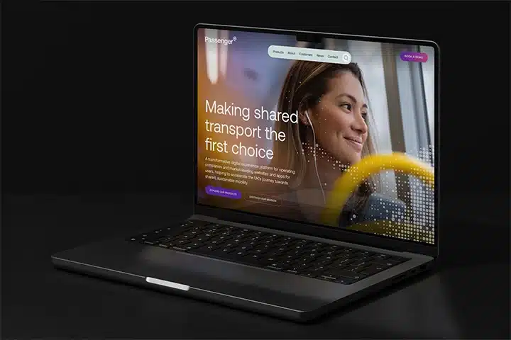
Work Consortiq
A multi-dimensional brand and communications project for an ambitious business
View case study
Altitude Angel is a pioneering business helping unlock the potential of unmanned aviation to revolutionise businesses and transform lives, by providing the digital infrastructure required to deliver unmanned aircraft system traffic management services, globally.
Following a successful round of investment in early 2023, they approached us to develop a new visual identity that would help them maintain their position as an innovative leader in unmanned air traffic management and support them in the long term as they pave the way for the future of unmanned aviation.
Despite an enthusiastic love of their identity, the team at Altitude Angel knew that what had got them this far was unlikely to carry them into the future. Straddling both the aviation and technology sectors, we had to tread a careful path to maintain their position as both a safe pair of hands and a dynamic future-focused business.
With the business and its identity gaining significant traction, it was crucial that we retained some of the elements with a suitably evolutionary approach, rather than embark on wholesale change.
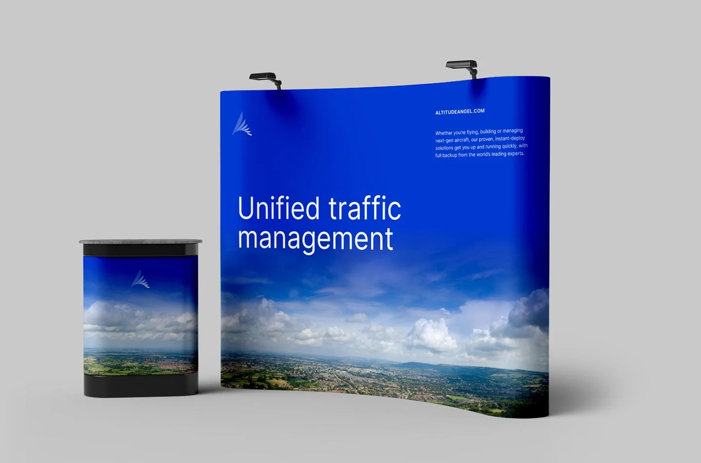
Our remit was to develop their marque and the entirety of the brand’s visual language, ensuring that each element from typography to colour and photography worked in harmony, creating a distinctive, ownable style able to be implemented across a wide range of both digital and physical assets.
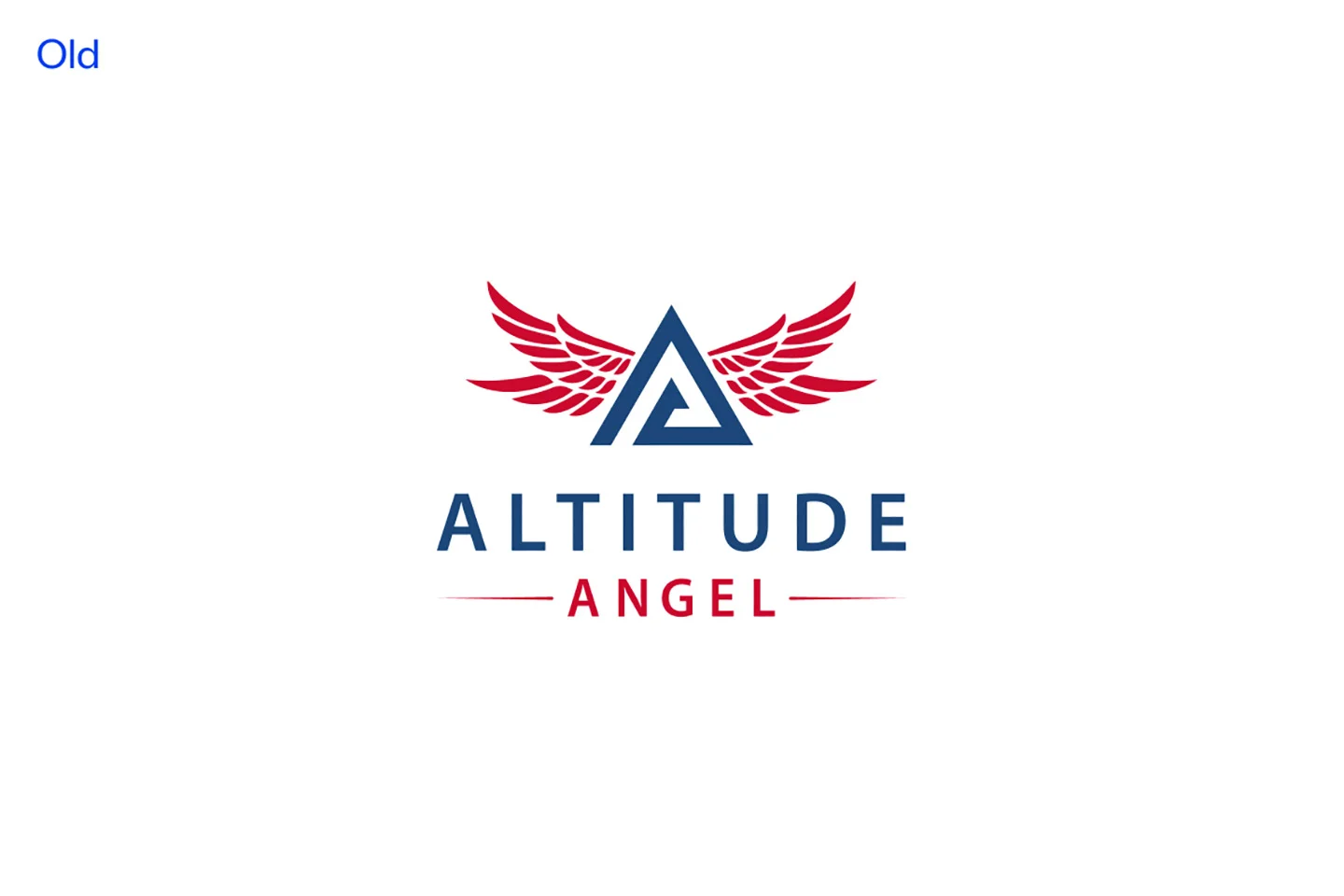
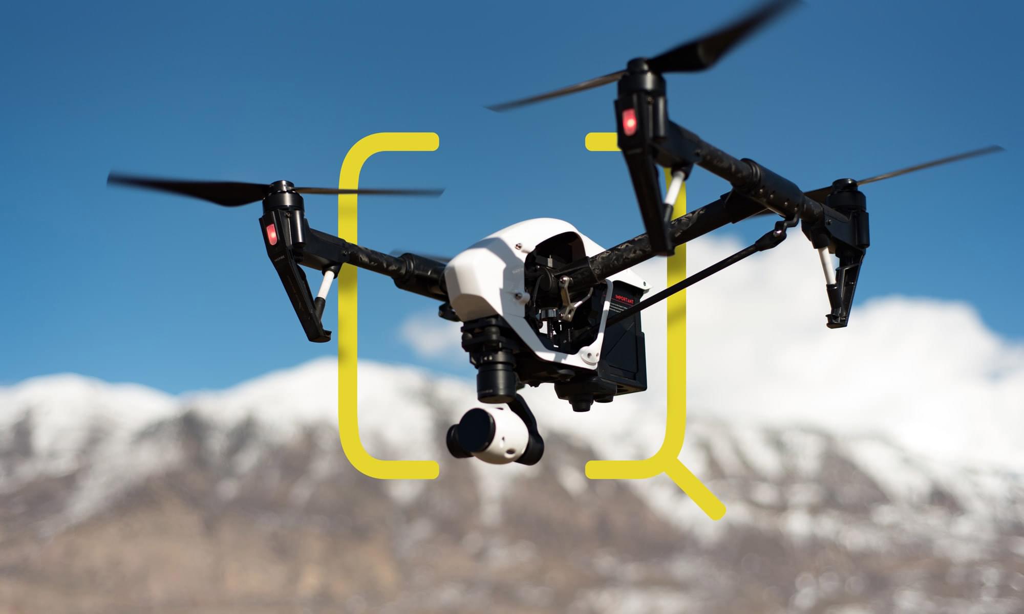
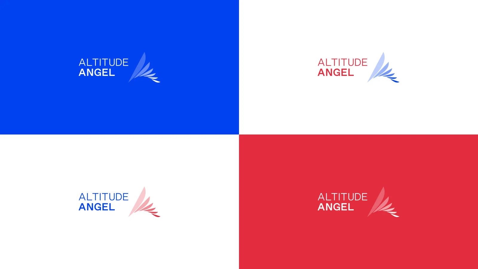
Altitude Angel’s previous identity presented some complexity, coupling a large, geometric ‘A’ flanked by angel’s wings. However, the relatively complex wings presented challenges when used at small scales. But a sense of the wing needed to be retained.
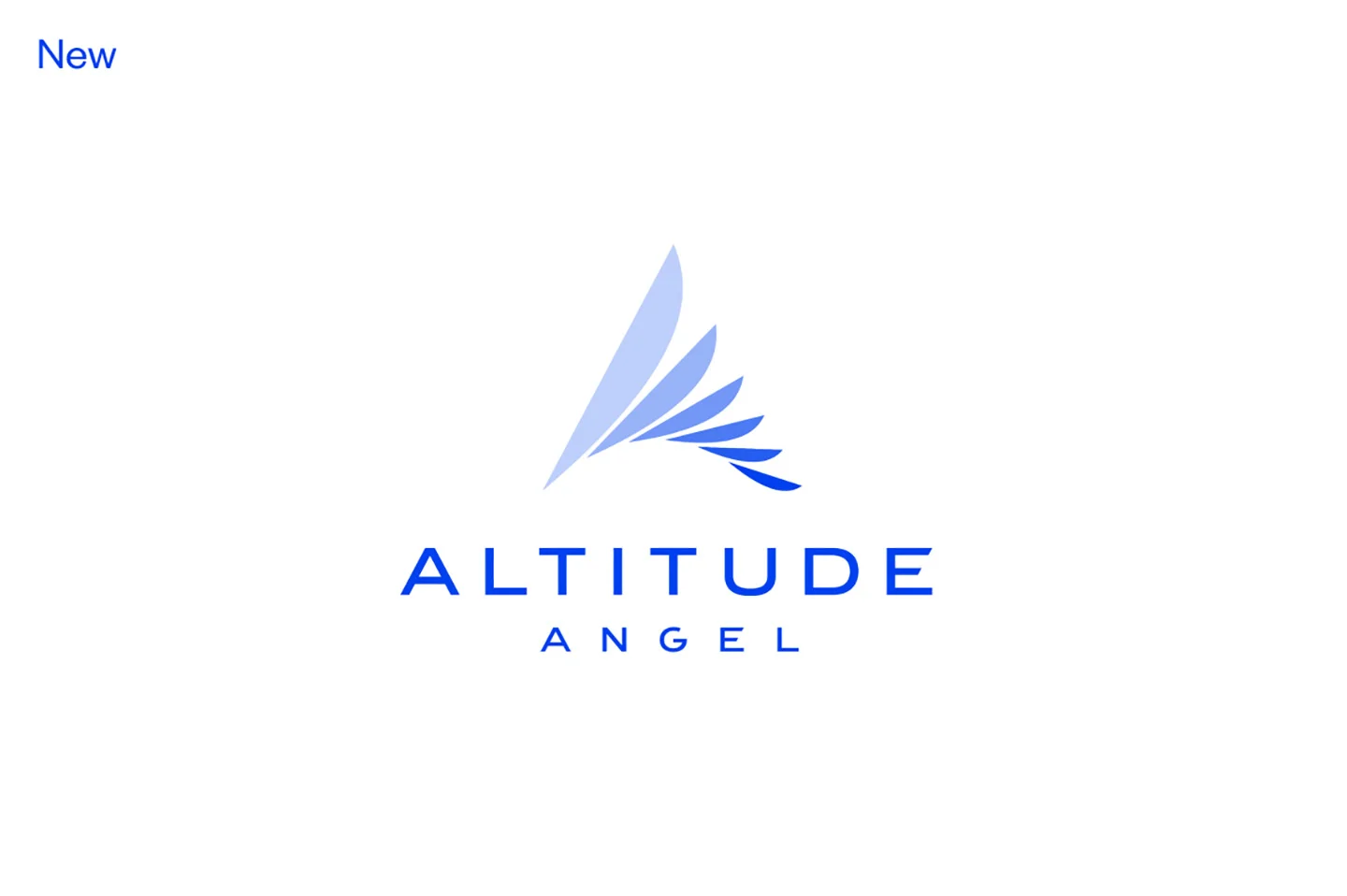
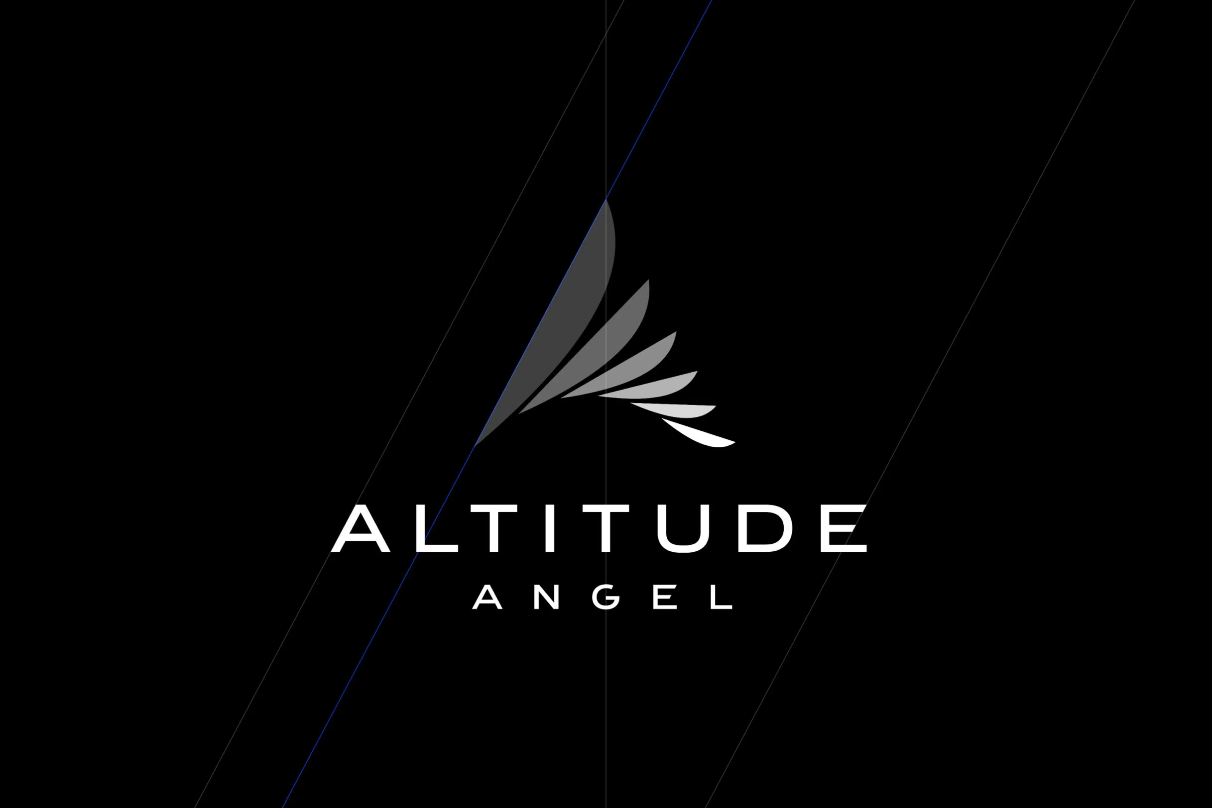
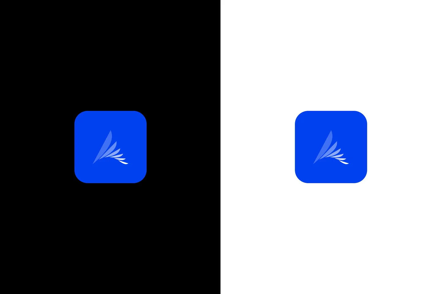
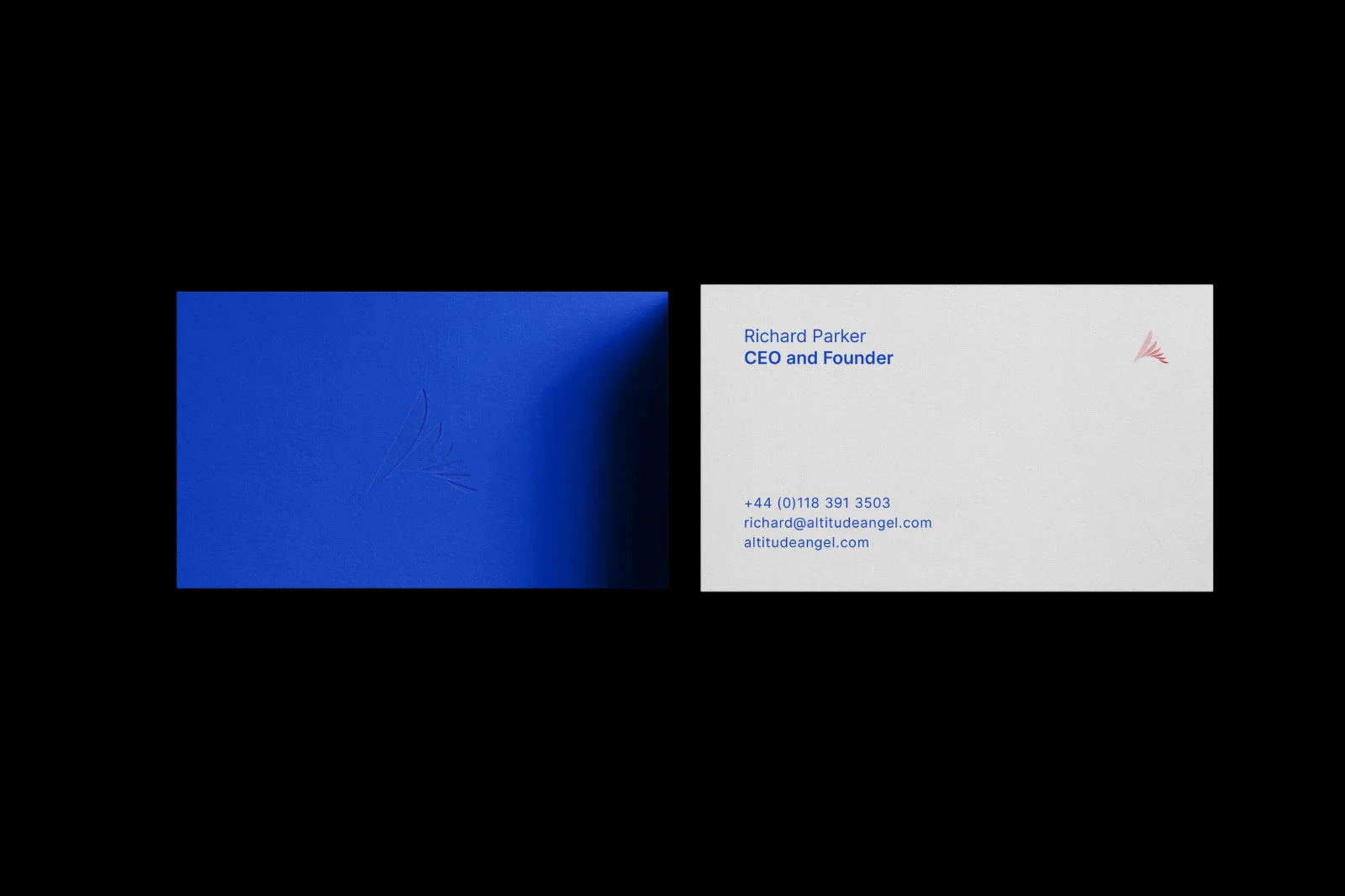
After some initial exploration, we determined that the most recognisable elements, the ‘A’ shape and the wing feathers could be reconfigured and combined to create a simplified, single wing arranged to mimic the shape of the ‘A’.
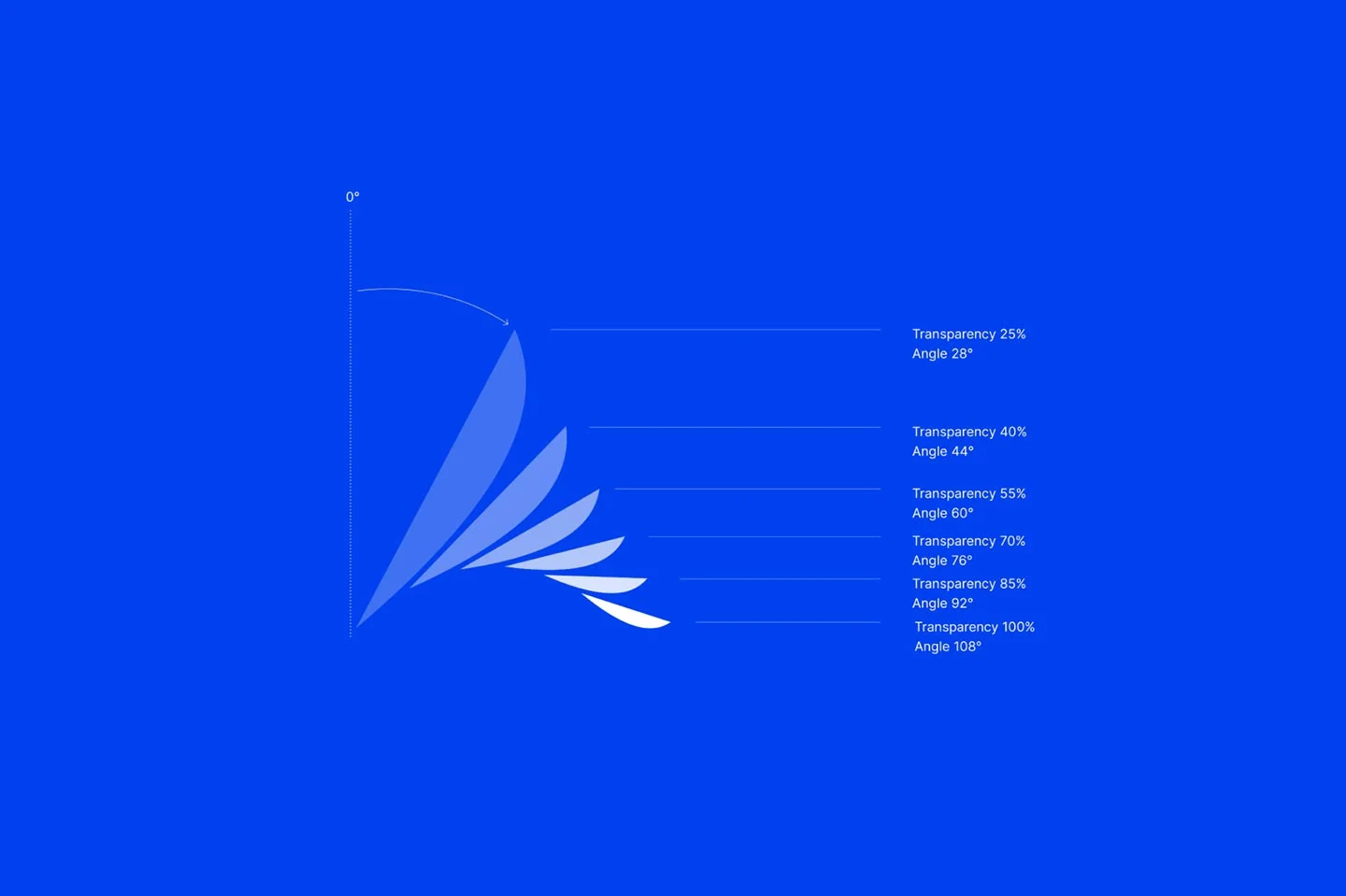
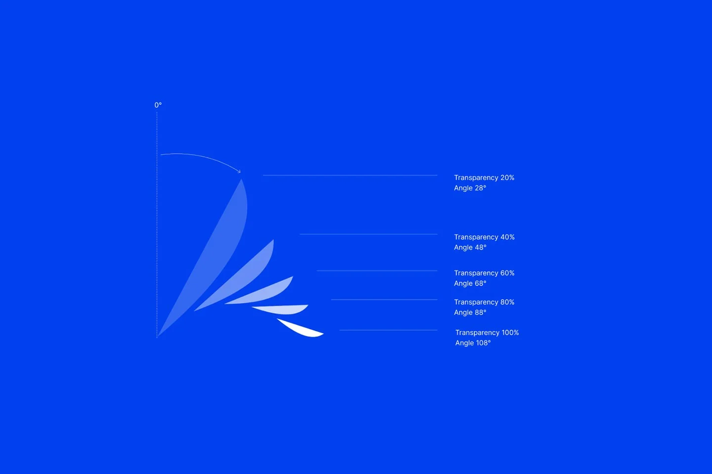
Initial typographic styling focussed on simplicity. We wanted to establish a sense of ownership so that, over time, the wordmark could exist on its own. However, whilst early versions scored points for simplicity, there was a concern as to the uniqueness of the mark. So, taking cues from the angles of the airfoil feathers, we made some subtle changes to a wider, less geometric typeface to create a mark that was simple and striking.

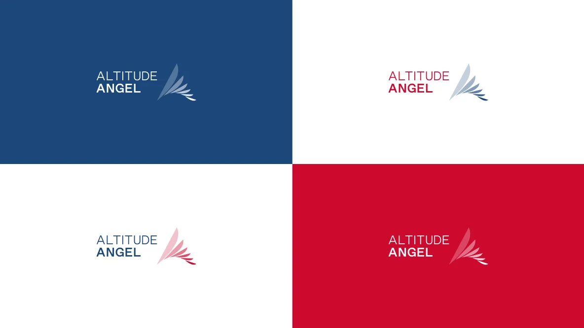
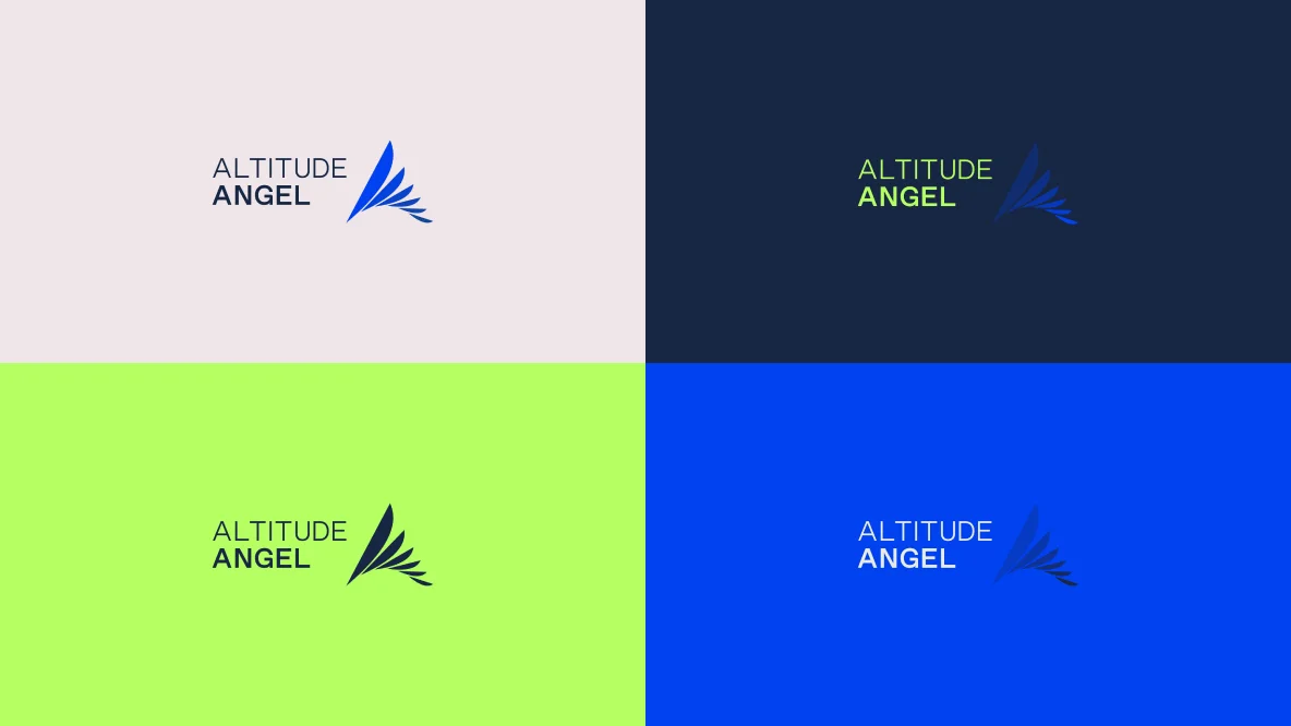
We had many conversations about colour. Typically playing it safe, aviation is somewhat defined by a colour palette of reds and blues, with a smattering of orange, yellow and gold. And, the old identity was positioned squarely within this sector.
We tested various colour combinations, always sticking to a primary blue to retain cues from the old identity. We dialled up the saturation of the blue to try to inject a little punch of technology and offset it with more vivid reds, and even a hint of lime green, reminiscent of hi-vis surfaces used throughout the world of safety.
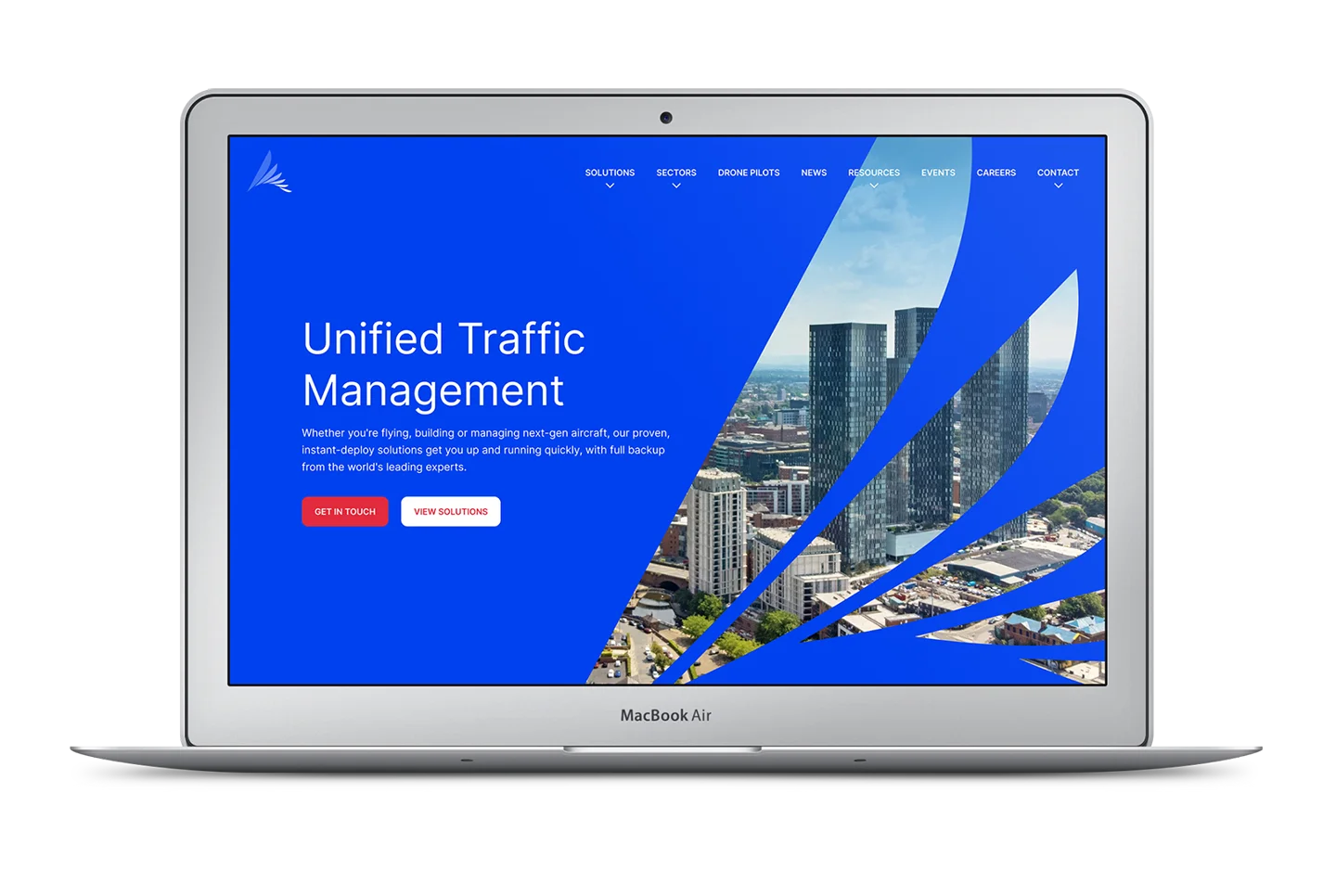
Ultimately, we chose to lean into blue, with highlights provided by vivid red and a little white to ground the identity in its aviation heritage, modernising the palette by saturating the colours to lean more towards technology.
Photography has, typically, focussed on the technology of drones and other unmanned aviation. But this was misrepresenting Altitude Angel’s service offering.
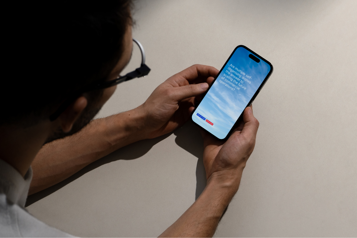
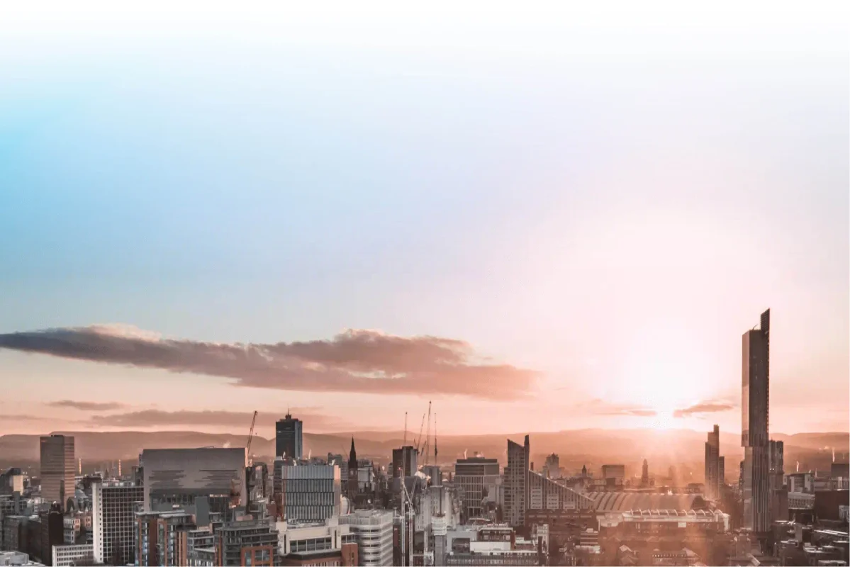
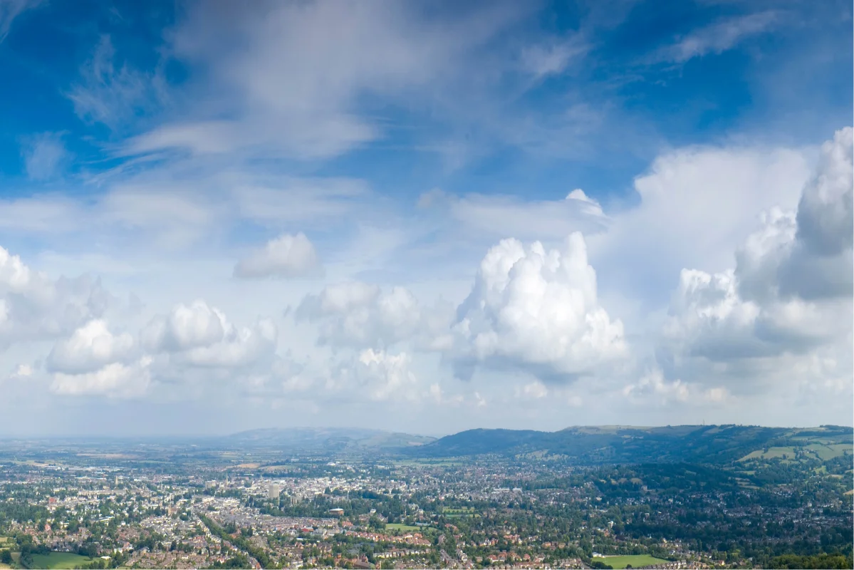
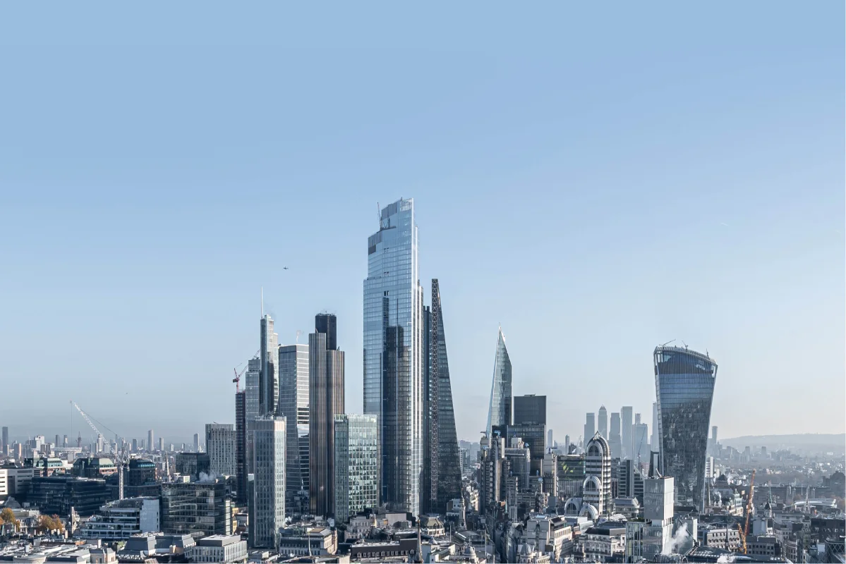
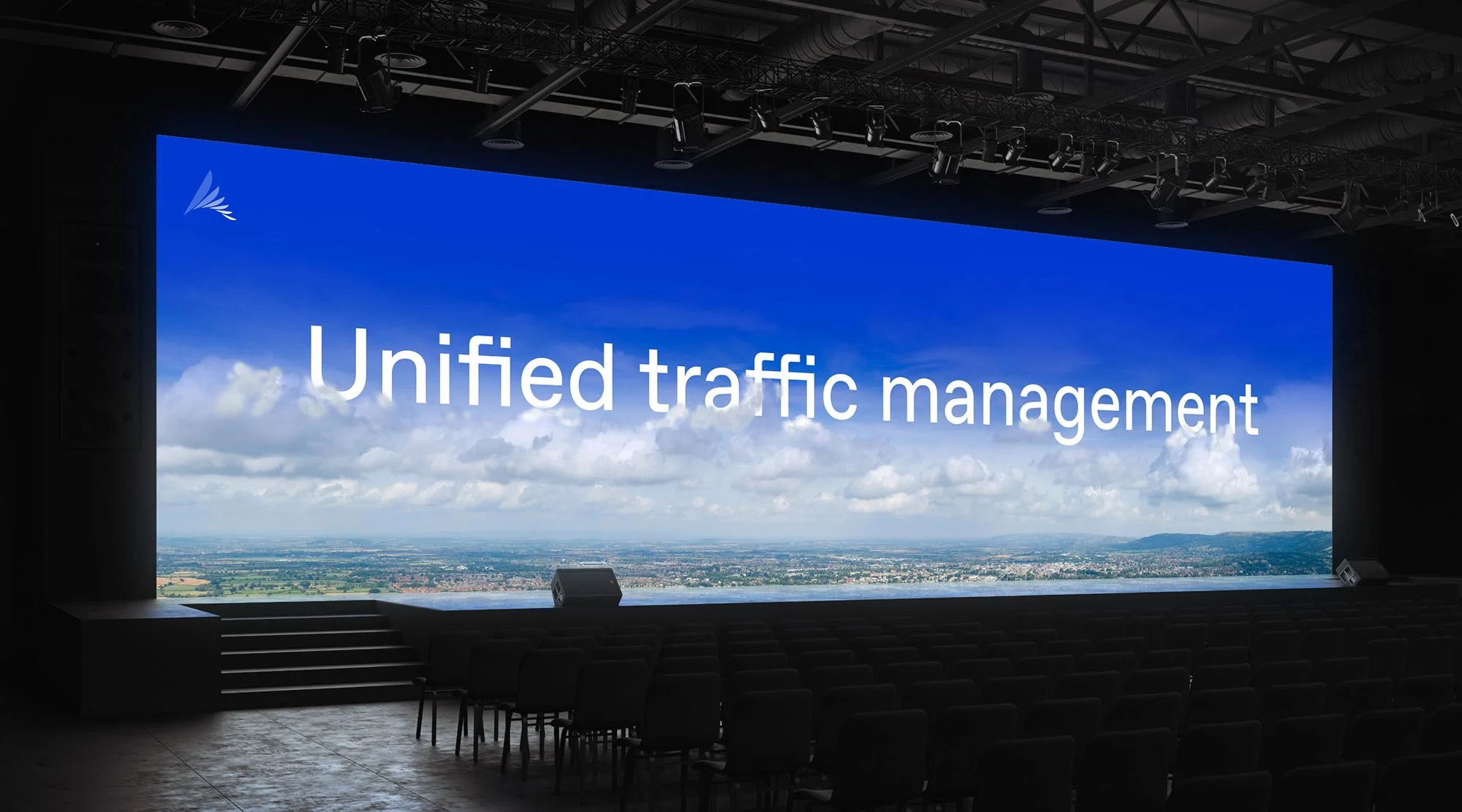
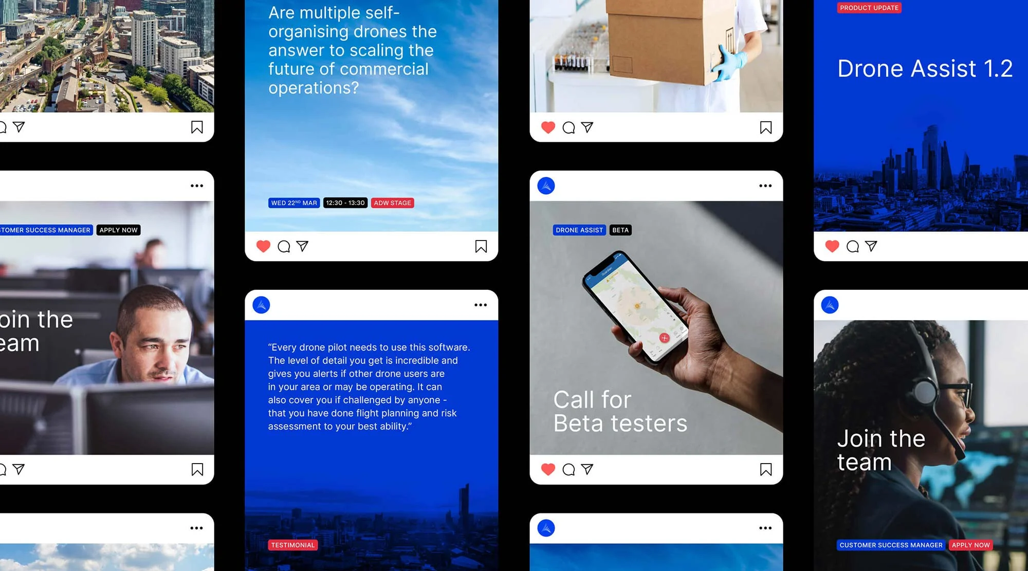
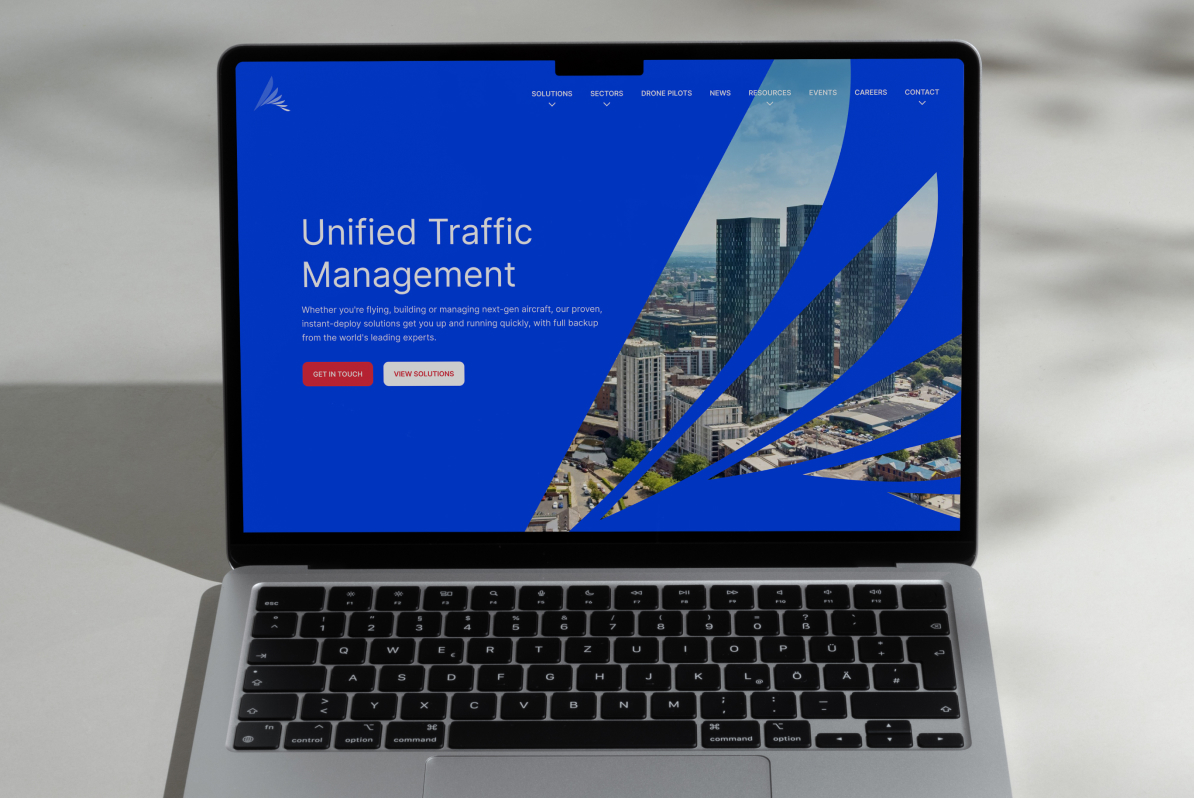
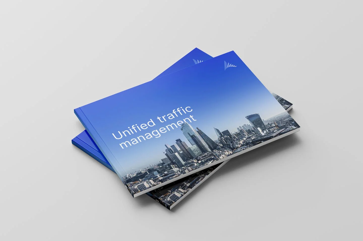
We recommended a photographic style which would focus primarily on two distinct features of the brand. We started using images as large canvasses of clear blue skies to better reflect their position of identifying safe, clear routes. And we helped reinforce this concept by positing the horizon low. This allows us to use images of both urban environments and the countryside whilst keeping space clear for branding and allowing messaging to interact with the subject matter.
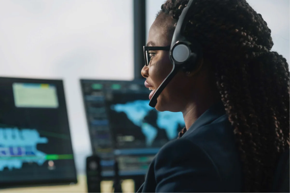
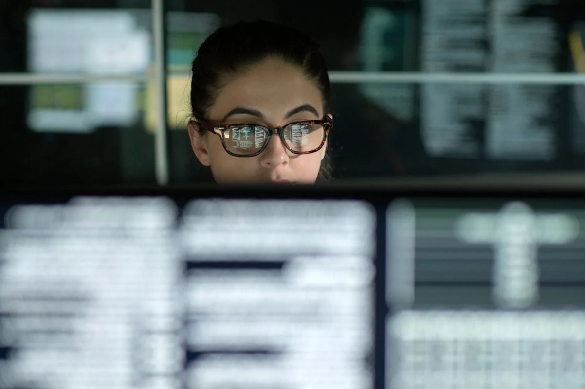
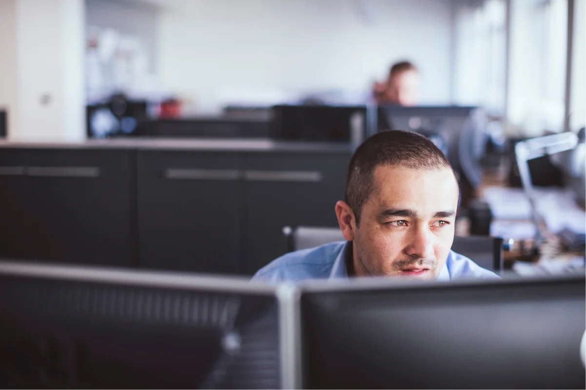
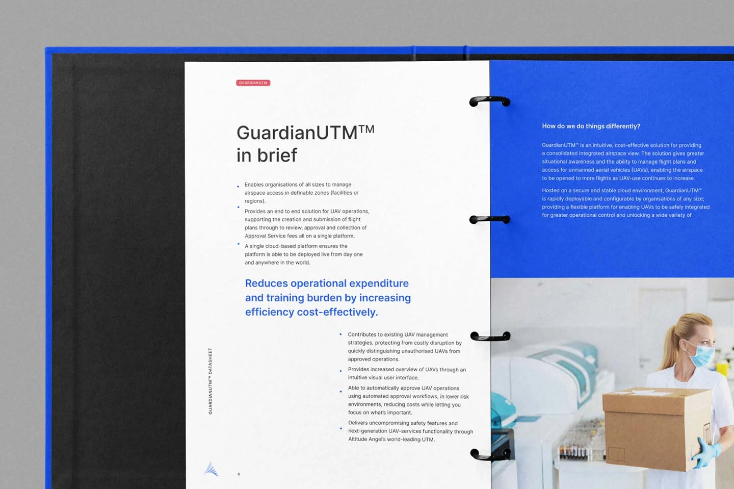
We also encouraged the team to look at more authentic user imagery, from air traffic control to drone operators and those using the services of unmanned aviation to transport vital medical supplies. These human stories help to reinforce some of the brand’s key aspirations, of revolutionising businesses and transforming lives.
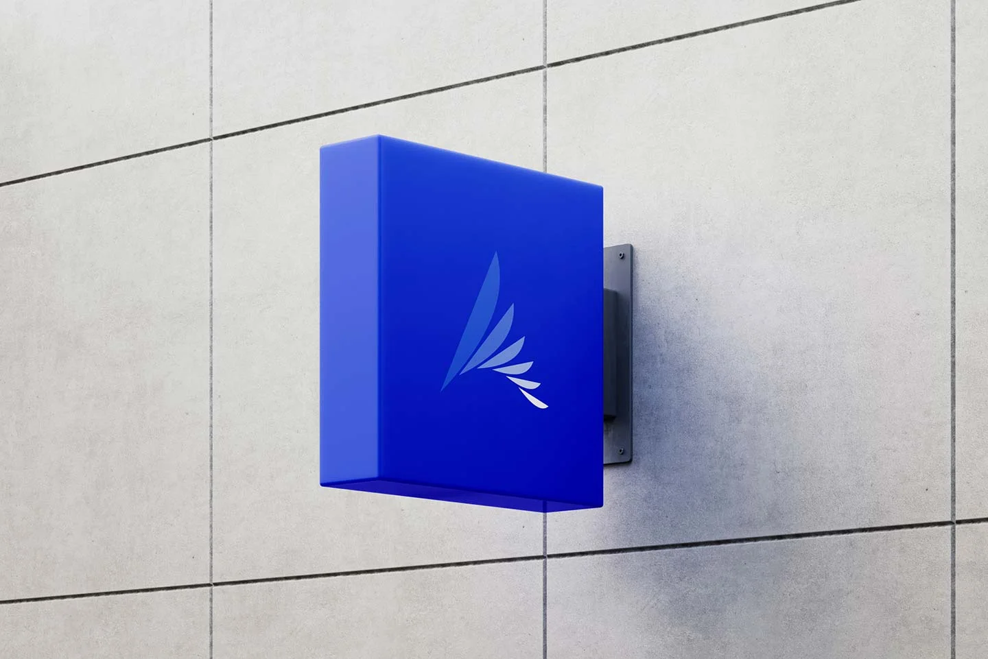
Once the various elements of the visual identity were established, we helped Altitude Angel to implement it across a wide variety of touch points.
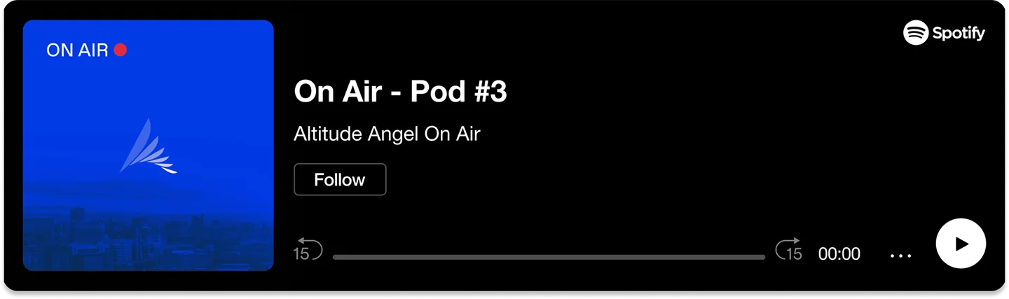
Using the angles created from the logo and a strong, we created some graphic extensions which can be used on document covers, social media and on their website. We develop a system of tabs which can be colour-coded and used to convey keyword messaging. We pulled much of their asset bank into Canva so that the internal marketing team can output assets which are on-brand. And finally, we delivered a set of brand guidelines which will help other suppliers understand the brand, and will help the Altitude Angel team keep everything consistent and clear moving forward.
“Working with Salad on our visual identity redesign meant we knew we were in safe, expert hands having witnessed work they had undertaken for others in our industry. It’s not easy to take a company on a journey to change a much-loved logo, despite their desire and recognition that things need to evolve. The process, in particular the development of logo concepts, was skilfully delivered.”