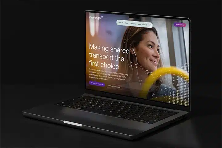
Work Passenger
A new brand, identity and website for a purposeful business, advocating for sustainable, shared transport
View case study
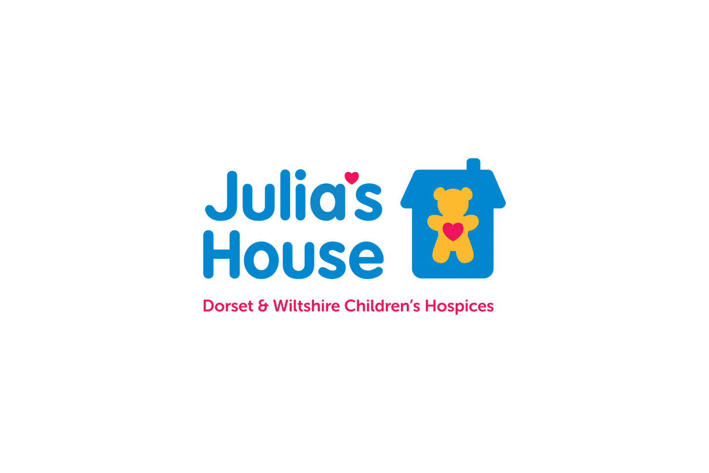
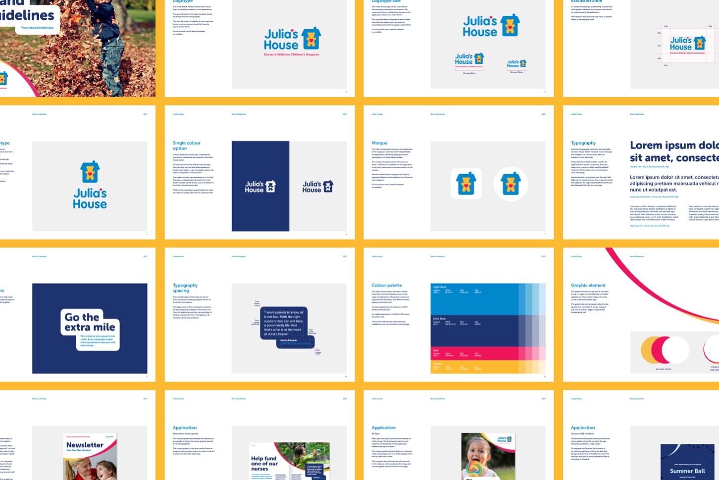
We were initially brought in to consult on the visual brand identity and through this process identified a number of areas for improvement. The challenge was to evolve the Julia’s House visual identity to position them alongside some of the larger and more recognised charities in the UK and our suggestions populated a brief which included simplifying the identity and making it more relevant for their audience (whilst Julia’s House delivers a service centred around children, the charity’s audience is adults). As well as modernising and defining the identity, we needed to create additional assets that would increase recognition beyond the logo itself, before encapsulating the work in a thorough set of brand guidelines that could be consistently applied by in-house designers, across a range of brand materials.


Julia’s House have a loyal and passionate following and it was important to maintain the core elements of the existing identity. Although this was a case of evolution and not revolution, we were required to revisit every element during the project.
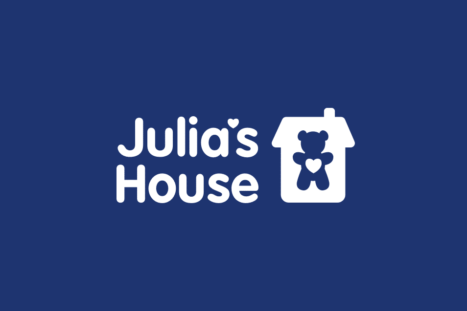
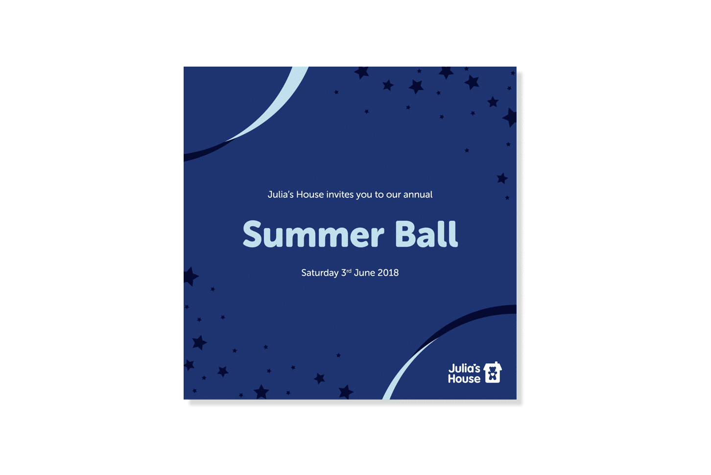
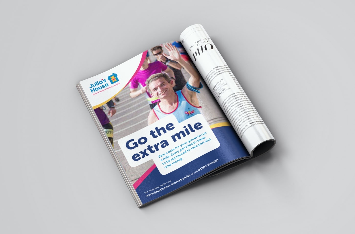
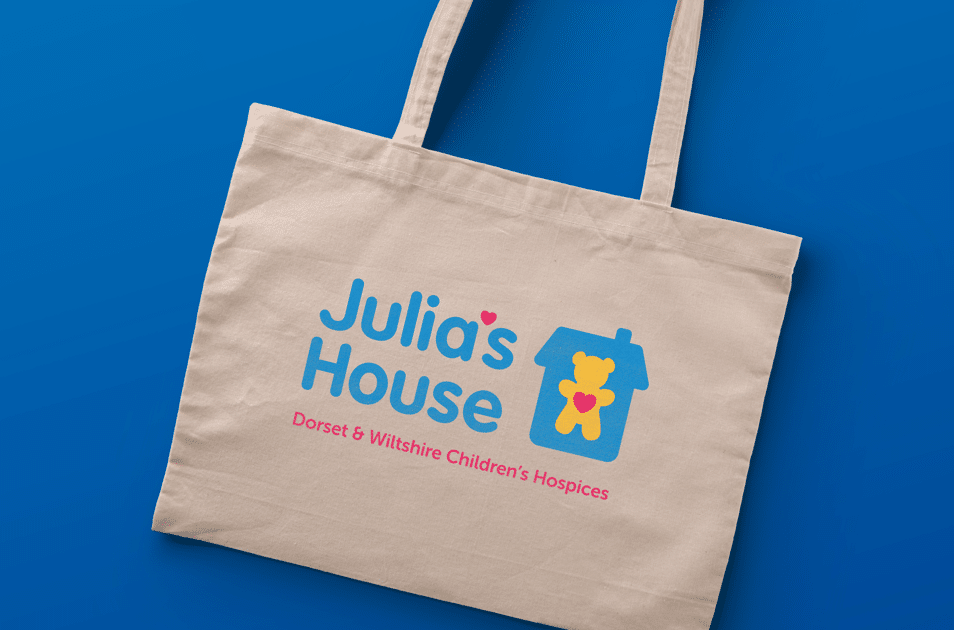
Starting with the logo, we refined each of the individual graphic components and developed the typography to create a more compact and balanced unit. This ensured the visual identity had the clarity and flexibility needed for implementing at different sizes across multiple applications. The previous colours have evolved into a bright and welcoming palette. And by adopting a bold, rounded font for titles and headlines, we have used supporting typography to convey both trustworthiness and approachability – two qualities that personify the Julia’s House organisation.
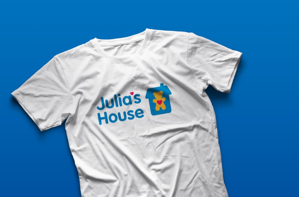
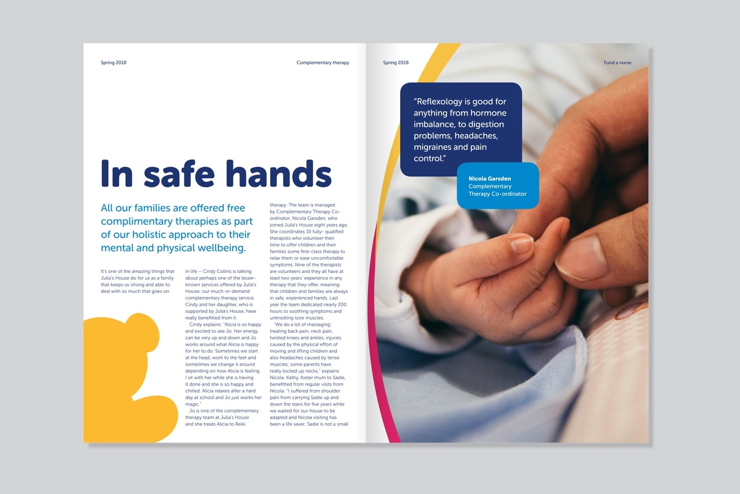
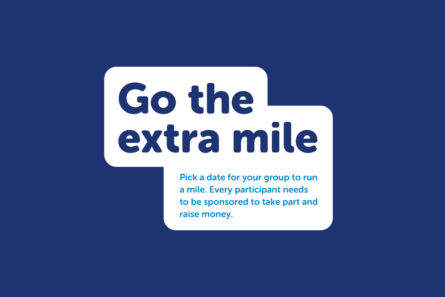
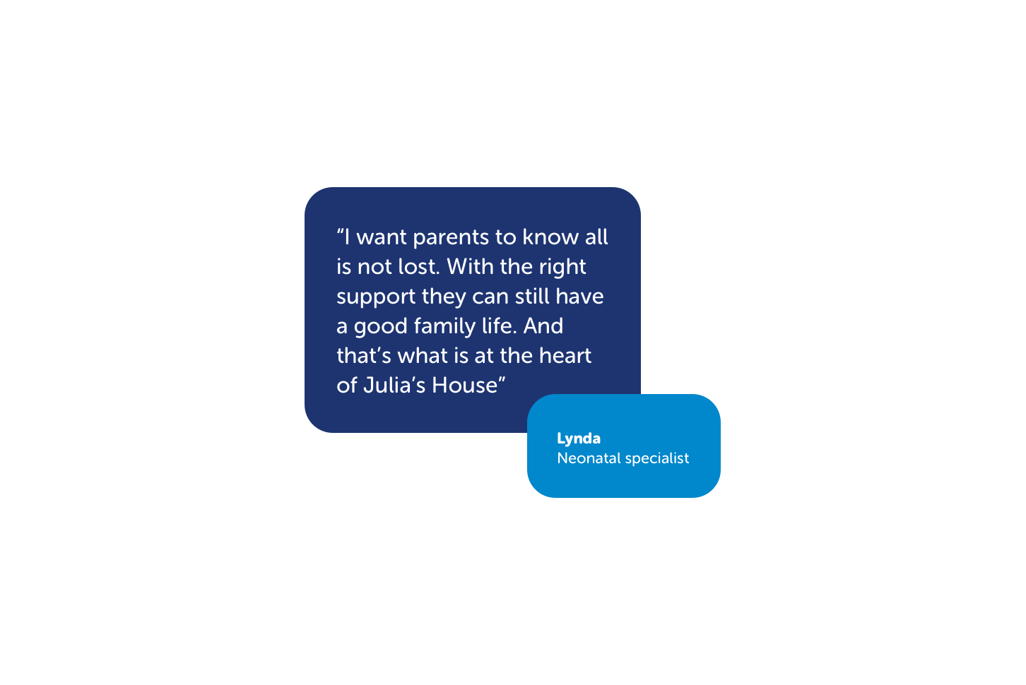
As well as developing the existing assets, we also created visual devices for displaying text and imagery. The new rounded containers are derived from the shapes found within the logo and have been designed to complement the full identity suite.
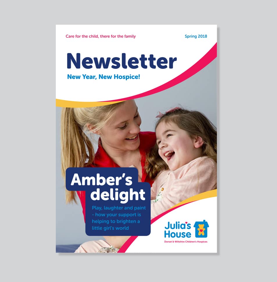
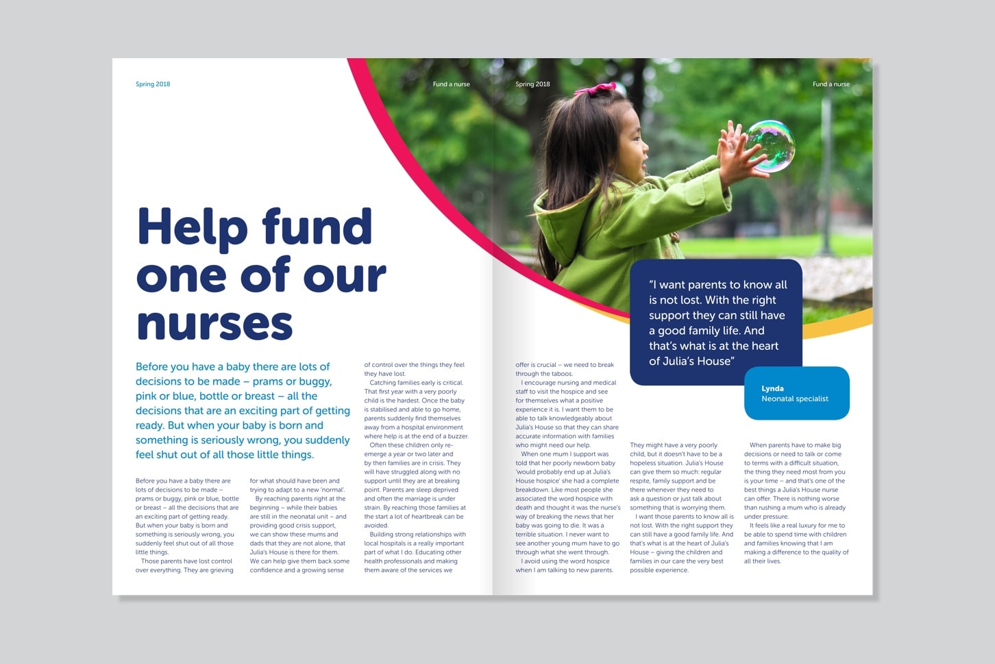
The new identity has bred an even greater sense of pride in the brand amongst employees. The suite of assets and brand guidelines give greater flexibility and clear instruction for the in-house team or any third parties working on the visual identity.
We have long admired the work that Julia’s House does – it is the most important work at the most important time. We were so proud and happy to help such an amazing charity. If you have time, please find out more about them here.

“It’s been a pleasure working on this project with Salad to evolve our brand. They’ve worked hard to understand the value and history of our brand and the intrinsic relationship it holds with our supporters. Their ideas have been well thought-through and presented sympathetically to acknowledge our valuable heritage, while at the same time giving a fresh modern look and feel to our communications. Professional, creative and approachable, we’ve really enjoyed working with the team on this task.”
A new brand, identity and website for a purposeful business, advocating for sustainable, shared transport

Developing a brand for a sustainable and socially responsible IT business, credited with winning a $150 million contract