Renewing the brand and refreshing the identity for an award-winning, family-run holiday group
The original brief
Waterside Holiday Group was founded by Ralph and Esther Jacobs in 1963, at the site which has now become the Bowleaze Cove Holiday Park and Spa. Since the original park was opened, the group has continued to grow adding parks at Chesil Beach and Osmington Mills. Most recently the group acquired Tregoad in Cornwall, and as the portfolio grew, so did the need for an evolution of both the brand and visual identity.
When we met the team from Waterside in 2019, the brief they came with was both strategic and comprehensive. Following a restructure of their senior management team, the appointment of a new CEO and more family involvement, they needed to bring the brand together, consider their identity, and look at how they could roll that identity out across their portfolio of parks.
With so much equity built out over an almost 60 year history, and generational spanning memories being created by multiple members of the same guest and owner families, there was a need to tread carefully. The team needed a brand which had the flexibility to grow with the business, that would never be a barrier to improving performance, and had a visual identity which would better reflect the business moving forward.
Customer insight, brand heritage & culture codified
We began our involvement by taking a deep dive into Waterside’s customer base. We reviewed Experian profiling of key customer groups, poured through historical owner and guest feedback and polled existing owners and guests to build out our knowledge of the brand, its customers, and sentiment around experience at every park.
Once we’d aggregated the data, we were able to take our findings to the board and carefully craft a detailed brief. We made early recommendations for the scope of work we’d carry out, as well as trying to ensure that brand equity was maintained.
We designed a series of workshops, firstly with a representative group of staff members, from sales to site maintenance, housekeeping and entertainment to gather as much customer-focused context as possible. With the outputs of these workshops we then worked closely with the board and senior leadership to focus on the key pillars of the group’s operational structure: holidays and guest experience, ownership and owner experience, retail and entertainment, sales, innovation and future plans.

Once all the data had been gathered and the outputs of the workshops condensed and simplified, we started to piece together the status of the business as we saw it and produce a brand platform that would support the business moving forward.
We found a business inspired by its communities, defined by quality and a sense of consumer-focused innovation. A family-run business which saw its employees and guests as an extension of the family, and a business guided by a strong culture and a set of living, guiding values.

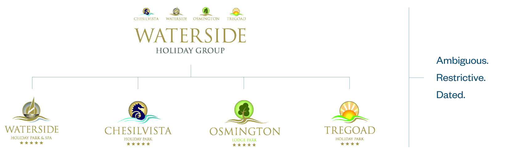
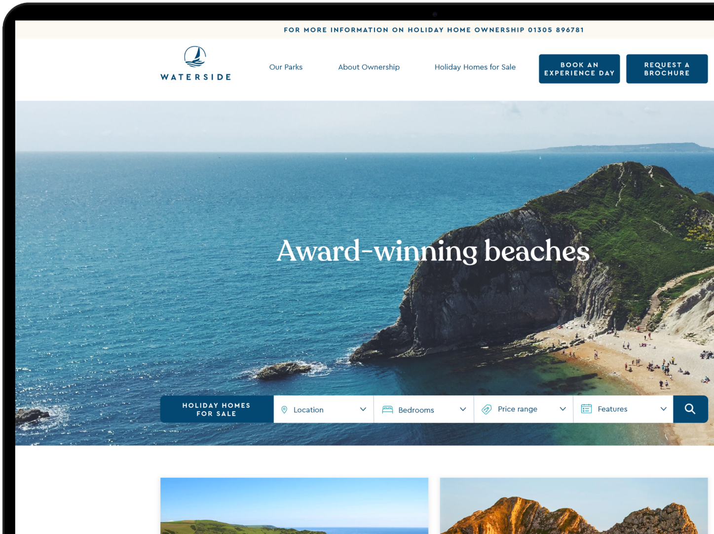
We explored brand naming options for the business and parks. Eventually, we created a naming strategy which allowed us to stay true to the brief: never a barrier to growth. At the time, the flagship park, Waterside Park and Spa was the outlier in a naming strategy more obviously based on geographical locations.
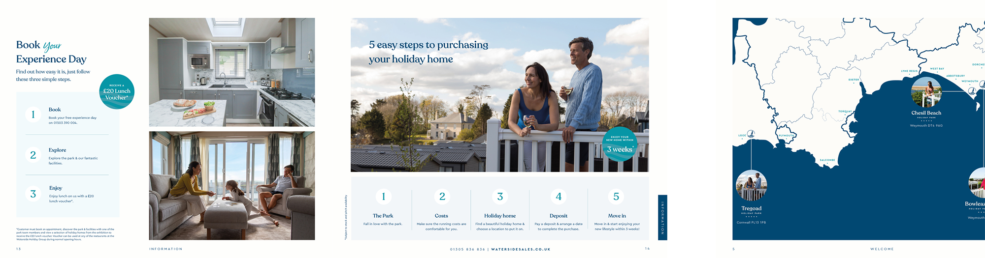
We recommended moving to a brand architecture that would reflect these incredible locations, maintaining the history of the Waterside name at the group level. So Waterside Holiday Group, mostly abbreviated to simply Waterside, was retained, and each park was designated a more obvious geographical moniker. Every park then gets a more appropriate descriptor depending on the services provided.
Waterside, as a group name, was freed up to simply represent the brand, and rather than maintaining sub-brands for each park could be used as a sign-off for the various products and offers. Approaching the architecture this way has enabled Waterside to continue to build brand equity, and each park has maintained a discreet identity and will retain customer sentiment, equity and value.


Evolutionary identity revolution
Work on the identity began post-pandemic. We delved into the history of the business looking for clues to support an evolutionary approach. We researched brands that led with similar architecture, and others that represented the idea of holiday, family and connection to nature.
The previous identity had seen each park treated as a sub-brand, which had forced Waterside to establish and use different identities for each park. We wanted to focus on a single mark for the brand and use a more simple naming principle for the parks. This way, the operating company can focus on delivering the experience across the portfolio, and the parks become the location where the 5* experience is delivered.
So, we developed a new logo for the business steeped in history. We simplified the typography around the brand’s word mark moving away from the existing, rather dated typography.


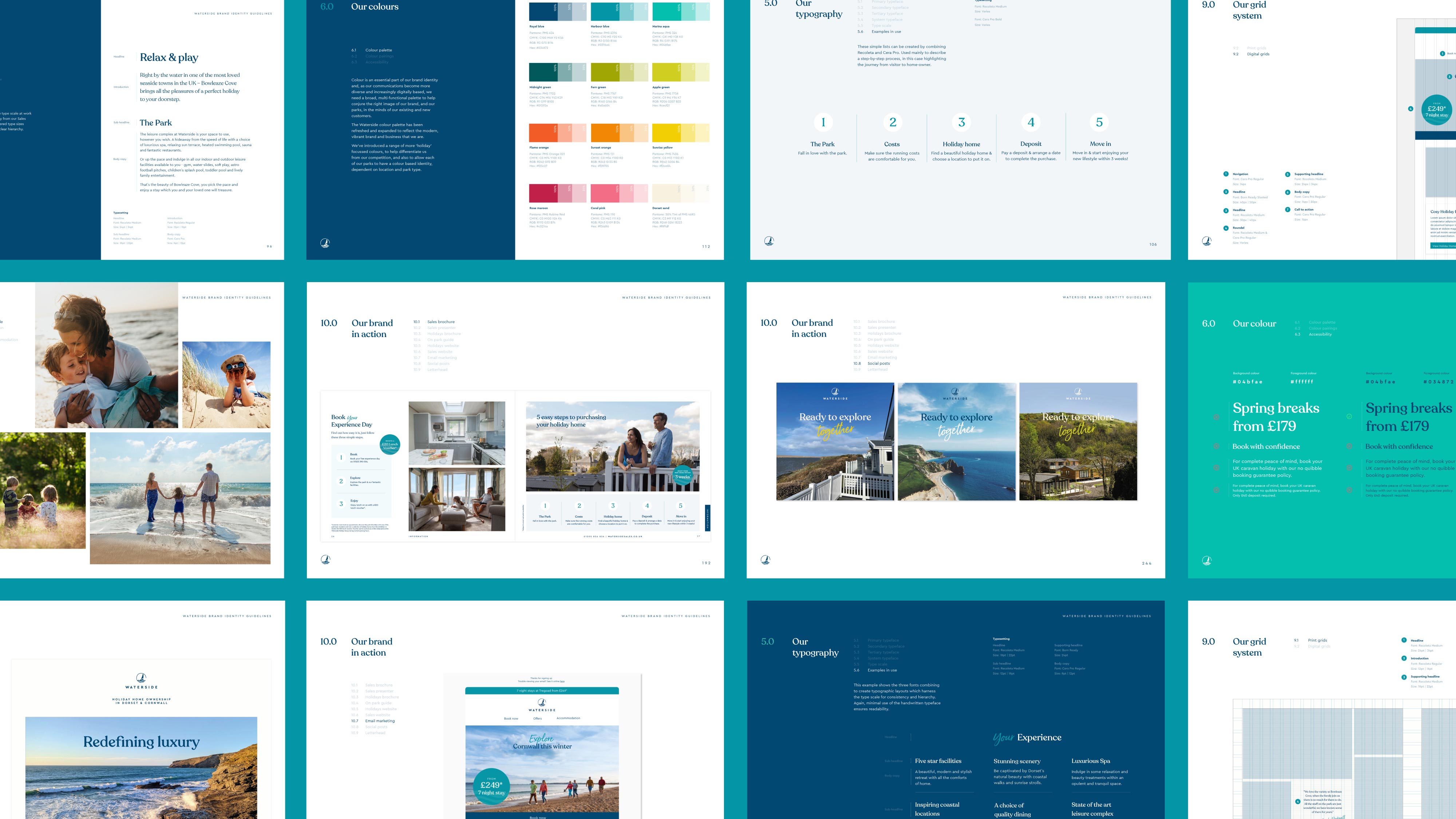
Typography
Supporting typefaces were chosen to express a more friendly personality, and help to modernise the visual identity without becoming boring. A third, scripted typeface was added to maintain a much-loved feature of the visual identity but was used sparingly enough to convey a sense of emphasis through messaging.

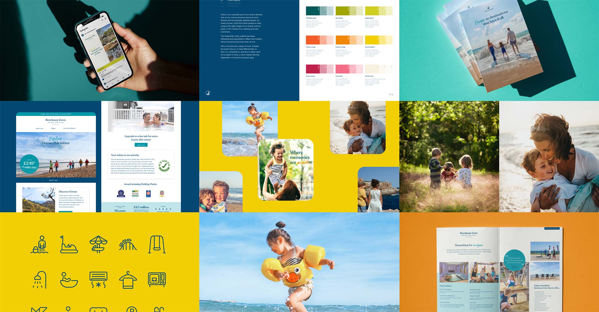
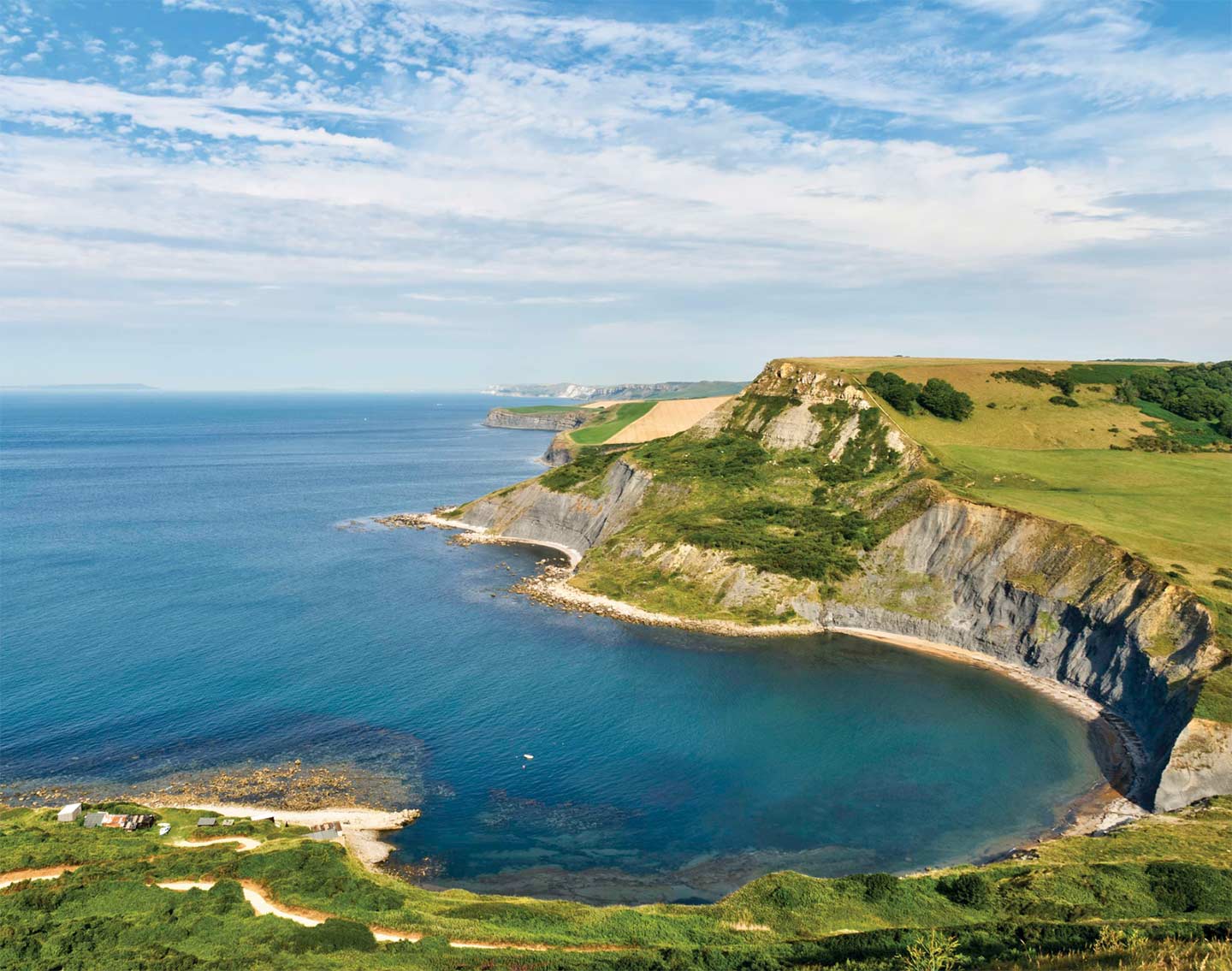
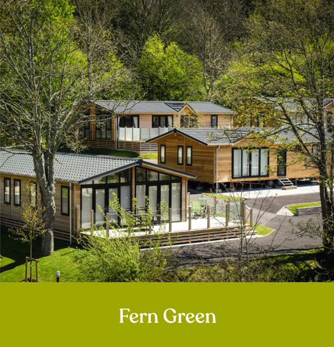
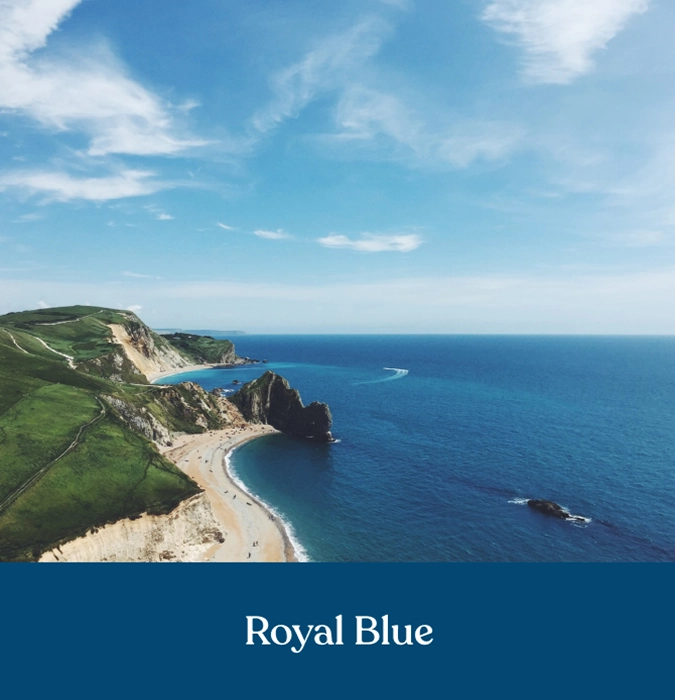
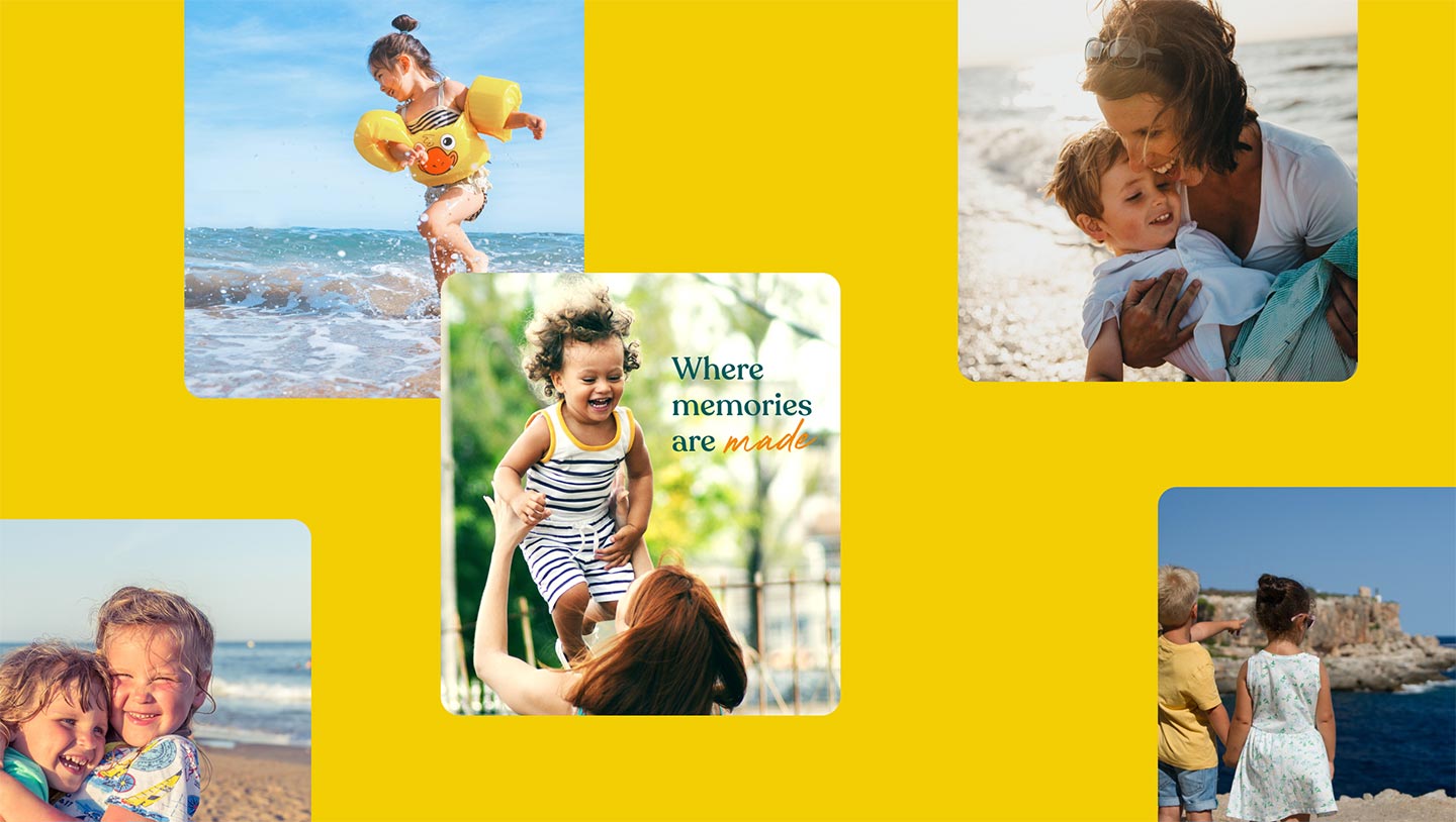
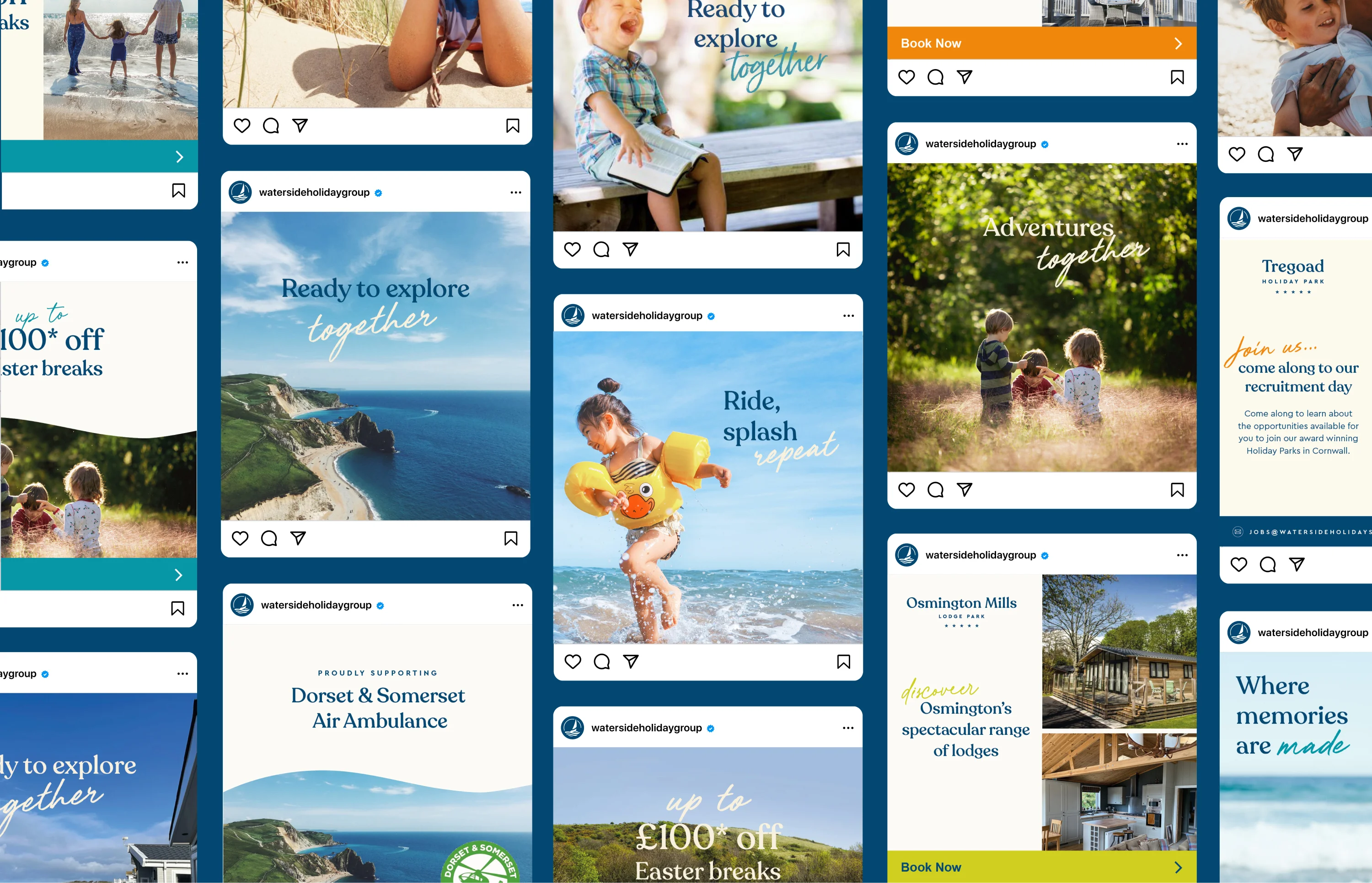
Imagery that binds the brand to the landscape
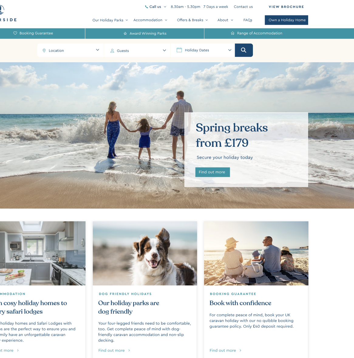
Imagery is core to the Waterside brand and something the marketing team had been working on even before we started work on the identity. Often based on people and experience, we added a critical component to the photographic palette: the places Waterside operates in. Using landscape photography binds the brand to the spaces it operates in, and the wider environment.


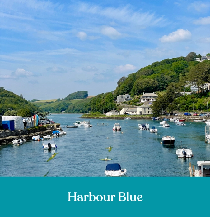
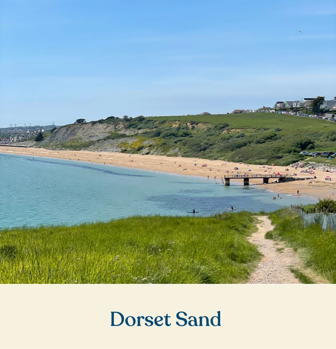
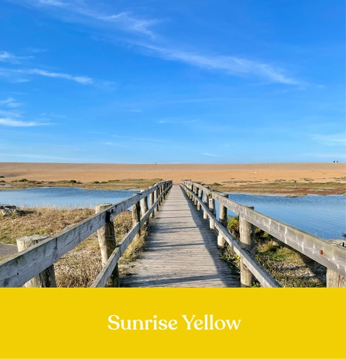
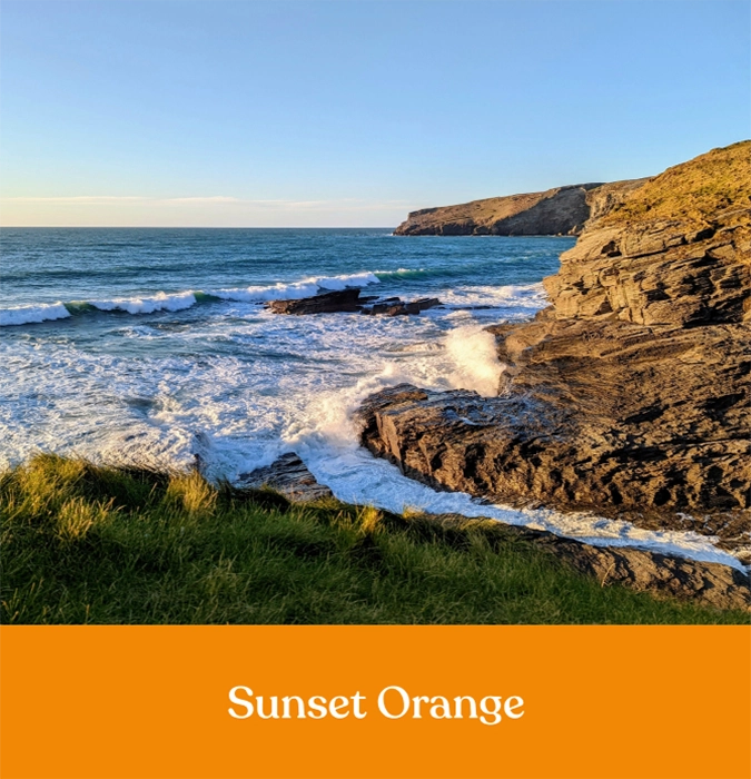
A sense of place through colour
We introduced a new, comprehensive colour palette to both root the identity in geography and to give a sense of identity to each park. Picking the colours of the surrounding areas, Waterside now has access to a myriad of seasonal combinations.
Extending the graphic language using shapes from the logo meant that we could lift brochures, and social media posts and bring a sense of identity across the brand.

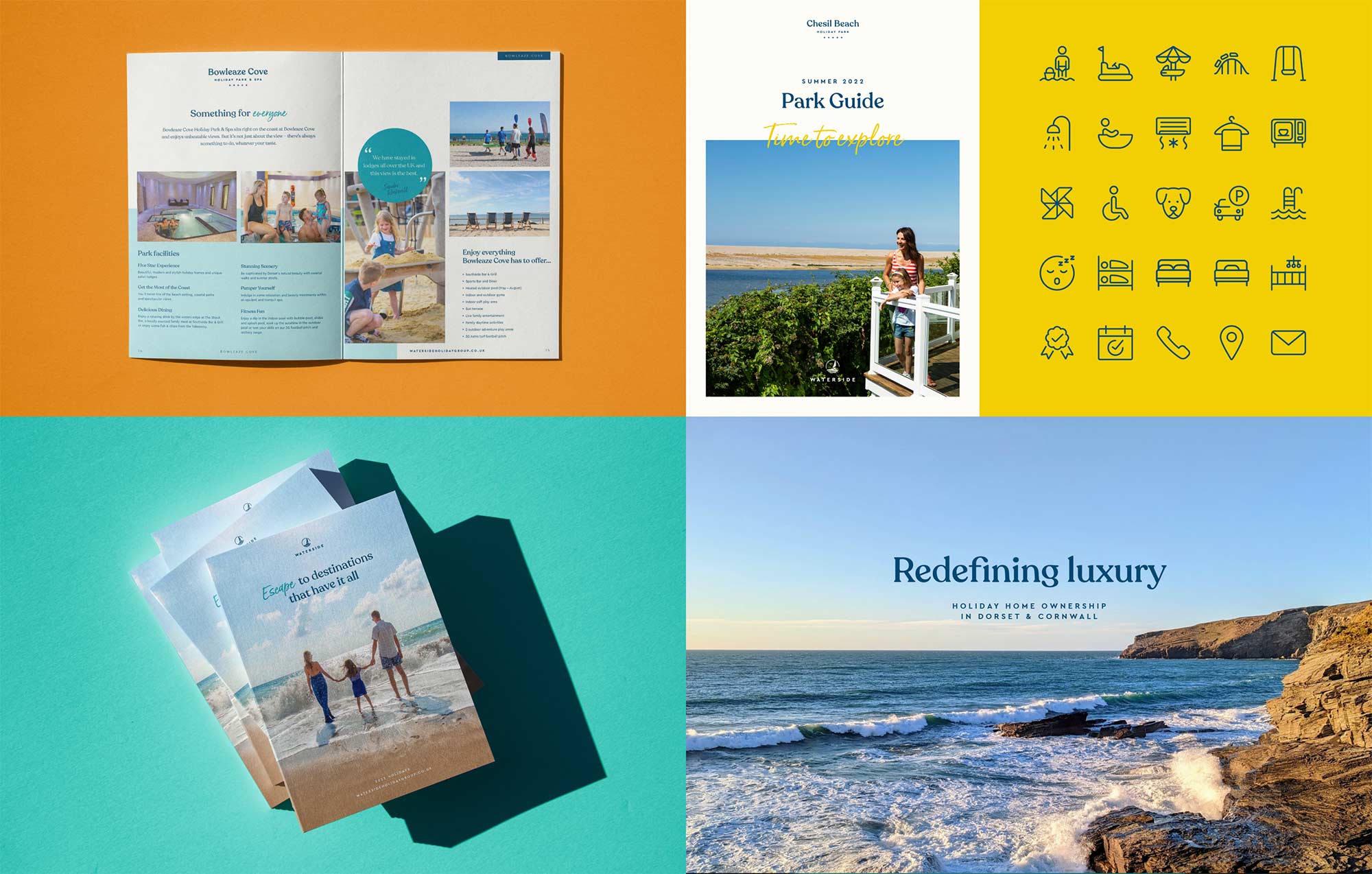
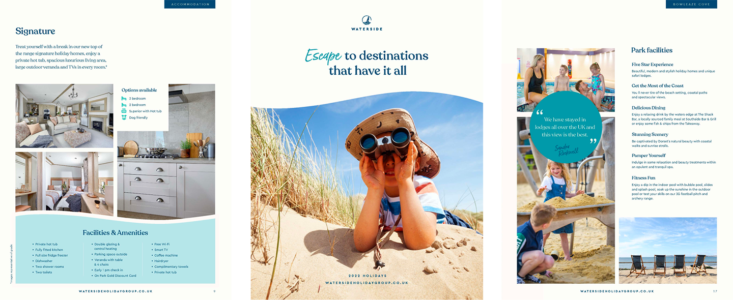
Reimagining the brand collateral
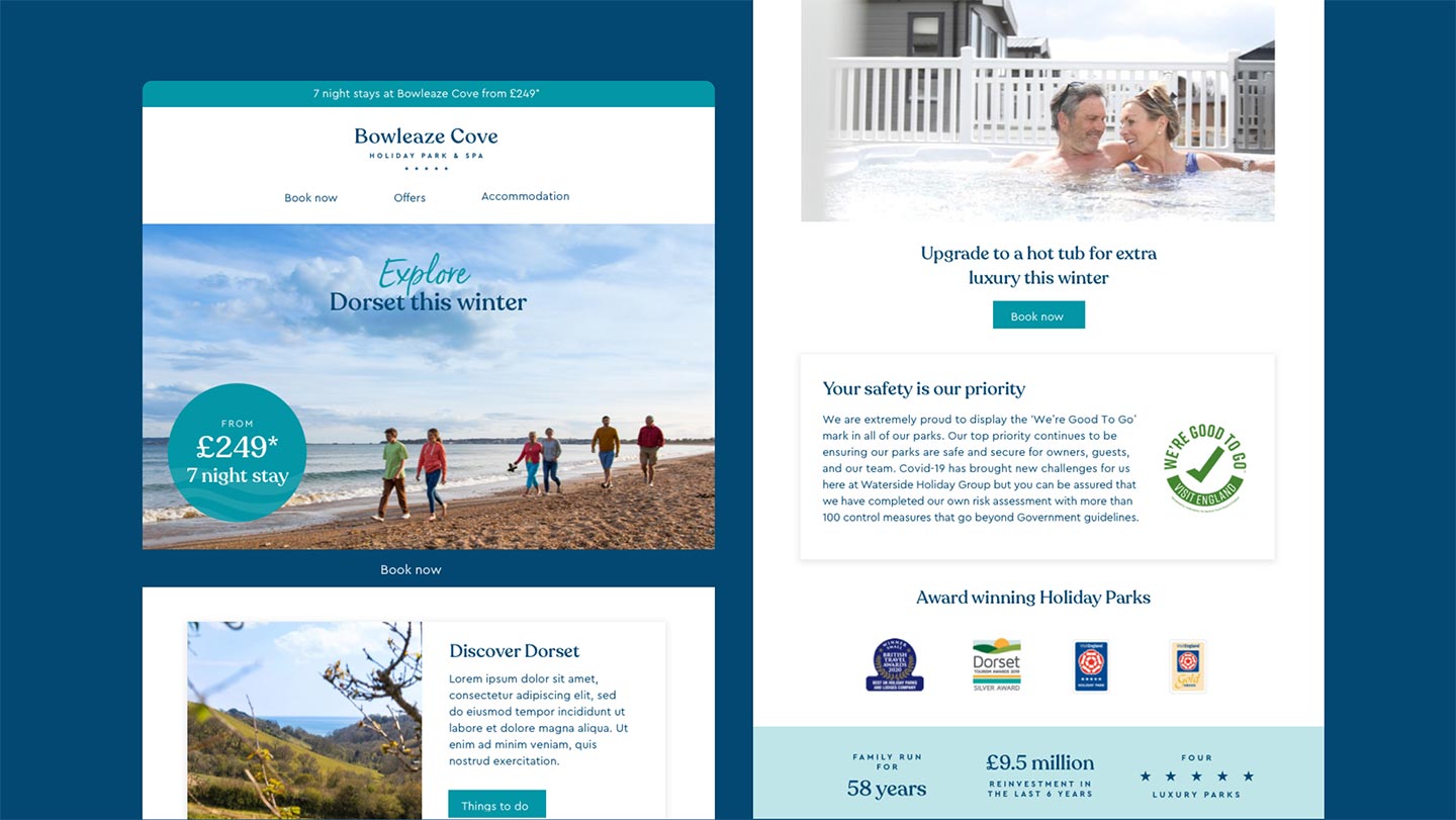
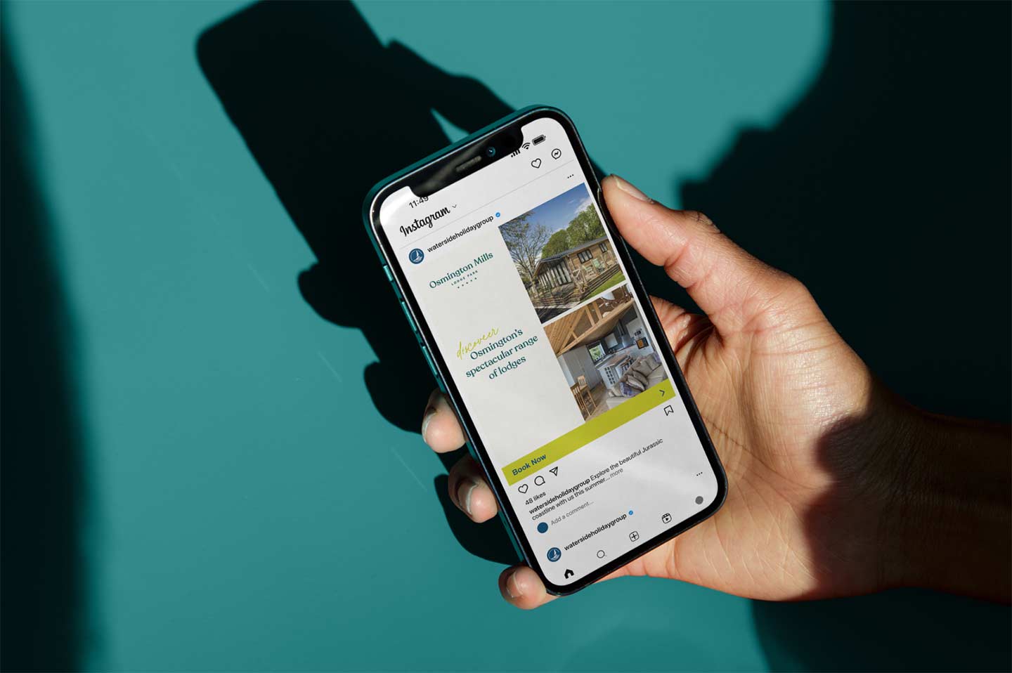
Following the development of the identity, establishing a new colour palette and expanding the imagery for the brand, we set about recreating some of the most widely used brand collateral. We reimagined holiday and sales brochures, how branded social media could work, email marketing and some early exploration of the organisation’s websites.
Defining the identity system
We pulled all the elements of the brand, from strategy to identity, colour, typography, photography and implementation examples into a comprehensive guidelines document. As a business with various marketing needs across the year, as well as on-park signage, vehicle livery and physical advertising, the guidelines needed to be robust enough to explain how the brand worked, but loose enough to give flexibility in application, particularly for the physical and architectural implementation.
“ …the rebrand serves as a celebration of everything our guests, owners, and local communities know and love about our parks. It will bring them all more closely together under one umbrella, as a mark of assurance that Waterside’s strong values are reflected across every location. ”