A long-term, people-positive partnership to continually evolve brand, identity and website

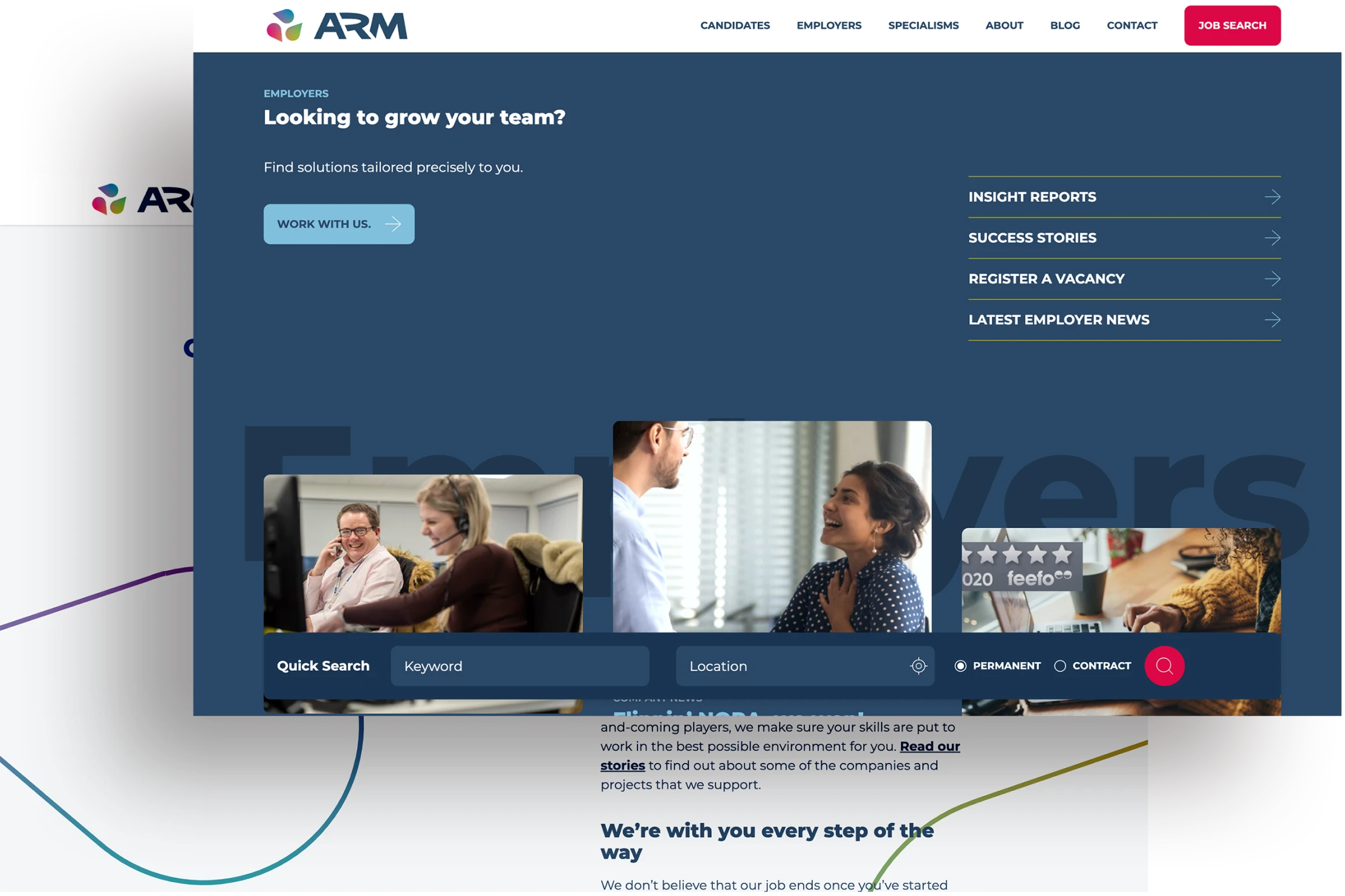
ARM Recruitment specialise in recruitment across some of the most demanding and competitive sectors in the world. They needed a candidate focused, fully integrated website to communicate their unique offer, house their candidate applicant system and raise the profile of the business.

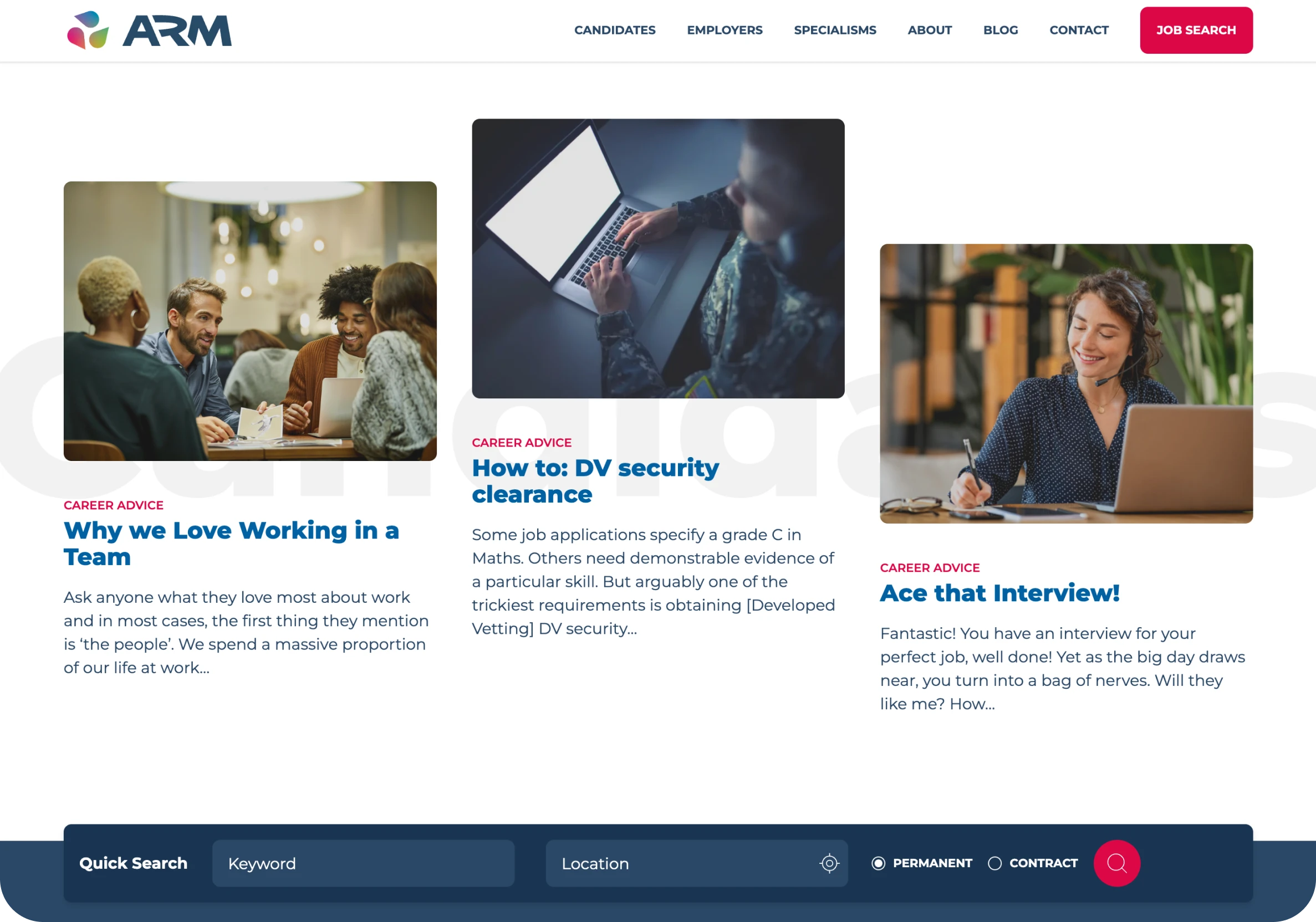

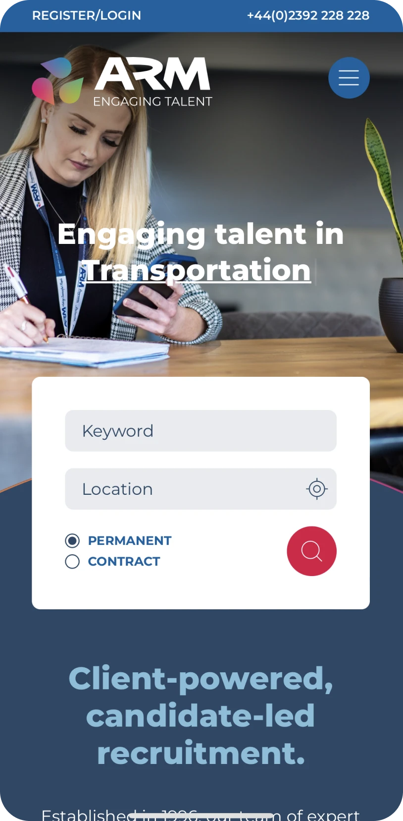

The website needed to be user friendly in order to increase inbound revenue via applications and CV submissions.
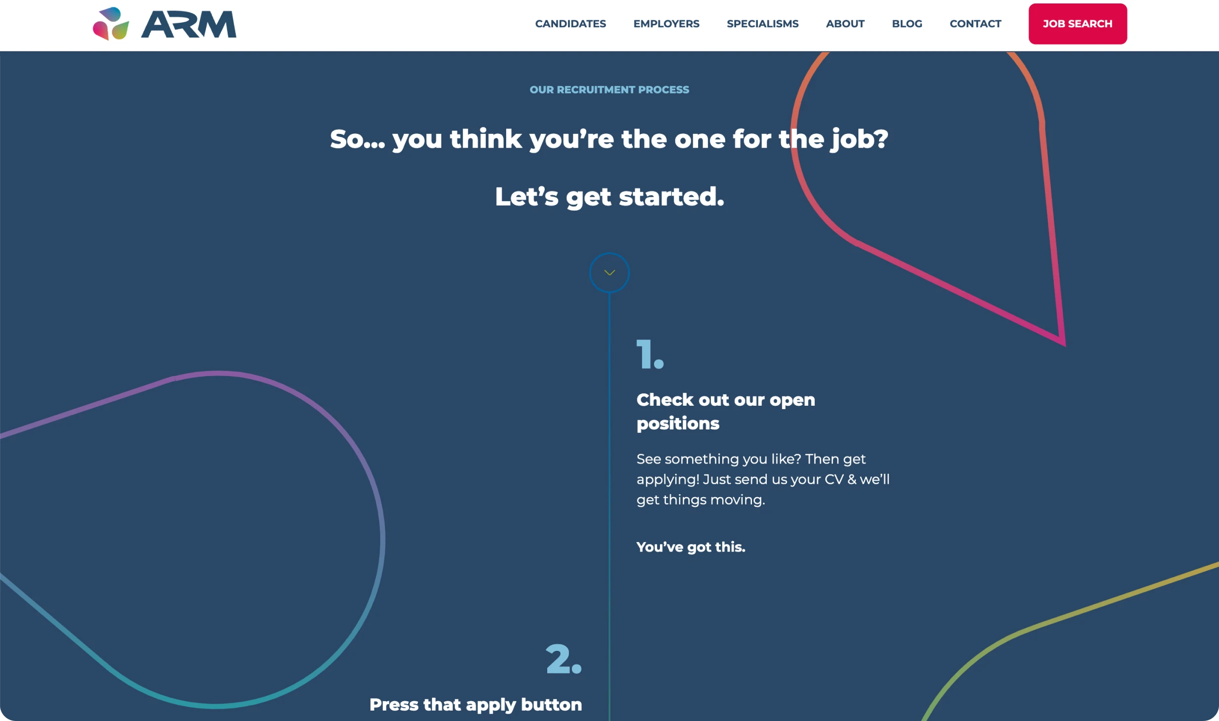
Starting with a significant restructure, our planning focused on streamlining the experience, new information architecture and a tailored SEO strategy for the migration.
The website also needed to deliver for clients and the business's own recruitment needs. We considered the user journeys for each to ensure their needs were met with focused messaging and bespoke content.
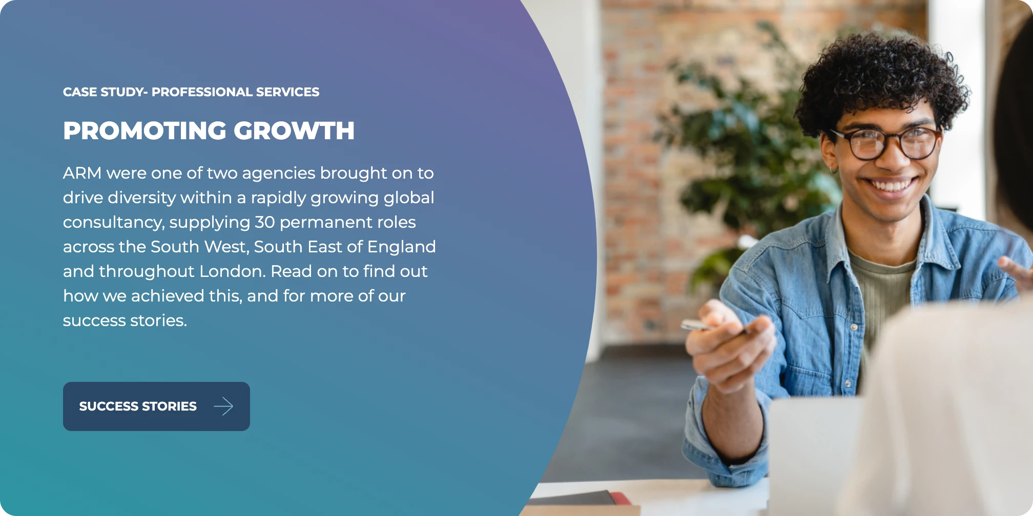
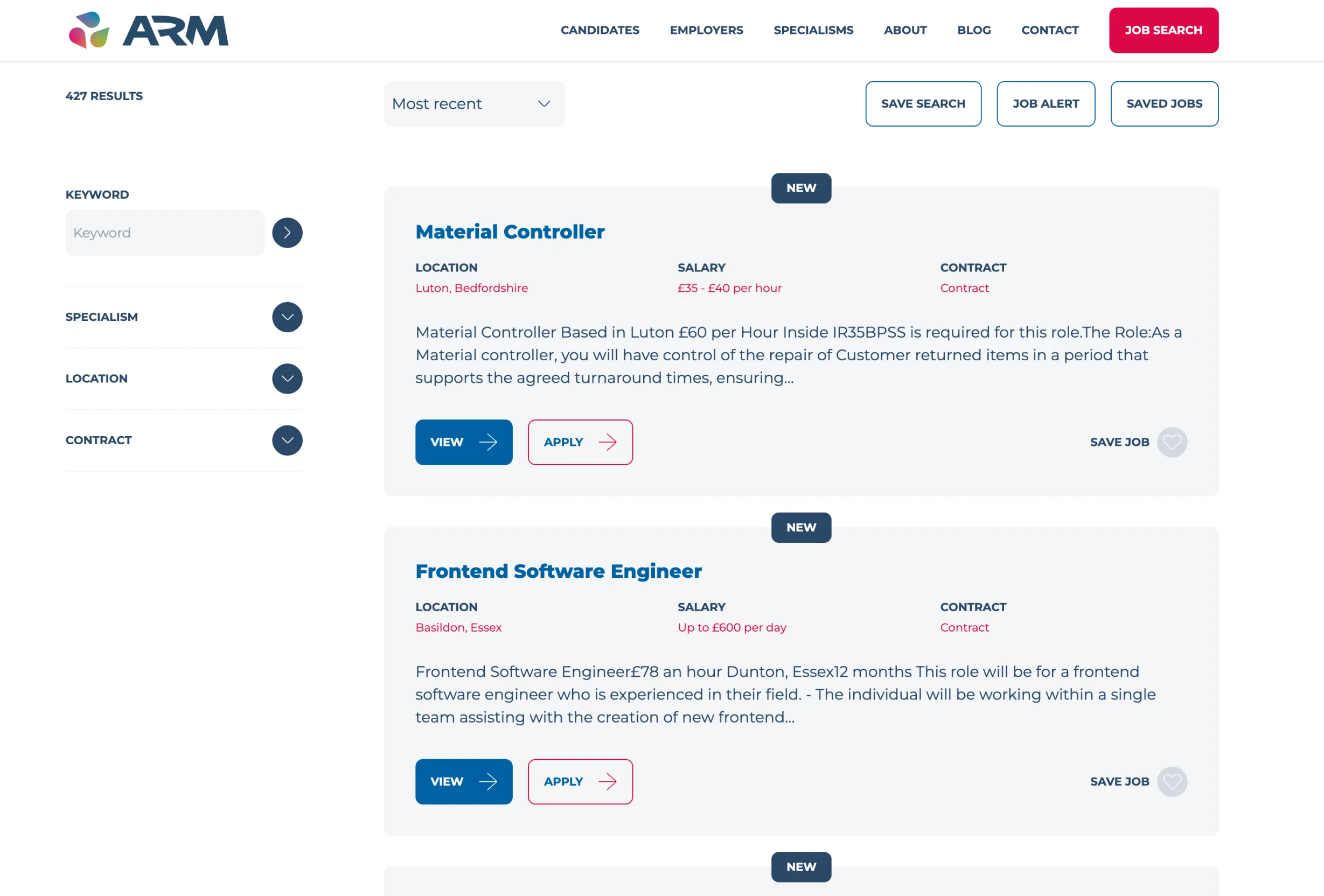
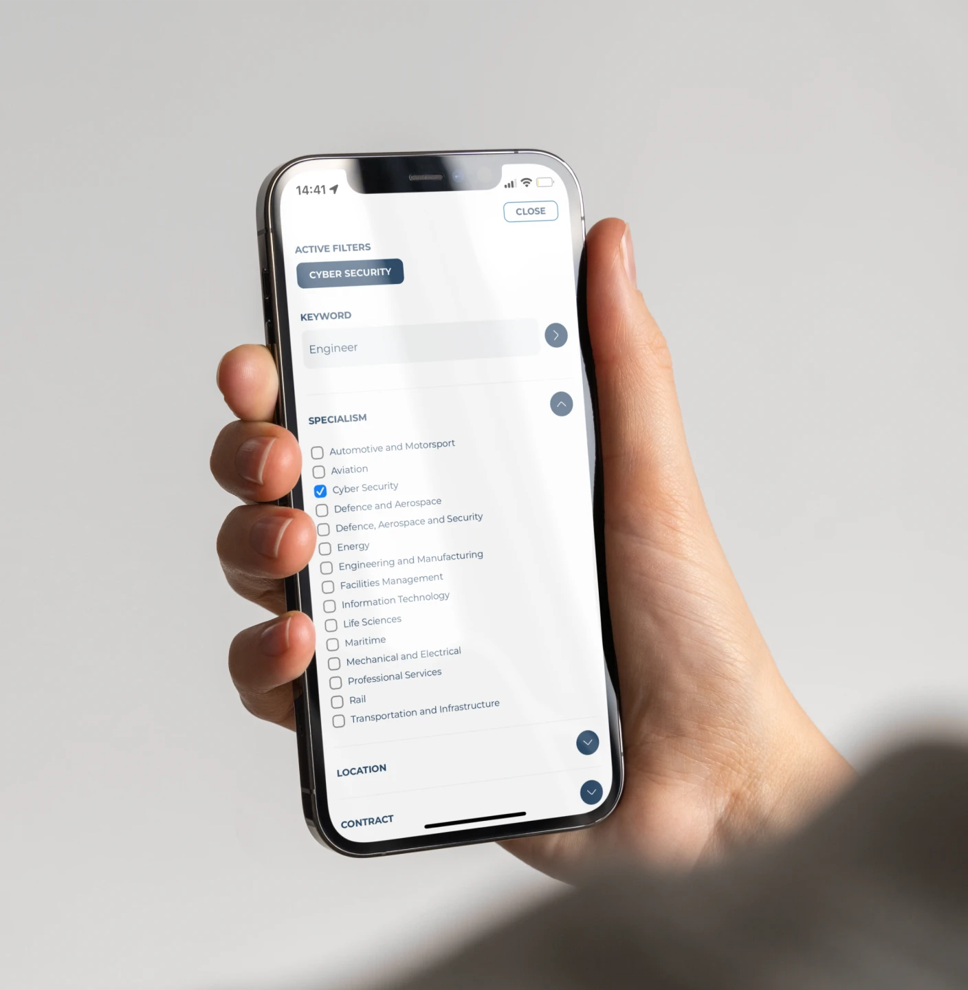
The job search features intuitive filtering, allowing applicants to filter by fields such as location, sector and contract type.
With a dedicated account, the website allows candidates to save jobs, review application status and create alerts for relevant roles via their own dashboard.
Using Gutenberg, we delivered a flexible, modular CMS, giving ARM Recruitment the tools they needed to build the site out using custom components, with full control of the content management system.
Previously the website was separate from all other tech platforms. The new site is now part of ARM Recruitment's digital ecosystem including an integration with Broadbean, allowing seamless connectivity between the job board and website.
The site is also integrated with an intelligent CV scanning system, Daxtra, this includes email integration with functionality that scans applications to pull in pre-defined candidate data.
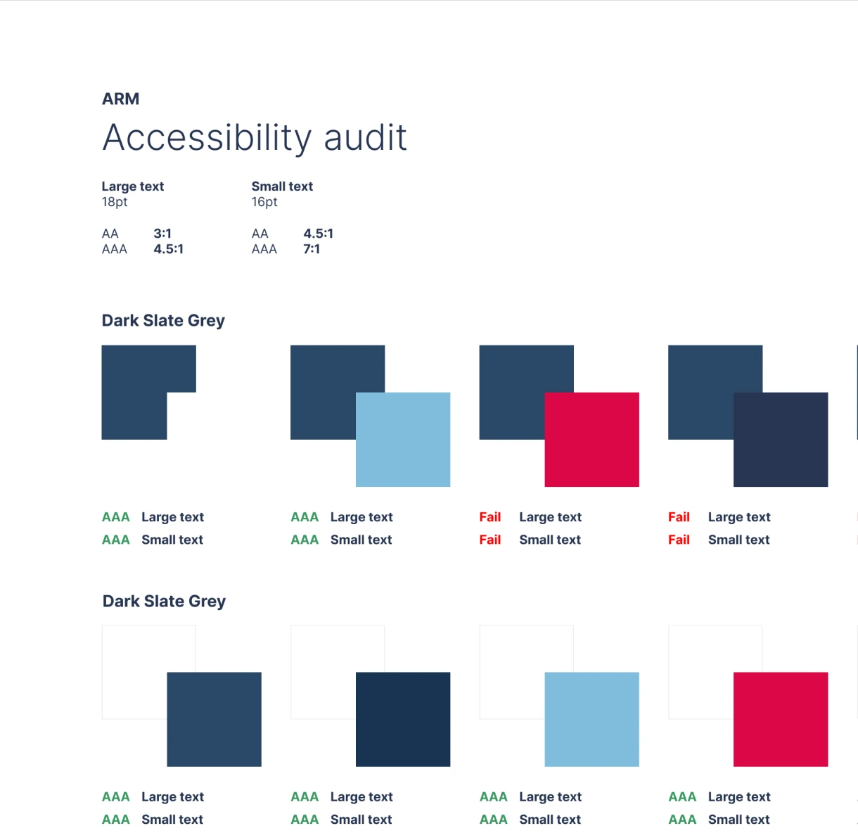
The account section was thoroughly tested on a 3G connection to ensure the website was accessible in remote locations or at sea. Finally, working with a predefined brand colour palette, we were mindful of how we used these colours in the design in order to meet accessibility standards in order to meet the minimum AA standard of accessibility, as per the WCAG guidelines.
“Salad’s website design is great, we have had many compliments since the launch. Our friendly and supportive team, namely Head of Delivery, Nicole Cook and Head of Development, Matt Leach are a testament to Salad’s wider team.”
