Positioning Ikano as thought-leaders in the CRM & customer loyalty sector

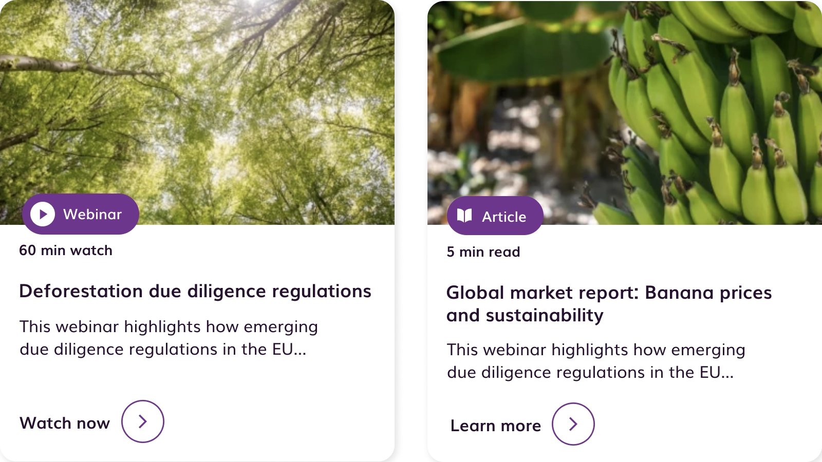
Evidensia is a digital platform sharing credible sustainability research to help businesses build sustainable supply chains, and helps governments and policy-makers inform policies. For sustainability practitioners it has become a trusted source for evidence that can be used to design and continuously improve sustainability tools and initiatives.
Founded by the ISEAL alliance, Rainforest Alliance and the World Wildlife Fund, the project allows users to search for studies from across the world, categorised in various ways – by country or region, sector or product, sustainability issues, and by approaches and tools.
Following a period of growth, Evidensia commissioned us to take over the support and maintenance of their website and implement a programme of work to help bring the evidence to life and improve the user journeys across the site.
As we didn’t build the first iteration of the Evidensia website, it was vitally important that we spent enough time onboarding ourselves on the platform. We’re always keen to keep downtime to a minimum, so the extended onboarding helped us to identify some quick wins in development we could implement once we started work.
We began by stabilising the website and improving technical performance, rolling out updates which were already part of the roadmap and ensuring that the tools continued to be available for users.
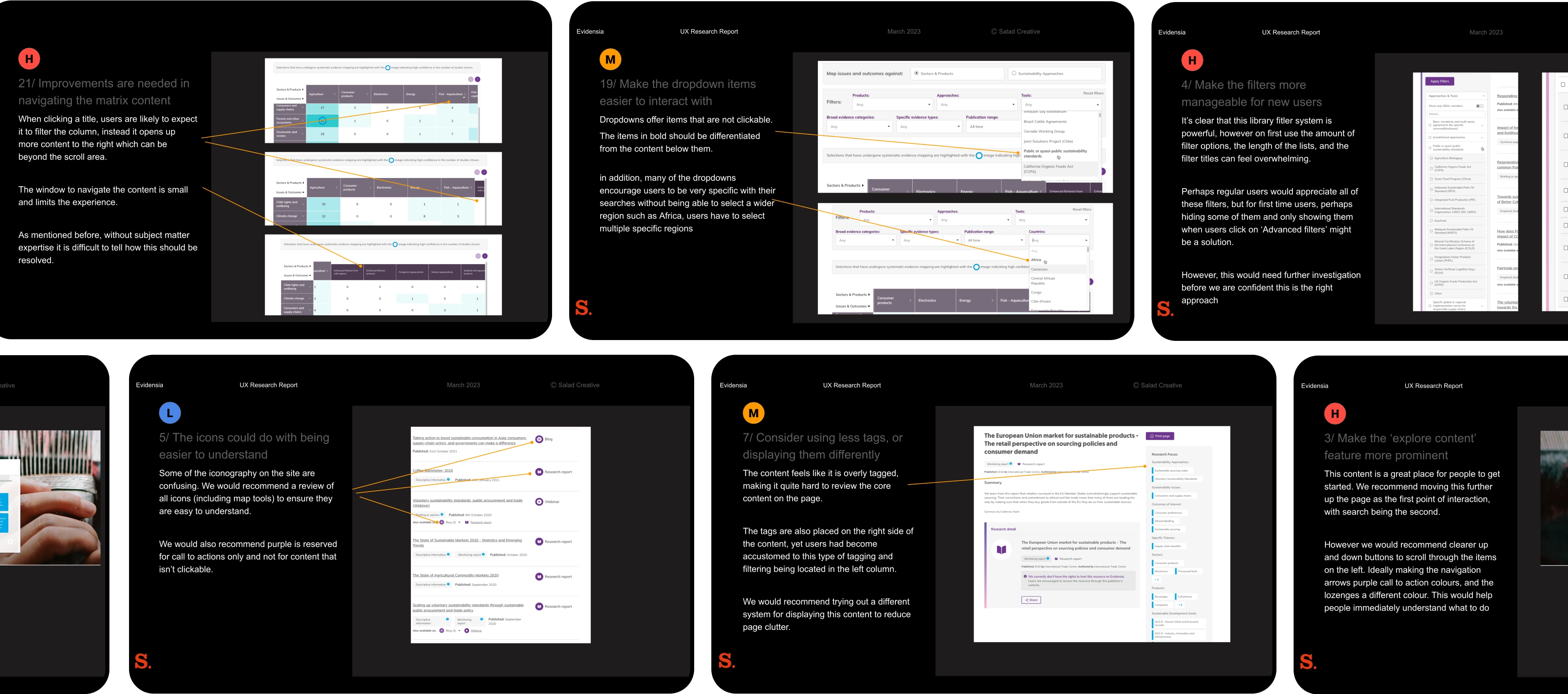
Following this initial period of getting under the hood of the site, we needed to audit the user experience of the site and find ways to improve the user journeys using evidence-based, not opinion-based user research.
The UX research, and accompanying report, identified the main pain points for users and allowed us to plan work systematically, prioritising the issues identified in user interviews.
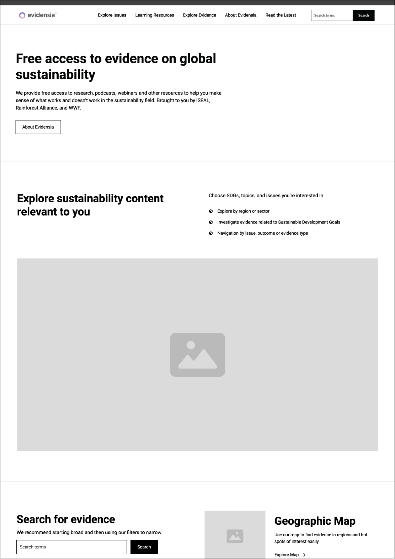
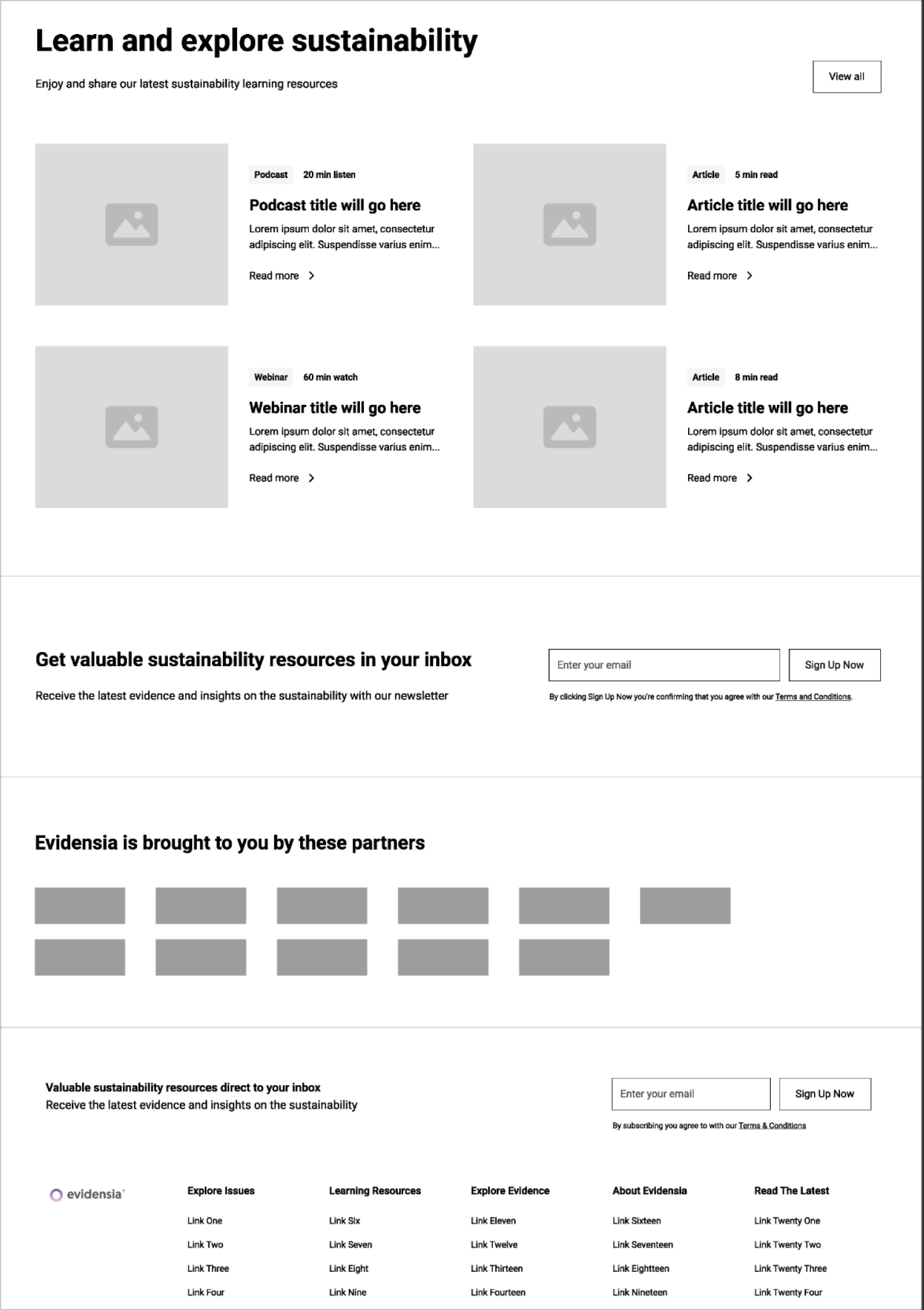


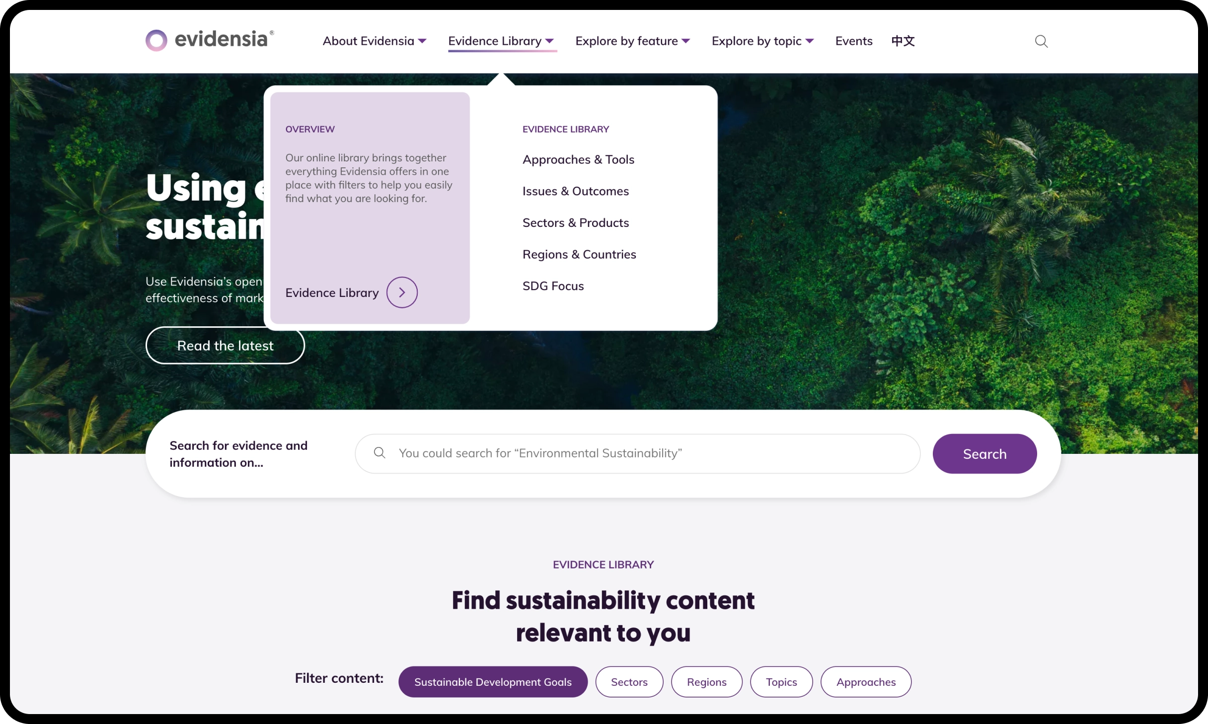
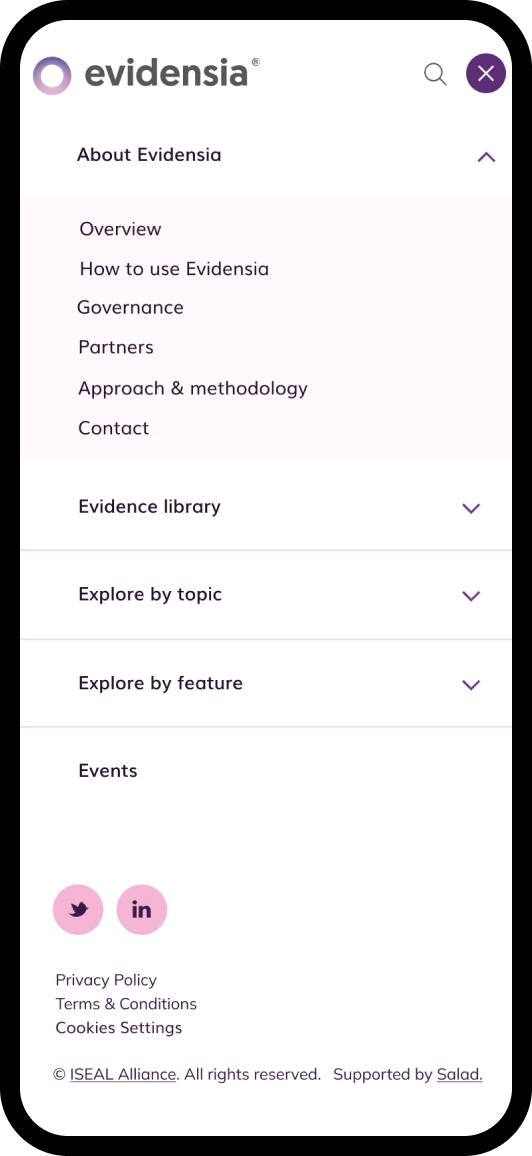
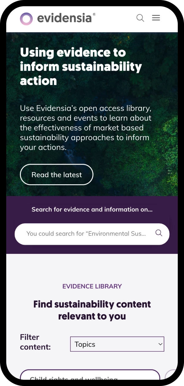
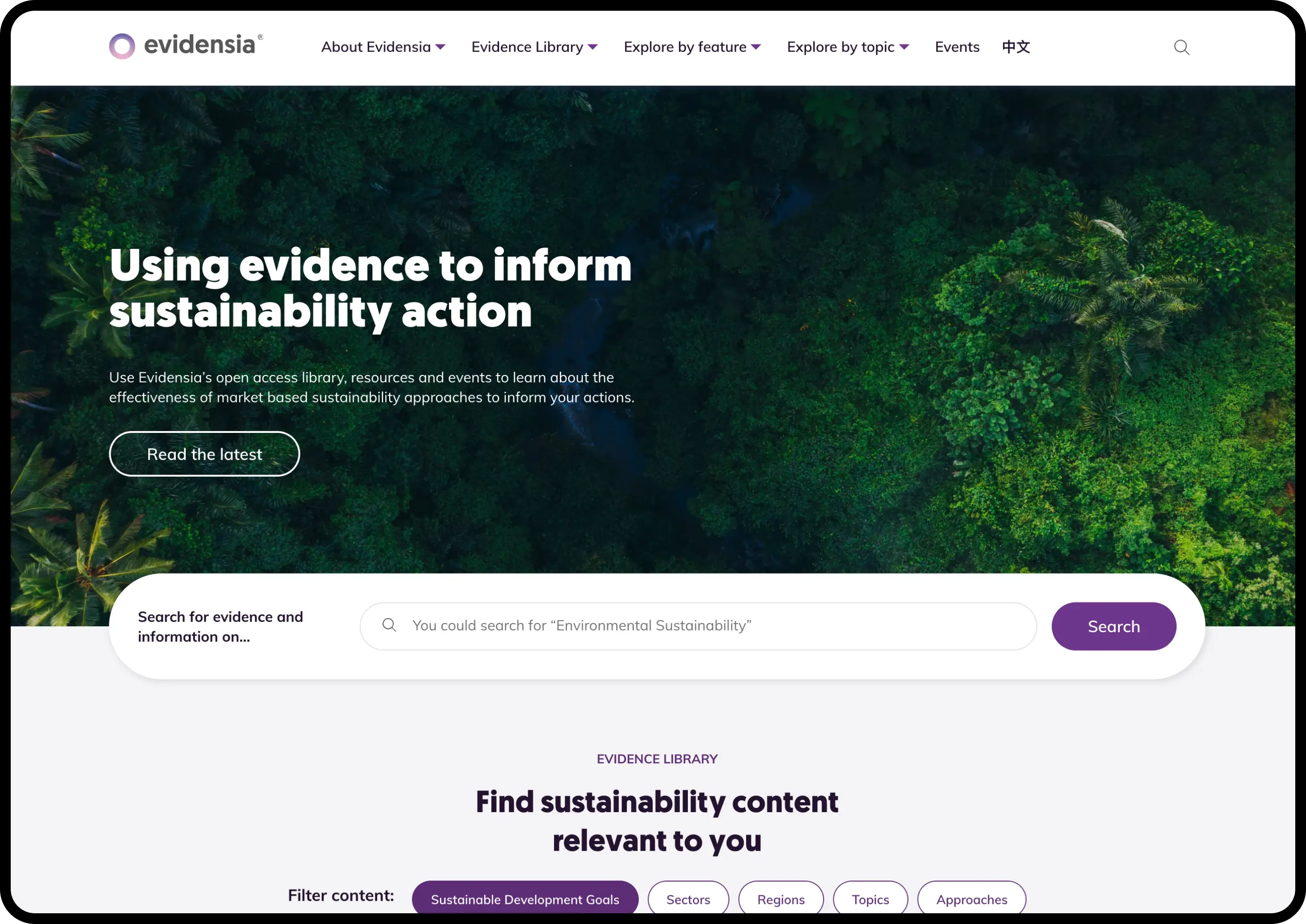
We clarified Evidensia’s value proposition, made significant changes to the content hierarchy of the homepage and redesigned the navigation of the site to give users a clearer place to start their research journey.
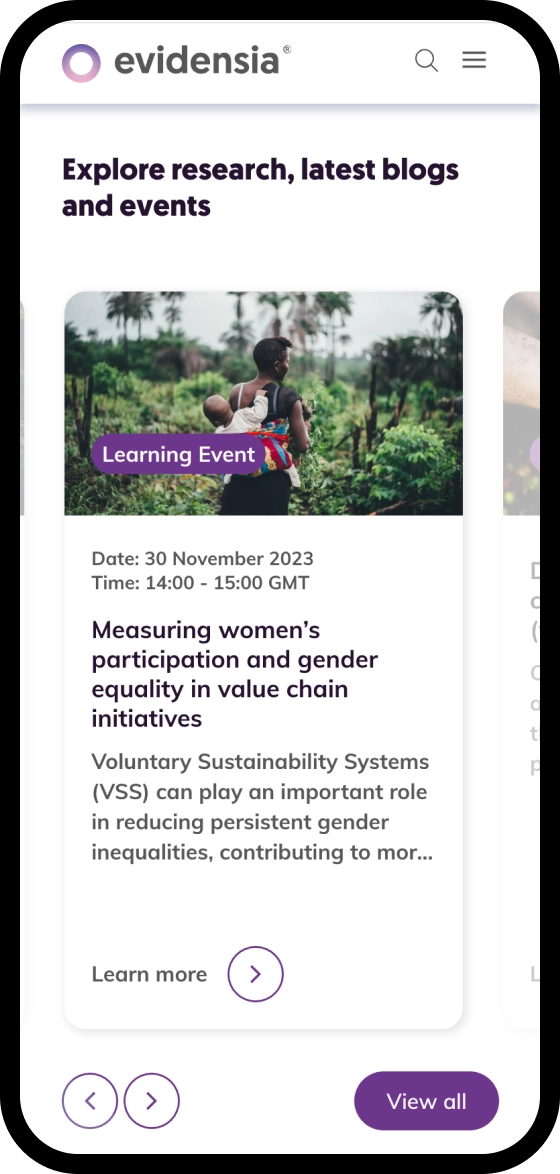
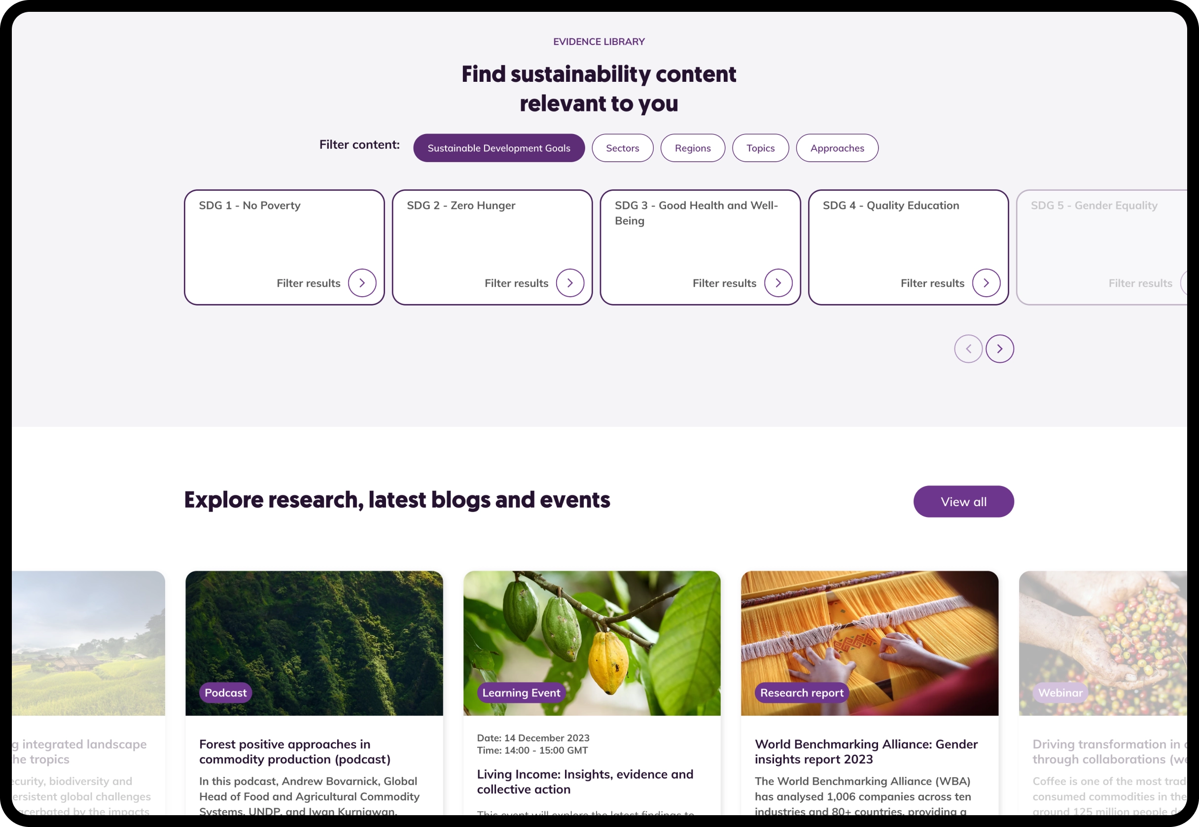
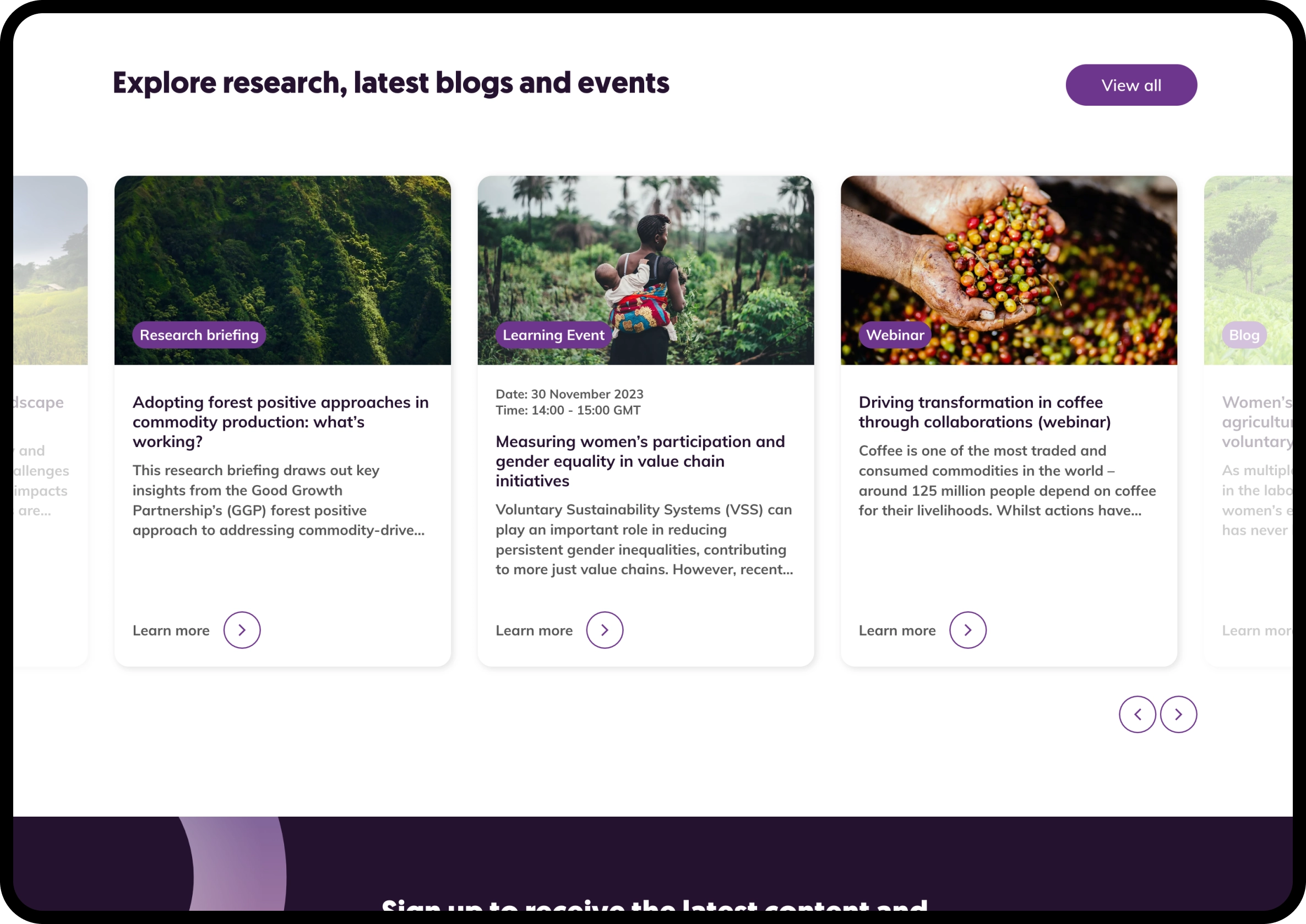
Other changes to the homepage presented more research to users earlier in their journey, to help minimise the time between landing on the site and engaging with content and make the user experience as seamless as possible.
We identified a need for clearer direction on where new users should start their journeys, and helping to solve this initial problem was key. The speed at which users can now interact with content has increased, and this simplified approach allows users to immediately interact with category filters and find relevant content quickly and conveniently.
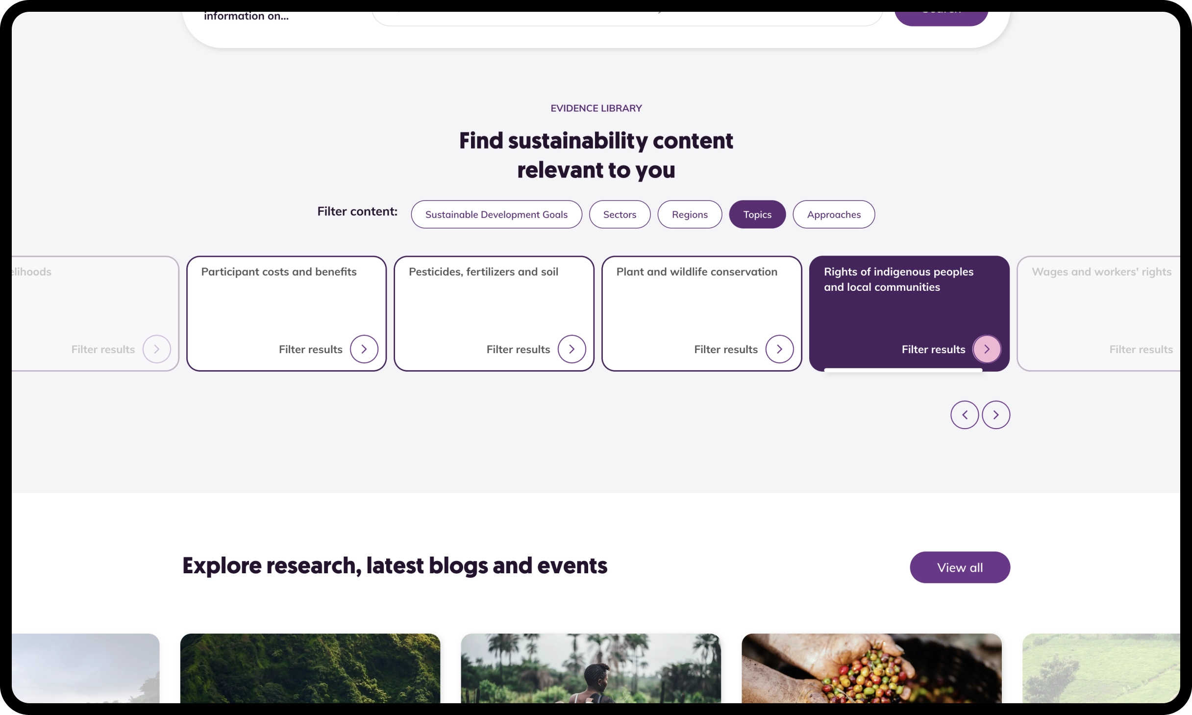
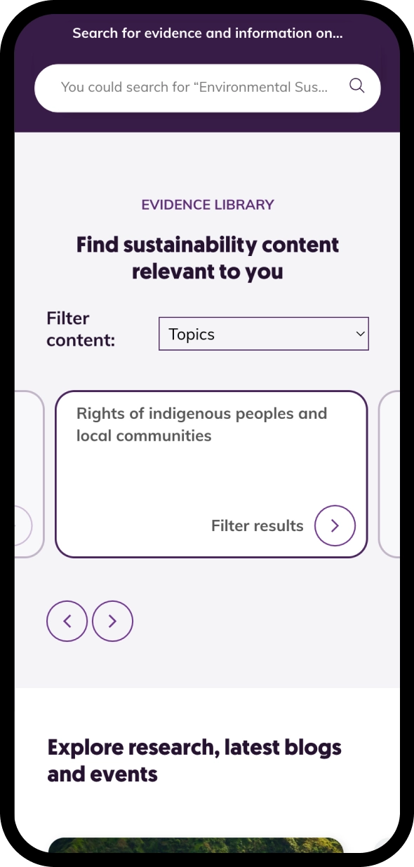
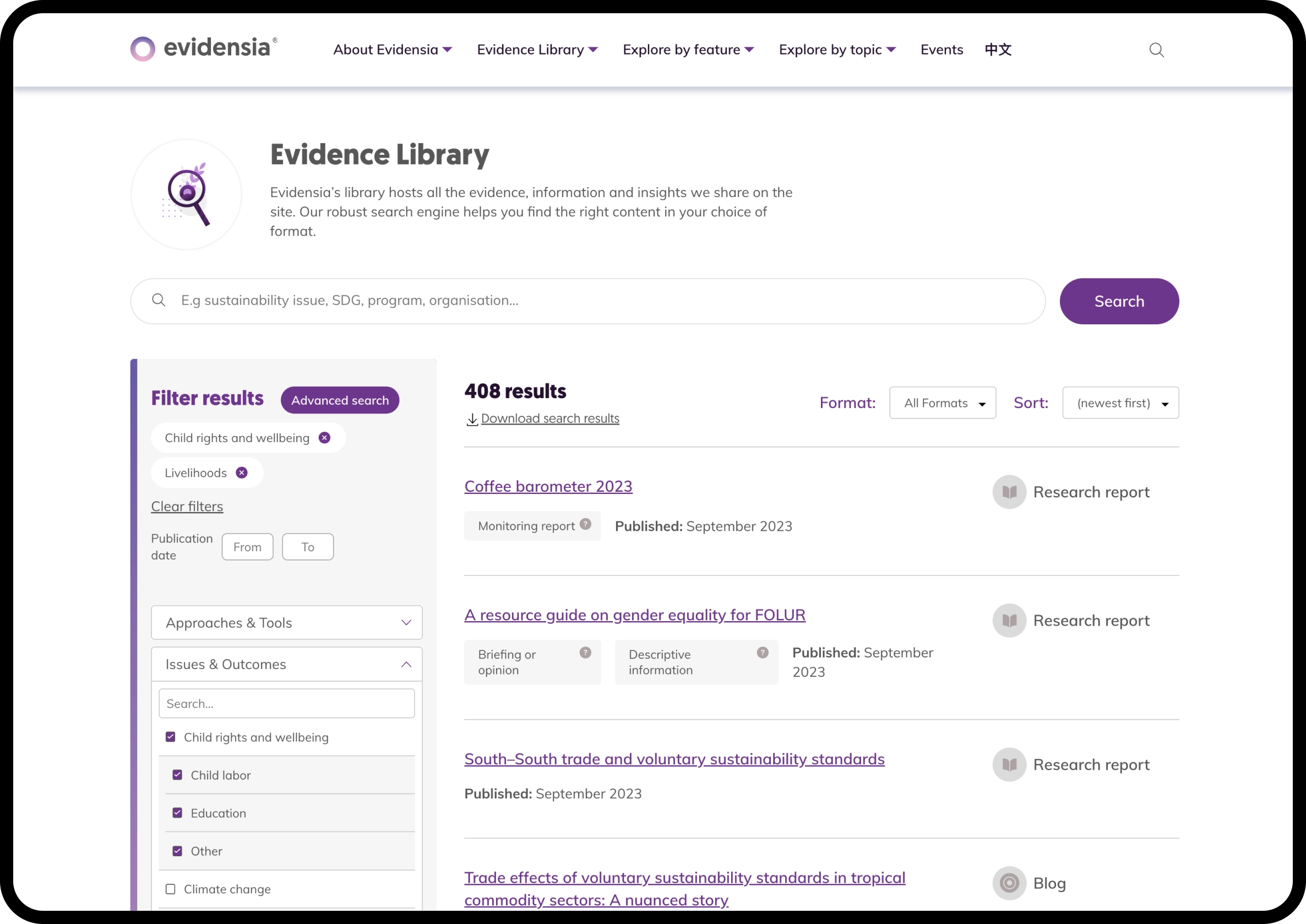
The Evidence Library is a key component of the site, allowing users to quickly find relevant content using various filters. In its previous form, there were an overwhelming number of options to filter content, which led to overly narrow searches and often left users struggling to re-broaden the search without clearing filters first.
We designed and implemented a simpler filtering system which allows users to search more easily through content and find research more specific to their requirements, with options to narrow their search if they need to.
We also improved the page structure and styling so key information and interaction points are more prominent, and ultimately easier for users to find.
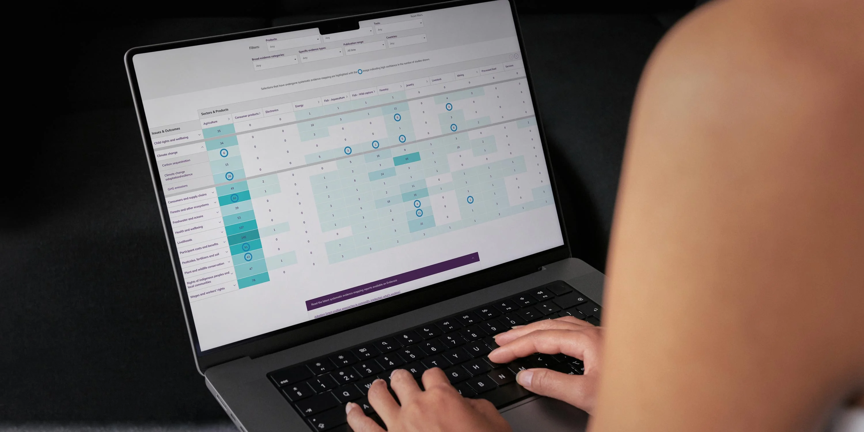
Participants in our research were excited by the Knowledge Matrix, which categorises all available research by sectors, products, issues, outcomes and approaches of interest. However, the research exposed some usability issues which caused friction when trying to read the tabular data.
Making changes to the colour coding, setting a default high-level view for the content and increasing to full width have all contributed to a smoother user experience and higher engagement across content on the site.
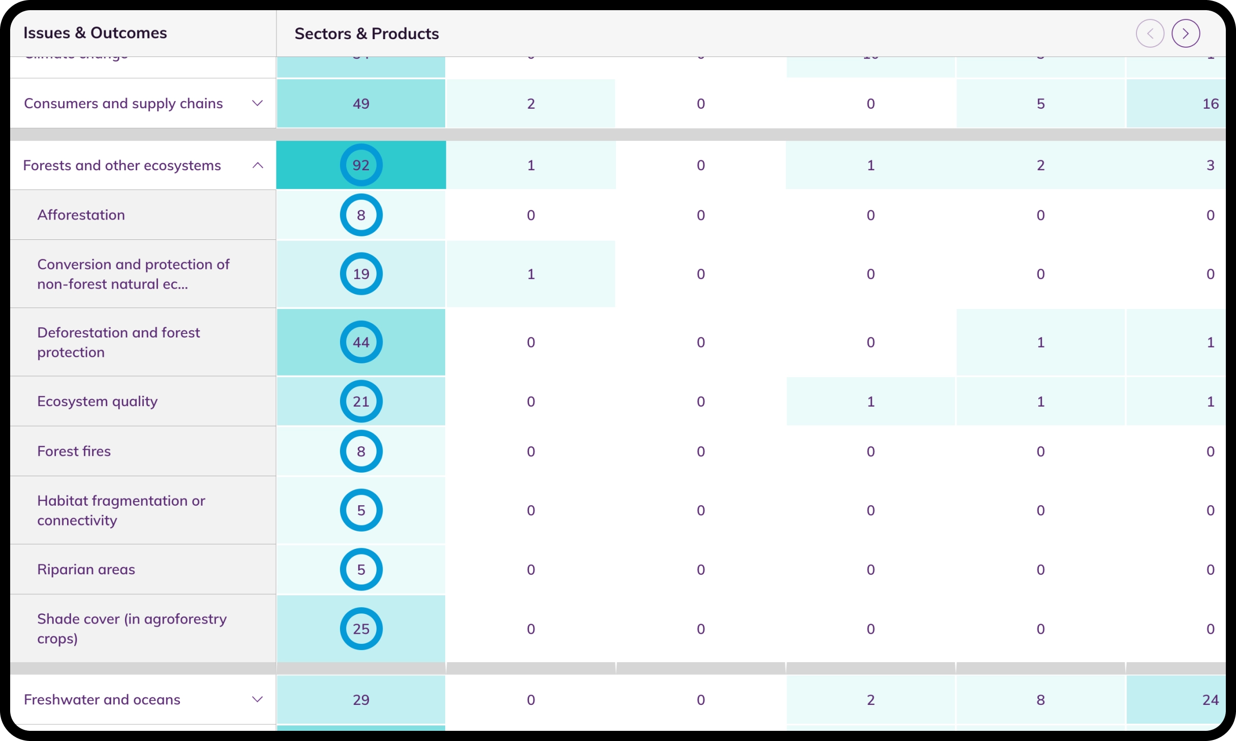
Since our initial work, we’ve helped the team at Evidensia improve the user experience of other tools used on the site and, where possible, we’ve been able to make decisions based on evidence, rather than opinion.
From improvements to the Geographic Map, which plots research across the world, to planning account-based log-ins for future users and launching a Chinese language version of the site we continue to support the team to make the tools available more user-friendly.
