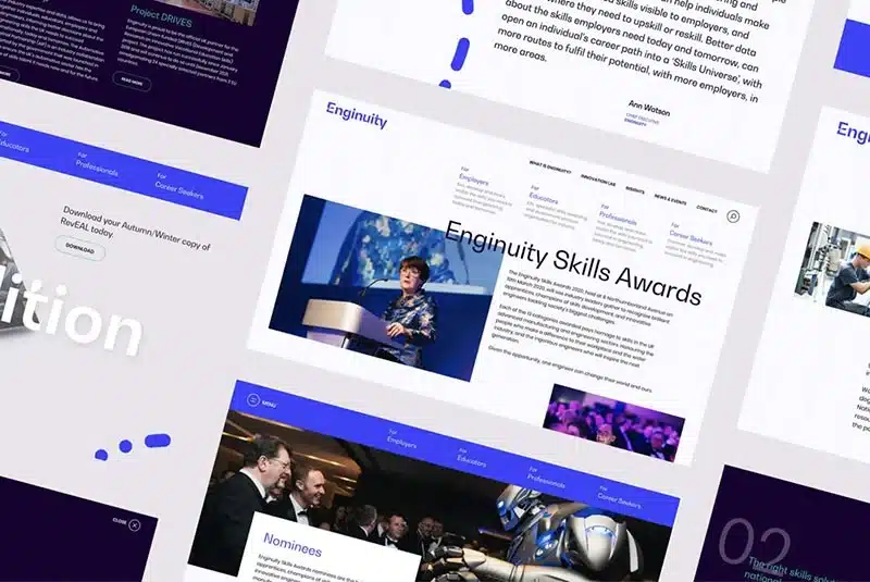
Work Enginuity
Re-engineering & rebranding a skills organisation from the ground up
View case study
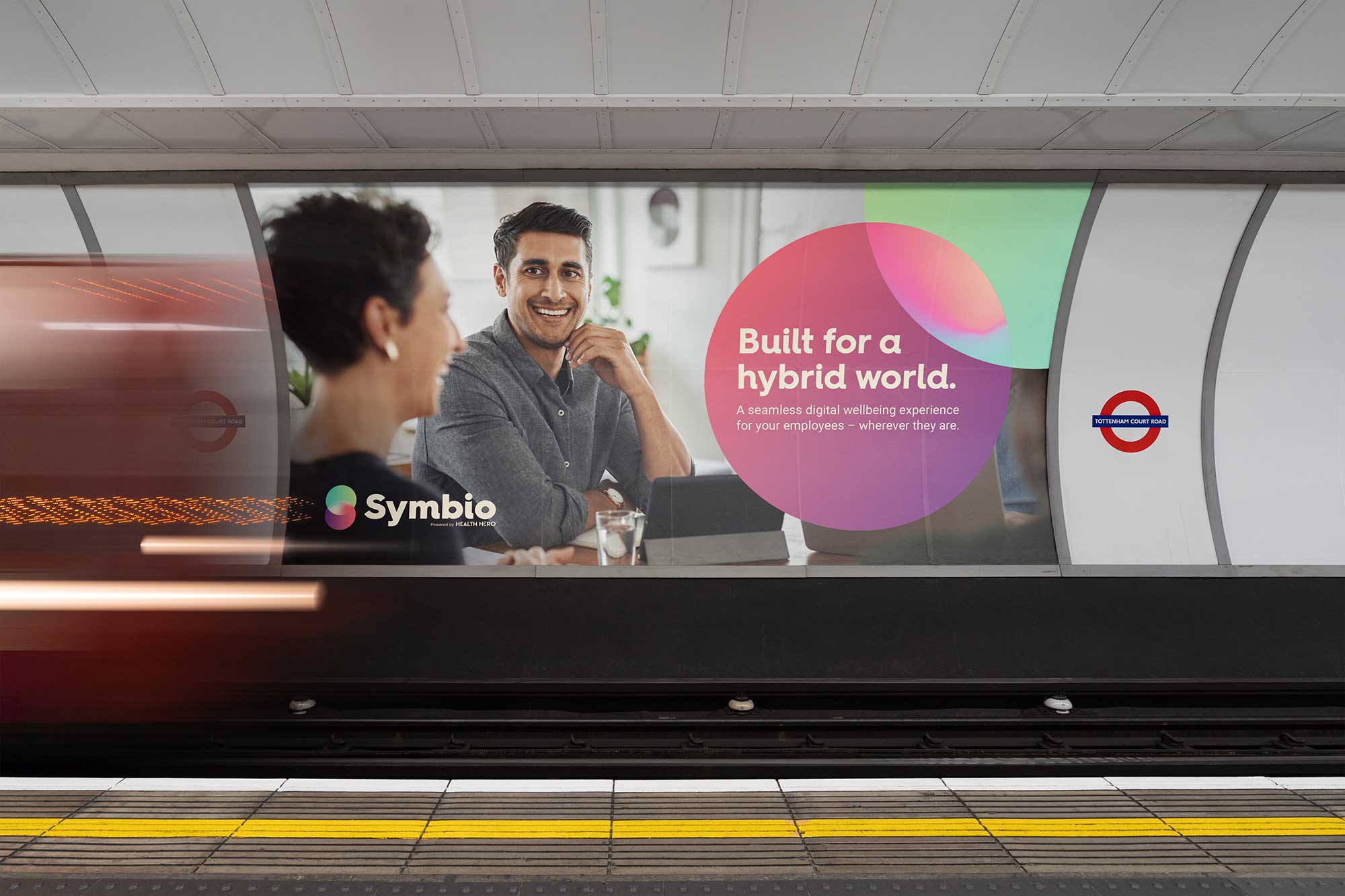
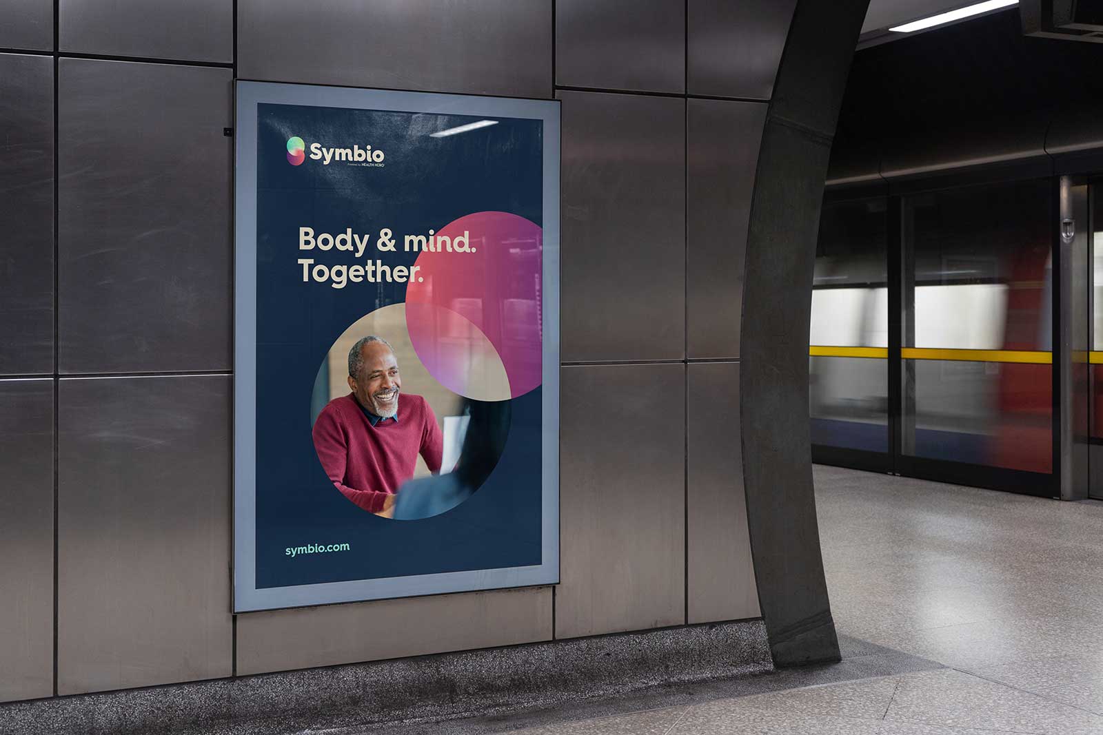
Powered by Health Hero, Symbio has its sights on becoming “the global market’s most engaging and holistic employee wellbeing platform, helping progressive organisations to understand, manage and enhance the mental and physical wellness of their people – within, and beyond, the workplace.”
Its mission, “Reimagining wellbeing”, aims to satisfy existing demands from wellbeing programmes within the workplace in three ways:
We were asked to help build the brand, create the name and visual identity, shape the personality and tone of voice for the app’s chatbot and provide guidance to the in-house marketing and development teams managing the roll-out.
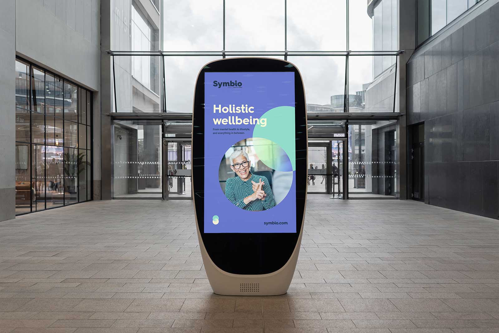
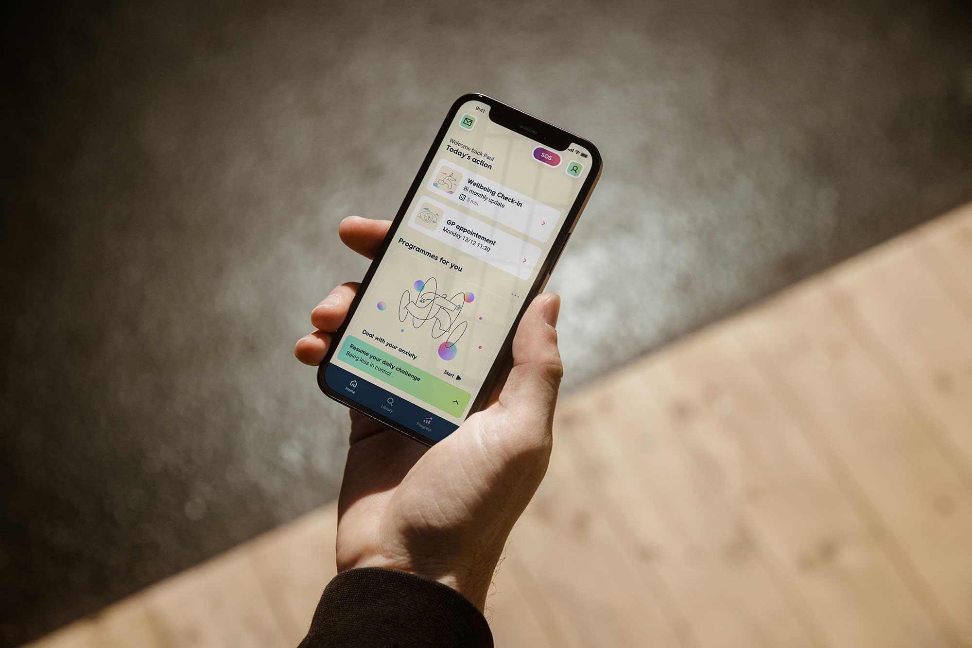
The core essence of Symbio is its holistic approach to wellbeing. Not just covering mental health, Symbio aims to provide a mechanism to measure and enhance wellbeing and performance in one streamlined, intuitive digital experience.
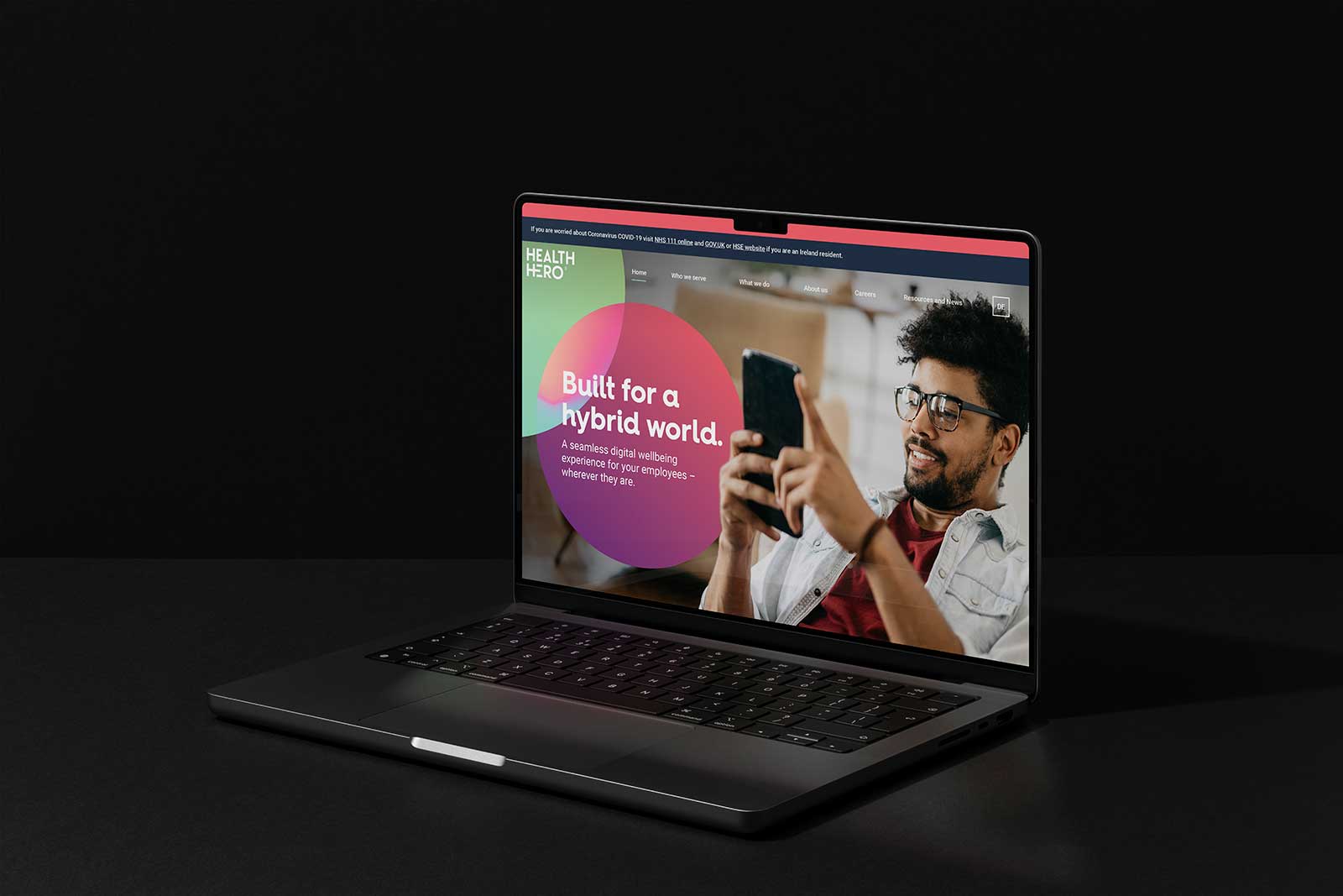
We delivered a considered strategy that clearly linked the app back to its creator, the leading virtual healthcare provider, Health Hero. Cascading the vision and values from the master brand into the app brand allowed us to focus on mission, personality and tone of voice.
From the mission, a group of opportunities under the banner “Re-imagining wellbeing” explain the potential of the programme and help guide the marketing and development teams along the way:

One source for all wellbeing, covering multiple specialisms; mental, physical and social to provide the right data to make informed decisions.

Encouraging participation and disclosure to create and sustain an appetite for positive change.


Providing a dependable source of carefully curated, personalised educational content and associated clinical expertise to help stimulate workplace culture.
“Powered by Health Hero, extending beyond corporate values into characteristics, and applying a consistent content tone by highlighting behaviours.”
We defined a set of key characteristics that help to humanise the app and created a specific set of values from which we never deviate, and which resonate for both the audience and the main organisation: holistic, proactive & qualified.
We used these characteristics to bind behaviours to the brand: collaborative, inquisitive and informative. And from those behaviours, we created archetypal combinations: caregiving, wisdom, and belonging.
In turn, these characteristics, behaviours and archetypes led to the development of a necessarily specific set of principles for the tone of voice, from which we rewrote much of the app’s content.
Once the core attributes of the brand has been established, with the positioning strategy determined and with a clear definition of the target market and competition, we had much of the raw material to begin the process of naming.
A process of reduction followed until we had a short list which we tested with a representative sample of potential users. Given HealthHero’s European coverage, we ensured that any names we might choose were sense-checked not only in English but also French, Italian, German and Spanish.
We tested names built from a variety of sources, from Latin and Greek root words to world mythology, we shortened conceptual themes, smashed words together and created acronyms.
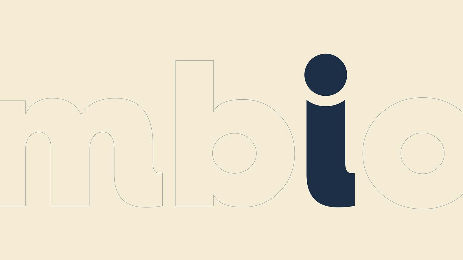
The final choice, “Symbio”, was created by combining the words ‘sym’, a variation on ‘synchrony’ to capture a sense of unity, and ‘bio’ which gives a sense of the entirety of our living being.
Given the meaning of the name and the brand’s core essence of mind and body working together, the brief for the visual identity had some clear direction baked in from the outset – an indication of the logical flow from brand substance and essence, through naming and into the visual codes that we developed.


Intricately interlinked and in constant communication.
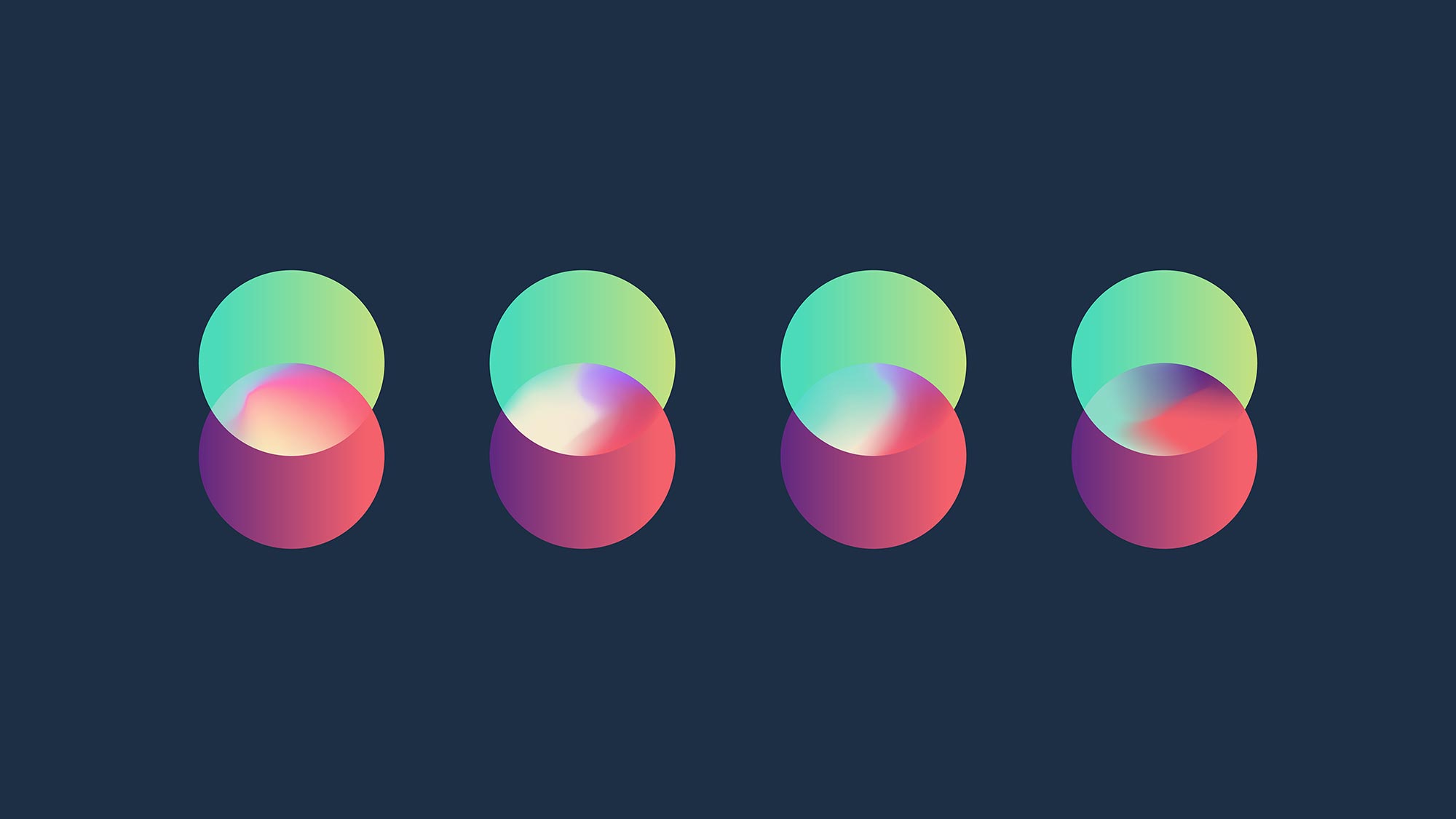
Symbio’s identity is based on the holistic concept of the mind and body working together, intrinsically linked and in constant communication:
“The brain and peripheral nervous system, endocrine and immune systems, and indeed all the organs of our body and all the emotional responses we have, share a common chemical language and are constantly communicating with one another.”

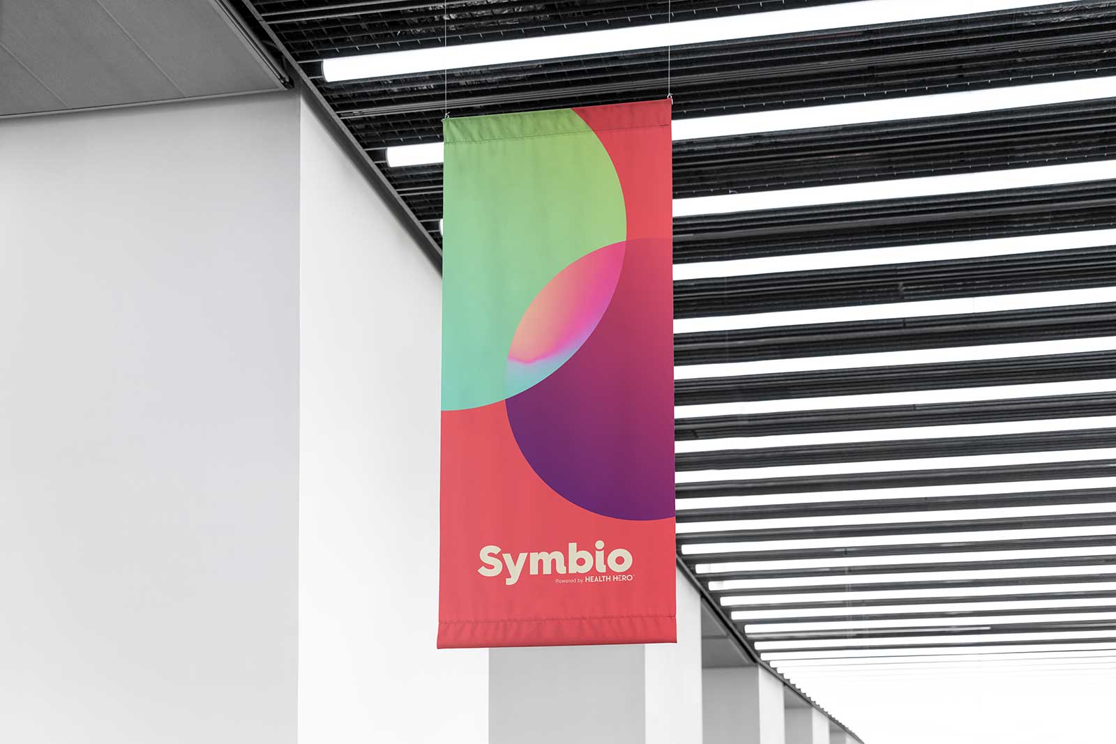
Using two conjoined circles, to represent mind and body coming together, the focus of the mark is found in the shape created where they overlap. This convergence is a whirlpool of colour, animated to illustrate the dynamic nature of communication between body and mind, an intrinsic link defined by a shared chemical language. Used as a brand extension, the logo creates a mask for imagery and a background field for titles and other text.
Typographically, the brand is simple. To inject some personality before users had seen illustration or imagery, we used a bold, full bodied sans-serif. We made some subtle changes to spacing, and one more noticeable adjustment to create a smile between the stem and tittle of the ‘i’. Functional ease of reading on all devices is provided by a typeface more suited to larger bodies of text.
A broad colour palette, rooted in the master brand and complimented by secondary colours that add depth, is capable of supporting the entirety of the UI within the Symbio app.
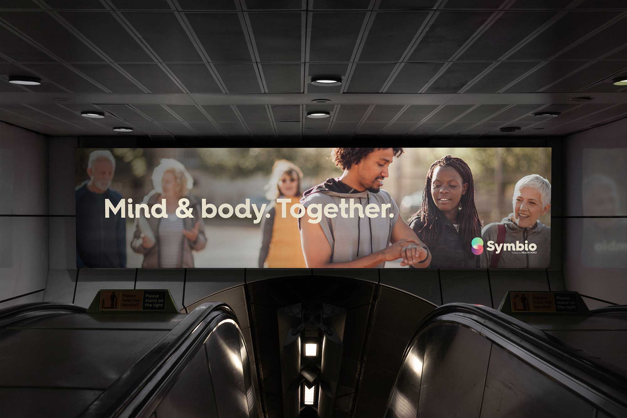
Photography is intentionally people-focused, anchoring the identity to the subject matter. Through the use of masks and overlays, we can convey a sense of positive improvement, and create depth through the diversity of age, ethnicity and gender.
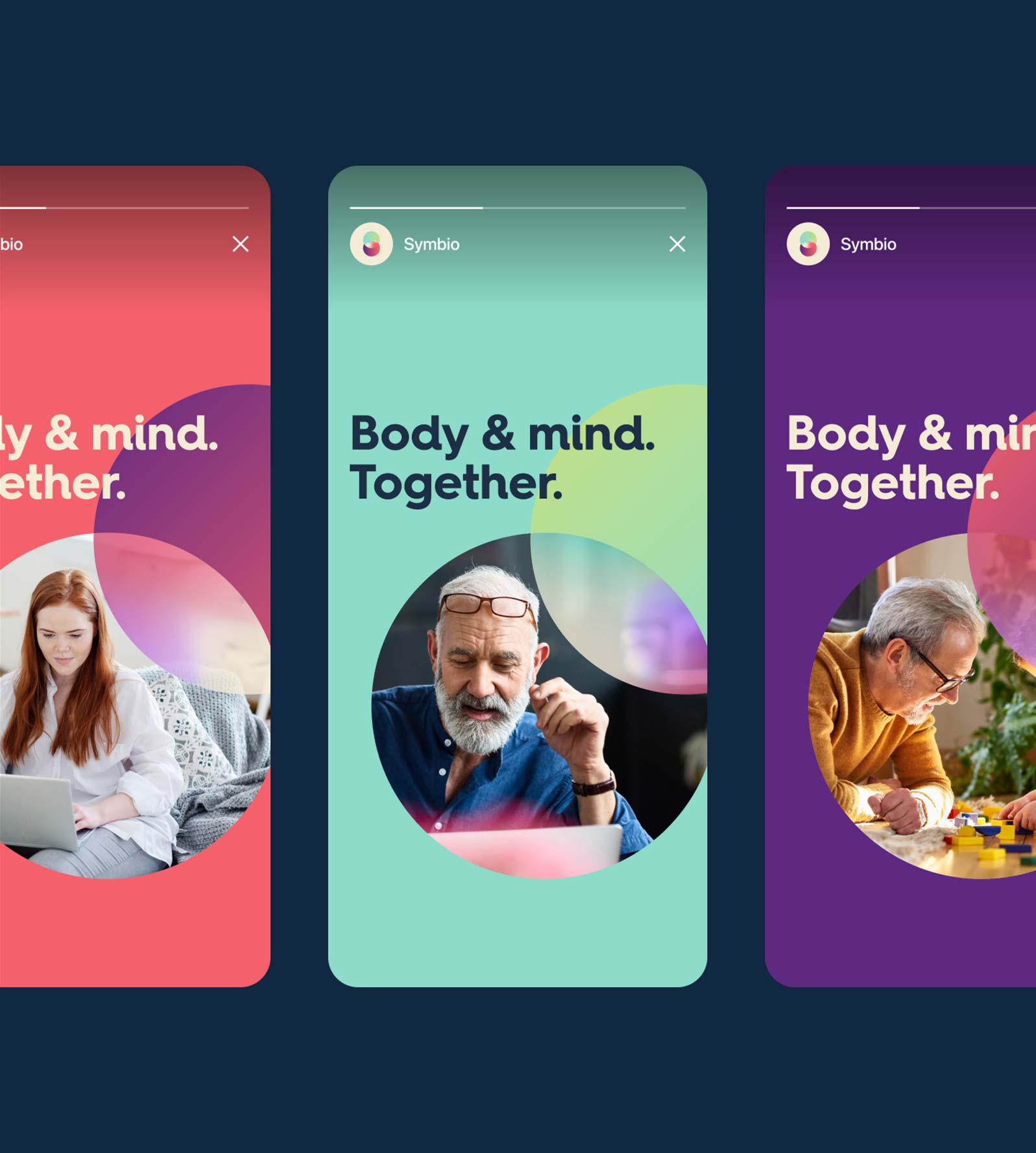
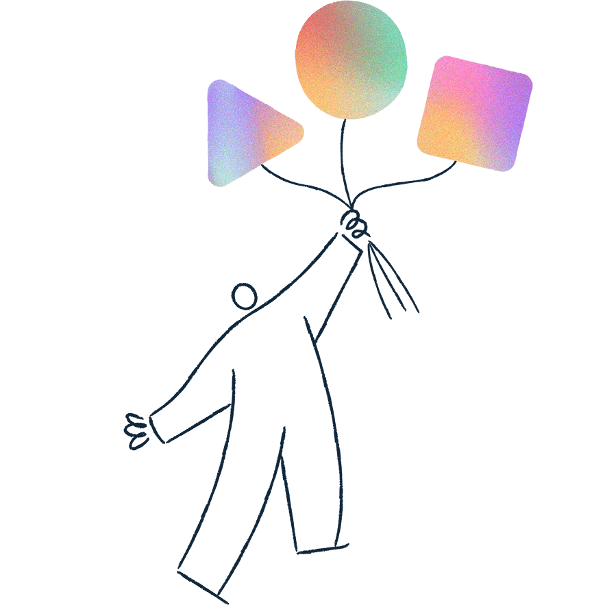
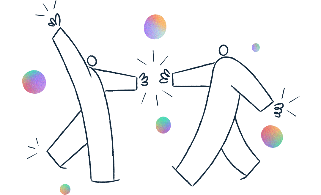
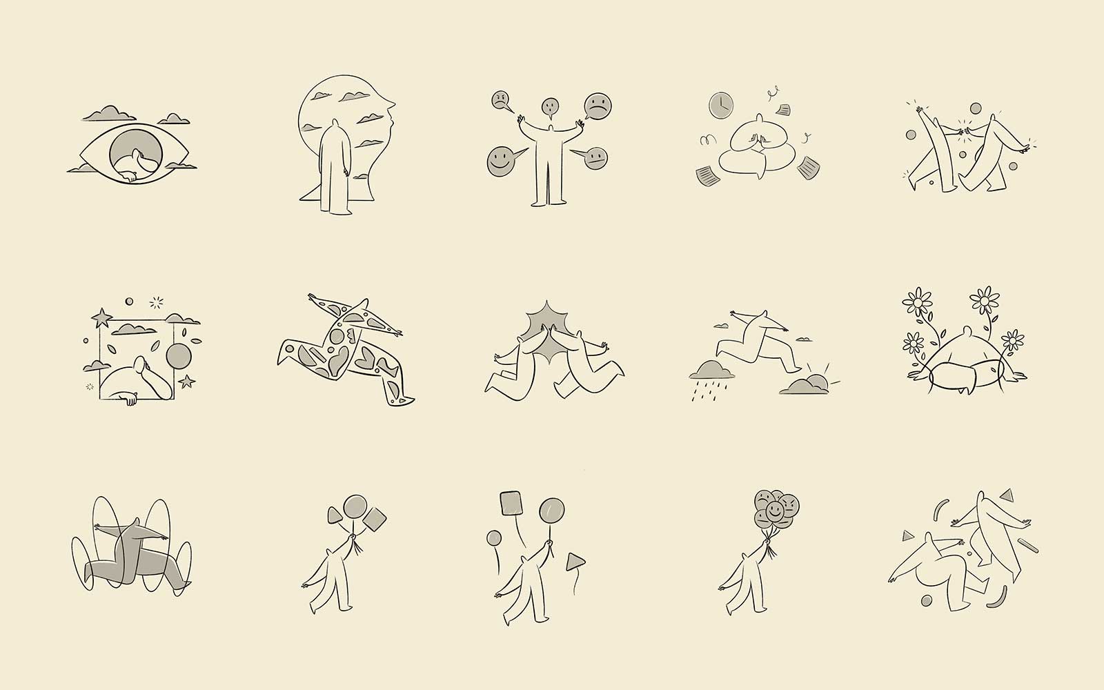
Illustration plays a huge role in the communication requirements of the brand, both in advertising and within the app itself. We helped the team at Health Hero choose a suitable illustrator and collaborated to brief and creatively direct the work. The result was a flexible suite of illustrative assets, which enabled the internal marketing and development teams to create an endless combination of characters to help support content.

“There is a really strong concept behind the proposition of Symbio – mind and body together – that cascades through into the naming and then into the identity work. It’s really tight and coherent. In fact, when we have prospective conversations, potential clients are always really excited by the proposition and intuitively get both the identity and the concept of the product.
The opportunity – and the challenge – is to continually ensure that the product evolves and consistently expresses the proposition and the identity across touchpoints, whether that’s through the UX of the product itself or in related marketing efforts.”