
Work Five Rivers
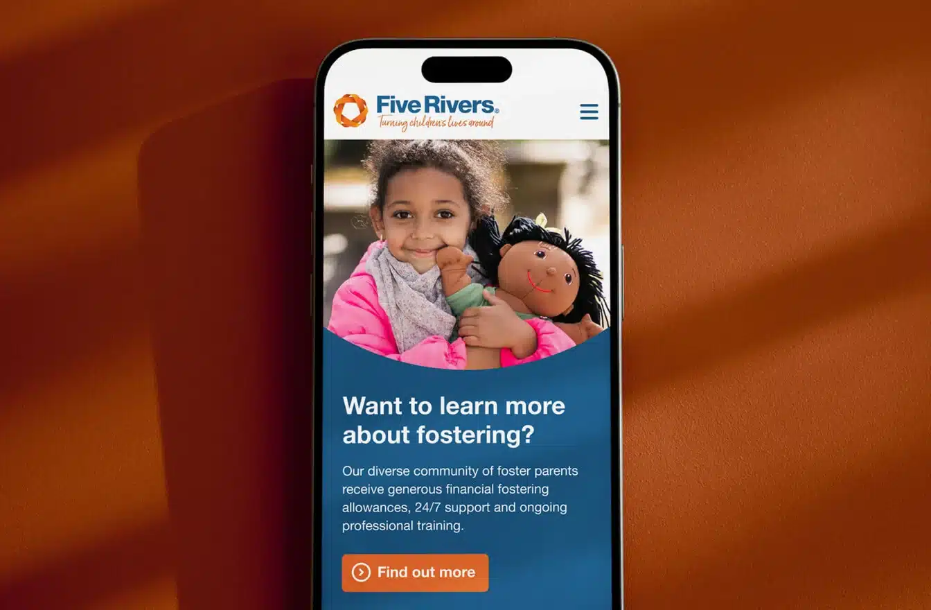
A robust and secure digital solution for one of England’s most experienced providers of children’s social care
View case study


Helped Tute build stronger partnerships by clarifying their role as a collaborator in delivering student outcomes.
Delivered a bold, flexible identity system reflective of their quality, expertise, and student-first ethos.
Transformed their website into a strategic platform, increasing visibility, control, and performance across diverse audiences.
Tute Education serves as a trusted online education partner for local authorities, schools, and non-mainstream settings. They specialise in delivering live online lessons across key stages 1–5, taught by qualified teachers, in a custom online environment.
Despite their robust platform and proven impact, Tute’s brand, visual identity and digital presence did not fully encapsulate their evolution from an online teaching provider to a comprehensive education partner.
Their website was functional yet lacked the strategic depth to convey their collaborative approach and commitment to student-centric education. Tute aspired to be recognised as the first-choice online teaching partner, reflecting their ethos of flexibility, partnership and unwavering focus on student outcomes.

Tute had already done much of the foundational thinking. They knew why they existed and they had absolute clarity about their role in the education ecosystem: filling the critical gaps that traditional education provision simply can’t address.
Our role was to help Tute articulate their purpose in a way that would resonate with the right audiences and differentiate them in a competitive sector.
Through a collaborative process we distilled Tute’s positioning into a single, powerful narrative. More than an online learning provider, they are a partner, working alongside schools, local authorities, and non-mainstream settings to deliver flexible, scalable education that meets the needs of every student. They offer partnership, not just provision.
At the heart of Tute’s brand strategy are three core principles. These were not new ideas, but they had never been expressed in a way that united the organisation’s internal clarity with its external communications. By defining and formalising these principles, we established a framework that could underpin everything Tute says and does and help ensure consistency, alignment, and authenticity at every touchpoint.
Tute acts as an extension of their partners’ teams, sharing goals and accountability for student outcomes.
Every decision is driven by improving student engagement, attainment, and reintegration.
A rigorous focus on teaching quality, safeguarding, and technology builds trust and delivers measurable outcomes.
Together, these three principles became more than just values. They became the lens through which every aspect of the brand and digital experience was designed. They ensured that Tute’s positioning as a trusted partner, dedicated to student outcomes and uncompromising on quality, was expressed consistently and clearly in everything from their elevator pitch to the smallest icon on their website.
With the strategic narrative clearly defined, it became obvious that Tute’s existing visual identity no longer served its purpose. It didn’t communicate the energy, clarity, or expertise that defined the organisation behind it.
In our early discussions, Tute made it clear they weren’t looking for a subtle refresh. They wanted a step change. A revolution, not an evolution. So, our job was to translate their strategic clarity into a bold, modern identity that would reposition them in the minds of their audiences and support their ambition to be the first-choice online education partner.
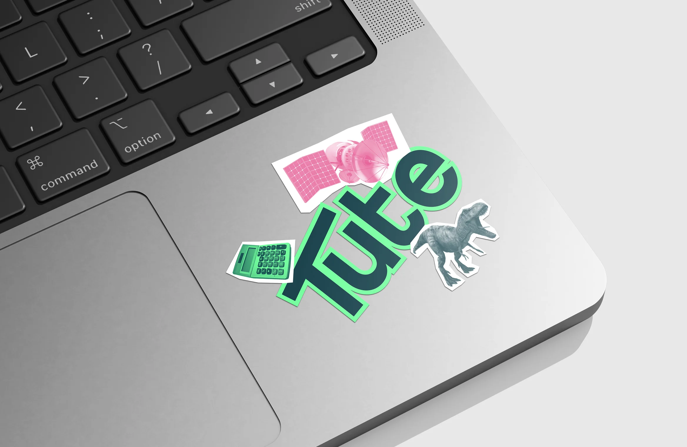
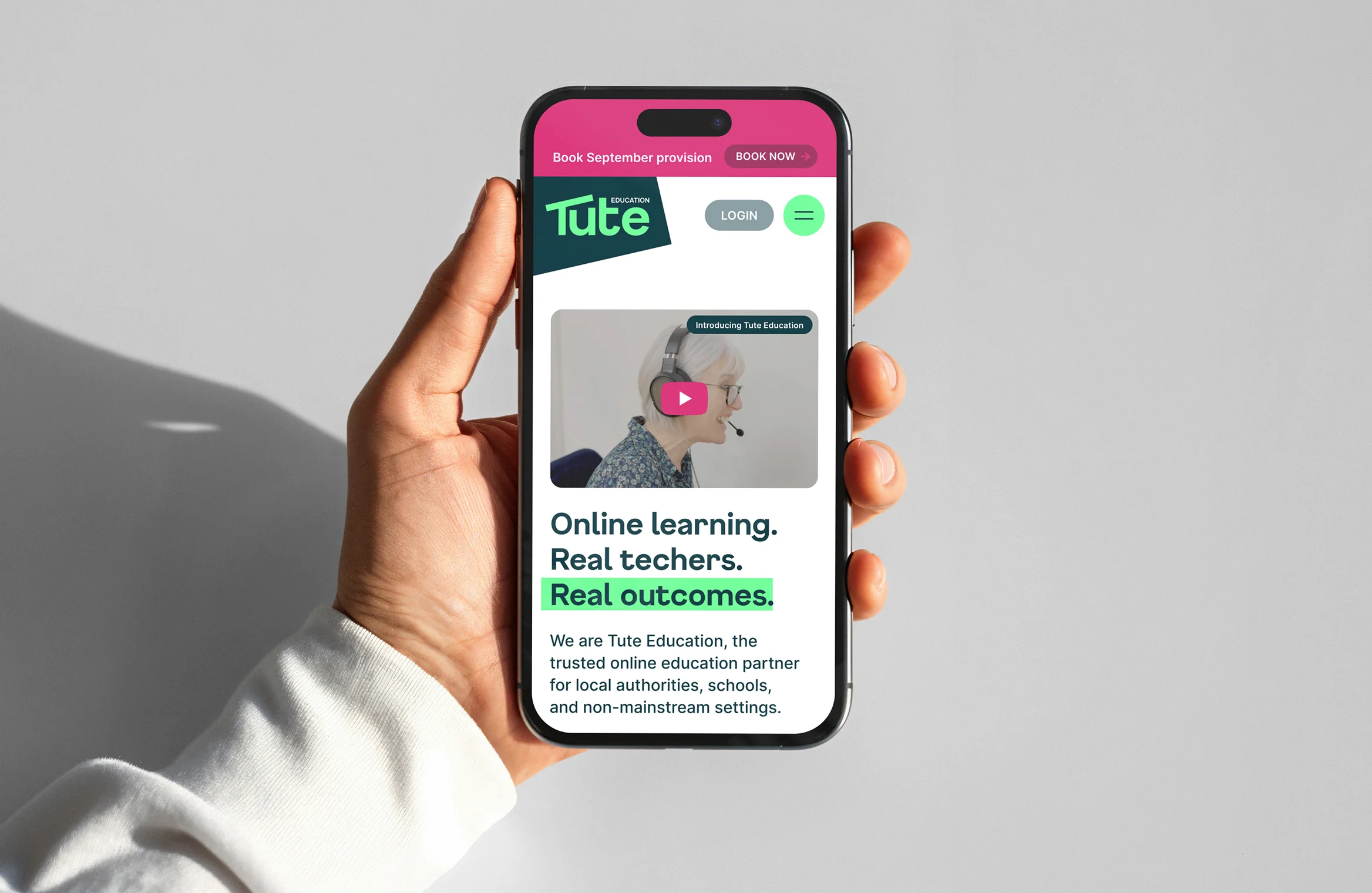
We developed a confident, future-facing identity that’s both approachable but authoritative. Friendly, without being informal, it signals that Tute is modern and dynamic, but underpinned by deep expertise and a commitment to quality.
The typographic system is clear, modern, and accessible, and Tute’s new colour palette brings energy and warmth, without compromising professionalism.
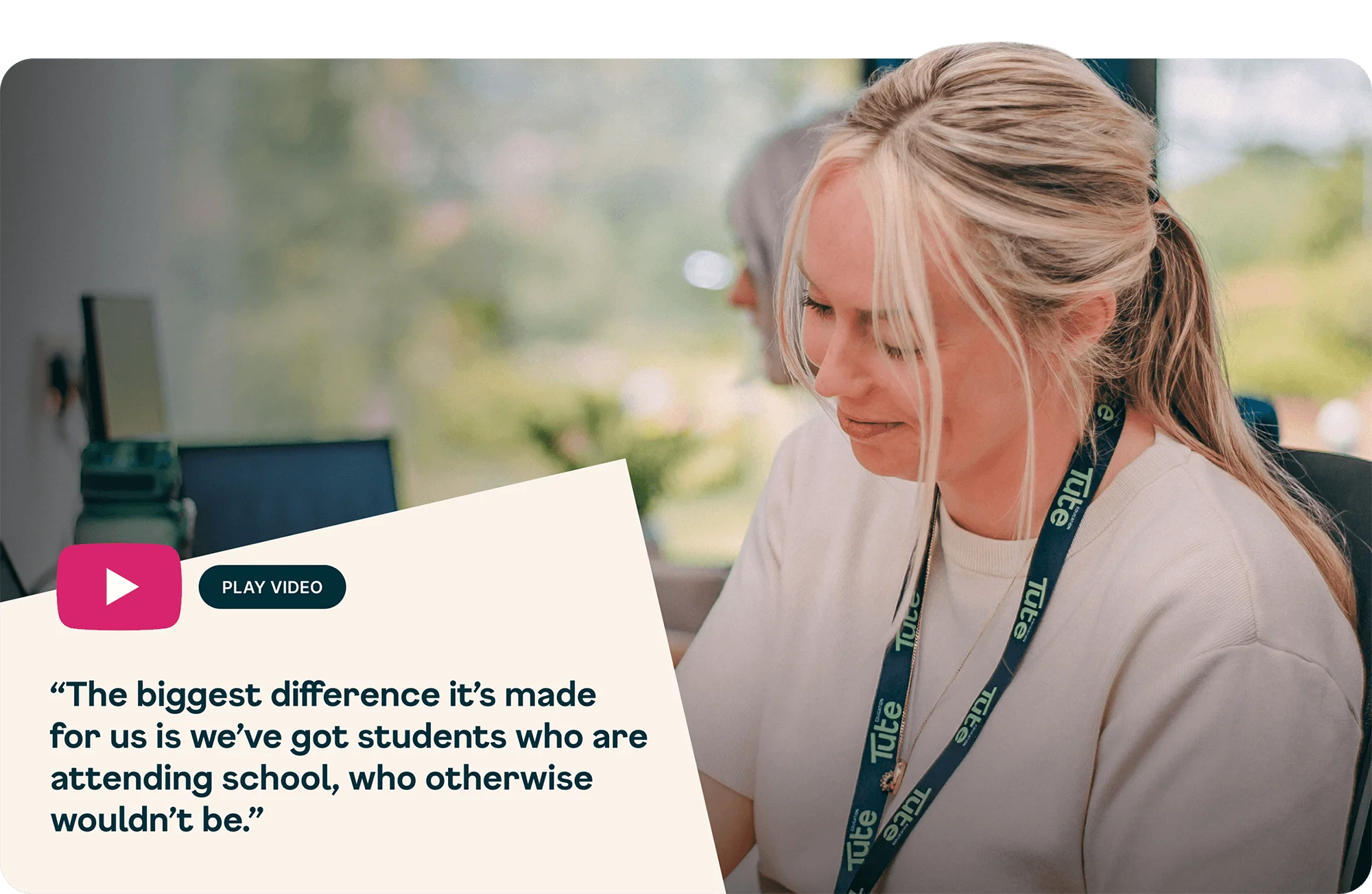
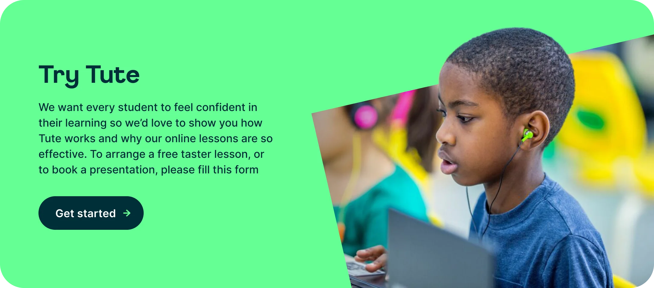
The human element of Tute’s story meant it was crucial to move beyond generic education imagery. The photography style focuses on people, the students, educators, and Tute’s team in real moments of connection and learning. To mitigate against safeguarding issues, we produced a series of AI generated imagery focused on the students. And, where photography wasn’t possible, for whatever reason, we introduced an illustration style that adds warmth and helps explain ideas in a simple, engaging way.


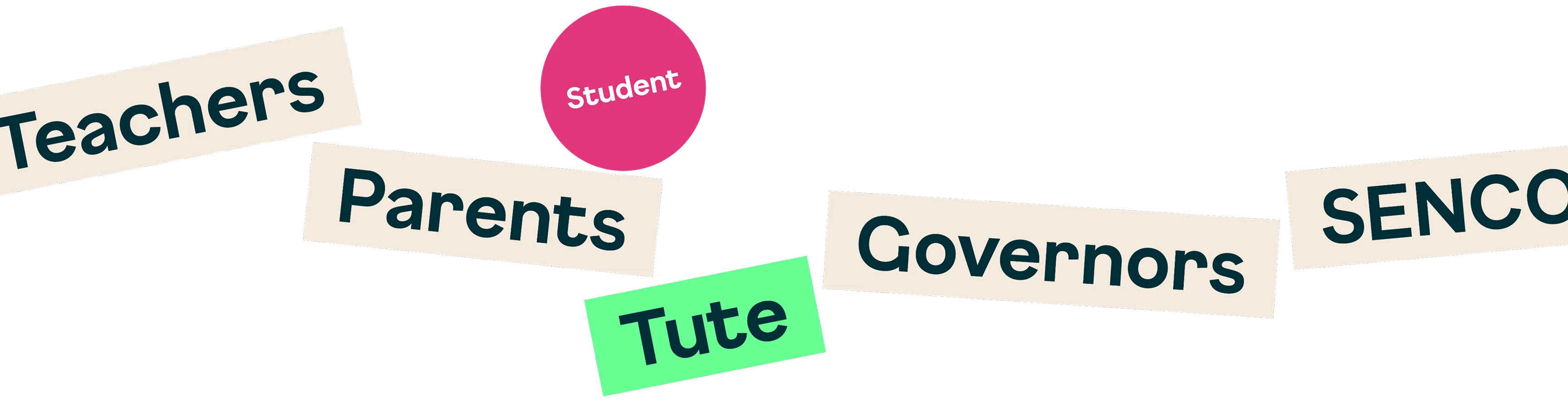
One of the key requirements of the identity was flexibility. Tute’s audiences are diverse, ranging from senior decision-makers in local authorities to frontline teachers, parents, and students. The identity needed to flex in tone and application without losing coherence or integrity.

As part of the identity system, we also developed comprehensive brand guidelines. These provide clear, practical instructions on how to apply the identity consistently, ensuring that as Tute grows, their brand remains cohesive and effective.


Tute’s previous website served its purpose but no longer reflected who they had become. It presented information but failed to tell their story or demonstrate the value of working with them. More importantly, it wasn’t helping them achieve their ambition to be seen as the first-choice online teaching partner.


Tute’s partners each come with different needs and priorities. From the outset, we designed the site around these audiences. The structure, navigation, and content were carefully considered to support clear and purposeful journeys, helping users find relevant information and understand how Tute could support them.
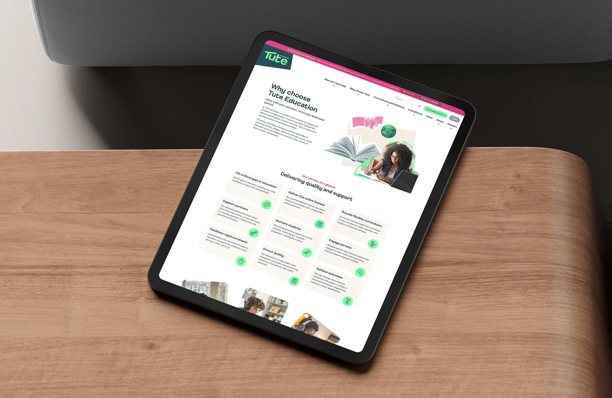
We migrated the website from Elementor to a custom WordPress platform, giving Tute’s team greater flexibility and control over their content. This move also strengthened site security, improved performance, and ensured better integration with Tute’s learning hub. The platform enables Tute to scale their services, with a modular system that maintains consistency as they grow.
In line with Tute’s commitment to inclusivity, we prioritised accessibility across the site, ensuring content is easy to navigate, language is clear and accessible, and the design works for all users.
We also optimised the site and implemented a robust SEO strategy to improve performance and visibility, ensuring Tute’s offer reaches the right audiences at the right time.

The result is a website that not only tells Tute’s story but actively supports their growth. It reflects their strategic clarity, reinforces their new identity, and gives them a powerful tool to engage with partners and stakeholders.
Together, the new brand, identity and website have repositioned Tute as sector leaders: trusted partners delivering high-quality, flexible education that meets the needs of every student.

“The Salad team were responsive, insightful, and genuinely collaborative. Our feedback was always welcomed, carefully considered, and reflected in the work. It truly felt like a joint effort.
One of the standout moments was unveiling the new brand. We introduced it during a company-wide Teams call, and the chat instantly lit up with hearts and comments. The response from customers and partners has been equally enthusiastic, and even some of our competitors have complimented the outcome!”