Website accessibility: A guide to design & development
Web accessibility is essentially making website or app experiences more accessible to a wider audience, regardless of disability type or impairments.

What is web accessibility?
Just like a building needs to consider accessibility for those with disabilities, or publishers print books in braille, when a website is accessible, by following a set of standards, it should work for as many people as possible, including those with a range of sight, hearing, movement or cognitive abilities.
“Accessibility is essential for developers and organizations that want to create high quality websites and web tools, and not exclude people from using their products and services.”
W3C (World Wide Web Consortium)
Why is web accessibility important?
There are many ways accessibility is both important and beneficial for your website:
1. Without it you’re potentially missing a whole market
It makes no business sense to miss out on potential customers: 18% of the UK population are over 65 and the disabled consumer market has a spending power of £200 billion a year. But the case for accessibility doesn’t stop there, many of the features designed for these users are also hugely useful for non-disabled people: take for example someone who has injured their arm, or a new parent who has a baby in their arms 24/7, by ensuring your website works for these users, you’ll ensure a better experience and be more likely to have returning visits.
2. Having an accessible website improves your SEO performance
In essence, accessibility and SEO serve the same core purpose; delivering relevant content in a way which meets the users needs. A good way to look at this is SEO being the best way to serve content to Google and accessibility being the best way to serve content to end-users.
Accessibility plays a pivotal role in SEO as it’s a key search signal for a website and is crucial to ensure that the site is not just technically sound in terms of meeting accessibility guidelines, but also serves the purpose of providing an easy, intuitive and engaging experience for all users.
Brands and businesses who accommodate and tailor to the unique needs of the individuals within their community in this way, see the biggest results and impact when it comes to not just their SEO performance, but the wider goals and objectives of their brand.
3. Lots of businesses and organisations are unaware which means you can get an edge on the competition
We hold our hands up, we didn’t always know how important web accessibility was, and we’ve been on a journey in the last few years to learn and improve. Indeed, we’re still learning, in part because the guidelines are regularly evolving. But what has surprised us is how few of the businesses and organisations who get in touch with us wanting either a new website or digital product, or updates to existing, know about web accessibility. This means they don’t understand the regulations or benefits, let alone being able to ensure the brief contains it as a requirement.
4. Quite simply, it’s the rules
UK government legislation states all public sector websites and apps must be accessible and feature an accessibility statement as per the Equality Act 2010 (UK). In addition the UN Convention on the Rights of Persons with Disabilities recognised access to information and communications technologies, including the Web, as a basic human right. Whilst there’s sound argument to make your website accessible from a business point of view, the flip side is that by not doing so could also end up costing you in legal bills if an issue were to arise.

Our web accessibility process
Planning & strategy
We begin our digital projects with discovery and planning stages, where we work with our clients to understand the audience types and assess the importance of web accessibility based on audience needs.
There are various levels of WCAG accessibility standards and in the early stages of our projects we work to tailor the approach based on the agreed level of accessibility standard, for example AA or AAA. This means we can then proceed with design and development with these guidelines adhered to.
Accessible design
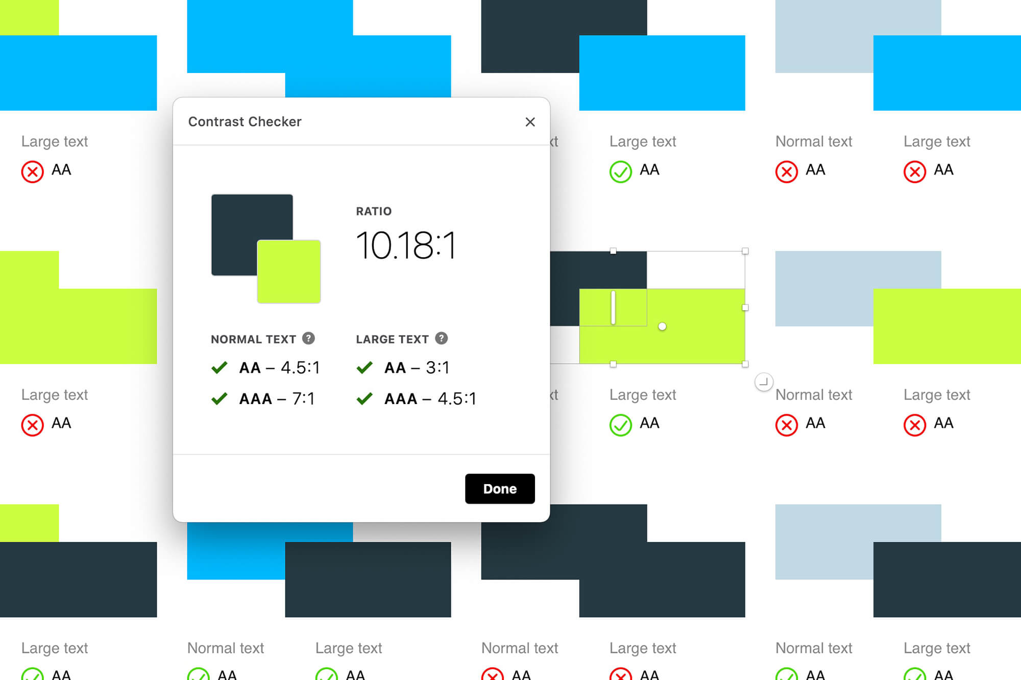
One of the first steps we take in the design process is to audit the brand colours to check the contrast between each colour pairing.
This is measured with a score between 1-21 and most often represented as a ratio where 21:1 represents the highest contrast that exists between pure black and white.
This number informs whether the combinations of those colours can be used for text throughout the website by following the WCAG 2.0 guide below.
Normal text: below 14pt bold or 18pt normal:
AA: 4.5:1
AAA: 7:1
Large text: 14pt bold or 18pt normal, and above:
AA: 3:1
AAA: 4.5:1
This process will often limit the choice of colours available and at that point we will make recommendations on whether to adjust some of the existing colours or introduce a new colour that will be more compliant and provide greater flexibility with the design without compromising accessibility.
What appears to the eye to have good contrast may not always pass these standards and vice versa. Some colour pairings that look to not have a strong contrast can actually be a good combination to utilise.
If you’re interested to discover how your brand colours perform this website has a useful tool to test them with.
The next step will be to consider the typography and ensure the text meets the agreed standards. This will primarily look at the text size but there are also many other factors to consider including the leading (line height), tracking (word spacing) and column width. It’s also worth considering that the WCAG accessibility guidelines don’t account for text size variation between fonts, and also the styling of many typefaces will have legibility issues for users with a visual impairment.
Once the colours and typography are set we continue to keep accessibility front of mind. There are many other areas the guidelines cover and it’s important we take an inclusive approach to all areas of the design.

Website development
When developing websites, we take into account the different types of tools and software available that allows users to make browsing the internet accessible.
For example, screen readers allow the content of a website to read out loud to a user. It also describes other visual elements of a page, such as graphics and images. In this case, we need to make sure that all important content is rendered using the correct markup, images are provided with descriptive ‘alt’ tags, and all interactive elements are signposted using appropriate ARIA labelling.
Tabbing index is important for users who navigate through a website using their keyboard, ensuring that the natural flow of a website is maintained where a traditional scrolling motion is not used. It’s also important to make sure that interactive elements, such as menu items or slider arrows can be used by a keyboard and show an obvious focus style where applicable.
Using semantically correct HTML is another aspect that must be focussed on when developing accessible websites. This means using the correct HTML elements for their intended purpose as much as possible. Alongside this, we also need to ensure code is kept as light as possible, with no unnecessary nesting of elements.
When websites contain a large number of interactive sections, the markup becomes more complex. We can use a variety of web-standard elements to provide accessible control. ARIA labelling allows accessible names to be provided in situations where there is no clear labelling. For example, a modal may have a close button, but apart from an icon, no visual indication that this is used to close the modal. In this case, we can add a label to the icon to explain its purpose, which will be highlighted by the relevant accessible tools. ARIA labels can be utilised in many different locations to ensure interactive content isn’t being hidden away.
Accessibility testing
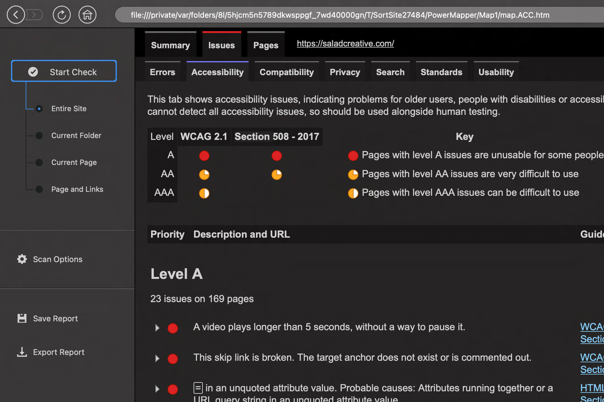
We use a variety of tools dedicated to testing a website’s accessibility grade including PowerMapper SortSite to run full site scans, measuring against WCAG 2.1 standards. This creates an action list for our development team and a sharable report to allow us and our clients to collaborate on a plan to achieve the highest accessibility grade possible.
We also utilise third party testing partners and tools, such as the WAVE Web Accessibility Evaluation tool. This is a great tool for spot checking work actioned in a production environment safely and efficiently.

Why you might choose not to adhere to web accessibility guidelines
Disproportionate burden definitely needs to be considered when talking about accessibility. We believe the best approach is to work with our clients to understand their audience, sector and their requirements before deciding which level of standards we work to.
If you follow every single AAA standard when creating a website, you are likely to be limiting the look, feel and functionality of the website.
If you’re looking to make your existing website more accessible, it’s important to consider the level of work required and which recommended updates will be beneficial to your organisation.
For example, following an accessibility audit, it may be recommended that you add subtitles to all video content on your website. If you have hundreds of videos, you could make the decision that older content which has low traffic is not updated, or is at the bottom of the to-do list.
How can I take steps to improve my website accessibility?
It starts with an understanding of where you are with your website or app and typically this means an audit and usability testing against the WCAG guidelines. The output of which can be used to inform the updates needed to make the website more accessible. This can be a journey, with quick fixes to start with, and the creation of a roadmap for more major updates. We often find that this work can lead to an update to brand guidelines as learnings are made about colours, fonts and treatments.
It’s also important to remember that the work is never ‘done’ and that every update and iteration to this site will need accessibility to be considered. Naturally having an agency who understands web accessibility is going to help, but we also believe that up skilling your in-house team to think about accessibility as part of the brief will be of huge benefit too. For example, we know that it takes a range of skills and departments to get web accessibility right: different job roles have specific concerns – for instance, a UX practitioner will work on aspects of design, where as a developer will be focused on the code solutions.
If you would like to understand more about how good website accessibility practices can help ensure that everyone, regardless of ability, can use your website or digital product, please get in touch.


