How SEO and web design should work together
10 techniques we’ve adopted to ensure our digital work is Beautifully Effective® in design and SEO
As a creative agency, we‘ve had to figure out how beautiful web design and effective SEO can co-exist and work together in harmony.
The truth is that this relationship is a complex one and there are a lot of strategic decisions and small compromises that need to be made along the way – but it is possible.
With many of our clients’ projects presenting this challenge, we’ve spent a lot of time developing and refining an effective process and solution. We’re happy to be honest and say ‘it is not easy’, but we live in a sales-driven world where many agencies suggest it is simple and most clients don’t have the visibility or knowledge to understand if it’s more complicated.
This guide will provide you with some directional and actionable advice for designing, building and optimising a website that works across all the required areas. If you use your website as a direct sales channel or a channel to drive enquiries, then can you really afford not to?
SEO Tips for Web Design
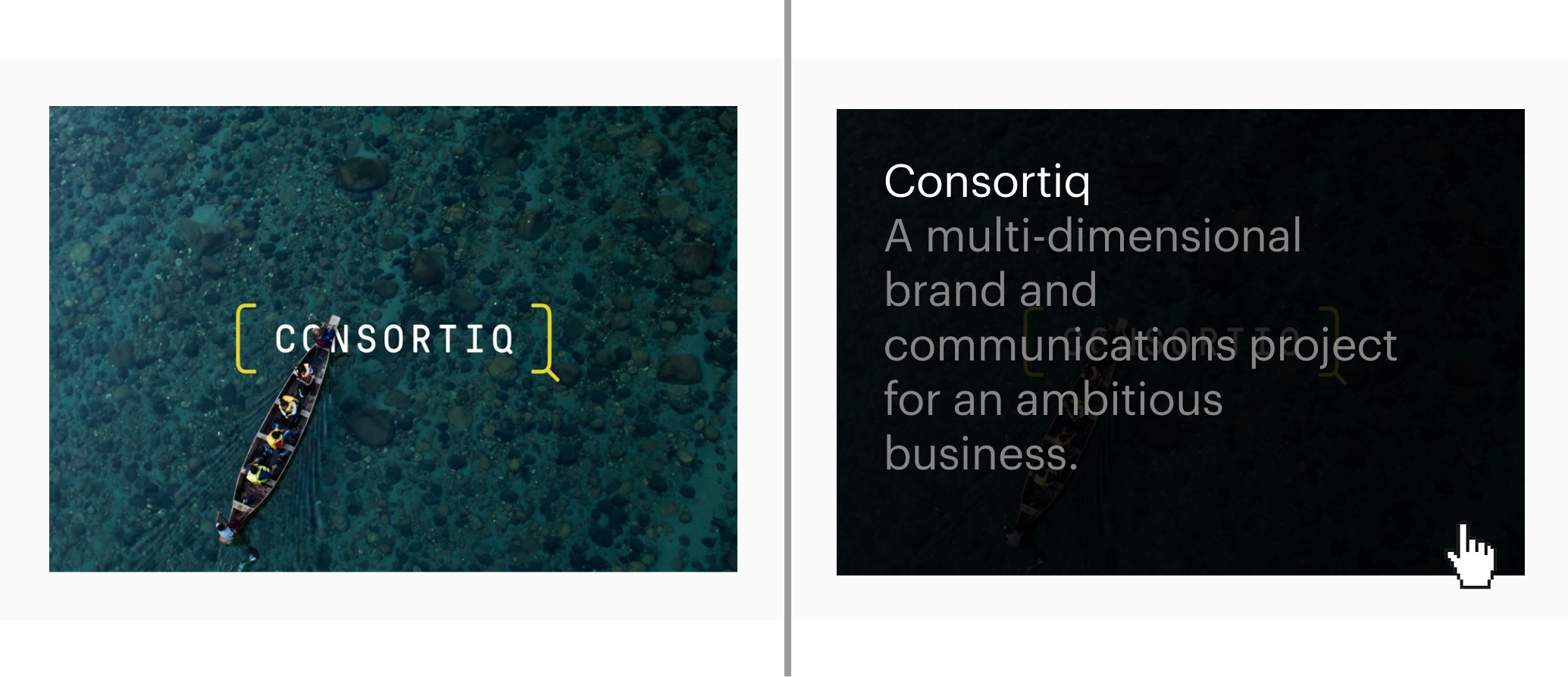
Tip 1: Introduce image overlays
Overlay images are an extremely effective way to include important SEO text without compromising on design. Initially when viewed, the image will appear as intended, but when a user rolls over the image, key SEO content and copy is revealed. Search engines will take what they need from the image optimisation and read the overlaid text as well – making this a great tool for including key product descriptions.
Tip 2: Position important content at the top of the page
Search engines understand content on a page in a hierarchical way, meaning that it recognises content higher on the page as being of more importance and relevance to the user.
It’s vital that any key subheadings, phrases and navigation links are designed at the top. Key H1 headings should be included first, with any homepage brand strap-lines positioned secondary to these.
Tip 3: Remember H2 subheadings
Whilst it is necessary for every page to have a H1 heading to benefit SEO, H2 subheadings are often forgotten about. These subheadings should be introduced at natural points throughout the design to ensure the page is easy to read, as many people prefer to choose a heading tag based on how it looks on the frontend, regardless of whether it’s a H1, H2, H3, H4 and so on so forth.
Search engines will often read H1’s first, and subsequently H2’s before the reading the remaining page text, therefore subheadings should be keyword-rich to help the search engine determine the page content. Think of this as the same hierarchical system as content.
Tip 4: Keep images sizes to a minimum
Large images can have a significant impact on your page load speed, which is a key contributor to technical SEO and search performance. Optimise your images and ensure that the dimensions and dpi are no larger than necessary to keep page load times at an optimum speed. For icons, it’s worth considering the use of SVGs as they often have smaller file sizes than PNGs and JPGs, with an added bonus of looking crisp on retina screens.
And don’t forget that well optimised images also include image titles, alt titles, and descriptions which are keyword rich and actually reflect what the image is of itself.
Tip 5: Limit the number of web fonts you use
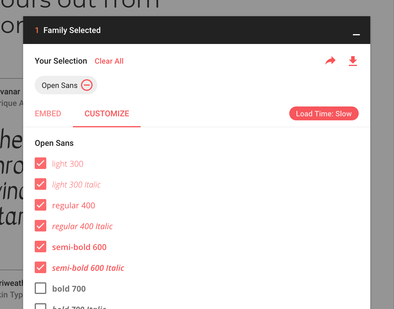
Web fonts give us creative flexibility and enable us to craft websites that are beautiful and on-brand. But the inclusion of several different fonts can be detrimental to page load speed as well as coherent design. Google Fonts offers useful and practical guidance about the use of web fonts, making it easier to understand their speed implications.
Tip 6: Introduce animation
Interactive elements like animation offer users a far more engaging experience, which can help to increase dwell times, conversion rates and engagement metrics, which thus have a positive impact on search ranking. Animated infographics, process graphics and engaging hover effects are just some of the animated tools we use to help boost engagement and improve user experience. It is, however, worth noting that slow-loading animations can have a negative impact on page load times and SEO, so try to ensure these are optimised.
Tip 7: Incorporate breadcrumb navigation
Breadcrumb is a form of secondary navigation that reveals a user’s previous steps in their journey through a website, enabling them to keep a track of their location and which section of the site they’re in. It’s essential to integrate this into a site’s design for a seamless user experience, and it’s an effective way for search engines to understand the structure of a site through internal linking, which can improve SEO performance as a result.
Tip 8: Embed videos
It’s a common misconception that video has no implication on SEO, as it’s not text-based content. However including video on your website can engage users and increase dwell time dramatically. An increase in views can also demonstrate higher page engagement, helping websites climb up Google’s rankings, as well as interactions with video content (playing, pausing, fast-forwarding etc.) also generates a huge amount of engagement. Hosting videos on platforms such as YouTube or Vimeo and embedding them on your website will ensure your site’s speed is not affected by slow-loading content.
Tip 9: Think about the user journey
As I’ve mentioned previously, keeping users on a website for as long as possible will help to improve SEO performance, so long as they’re engaged and have no barriers to converting. User experience (UX) can be instrumental in increasing dwell time, so providing a simple and intuitive experience can help users find exactly what they’re looking for as intuitively as possible. Users can become frustrated by dead ends so ensure the site’s navigation is simple and clear.
Tip 10: Add footer links
Internal link structure is a crucial element of SEO and helps Google to understand the importance, hierarchy and weighting to pages and content across your site., Footers are an ideal location to include links to pivotal web pages such as those in the top level navigation, any key sub navigation pages and sitemap links.
Including these in the footer design will increase the number of times they are linked throughout the website without impacting the user experience. In-page links can also be used to help boost a page’s visibility and direct traffic between relevant areas of the site.
Create a well optimised site with great user experience
We hope these tips help you and if you are looking for a new website design that is both beautiful and effective, striking the right design and SEO balance, then please do get in touch with us at ideas@saladcreative.com or by calling 01202 330 000.
Alternatively, find out more about our creative and marketing services or read up on a few of our related projects for more inspiration.
