A brand as beautiful & liveable as the spaces it creates
Impact
A refined identity that modernised the brand while preserving long-established recognition and character.
A clean image-led Squarespace website that beautifully showcases Aleksa Glancy’s distinctive expertise.
A considered SEO foundation to build visibility, with impressive year one results
Ten years into running her own architectural design and planning practice, Aleksa Glancy had built a portfolio of considered, beautifully realised projects, a loyal client base, and a clear sense of who she is and how her studio worked. What she didn’t have was a brand that matched the reality.
The original logo and website had been put together quickly in the early days and was long overdue an update. With a 10 year milestone approaching and bold ambitions afoot, the timing felt right. What began as a conversation about refreshing the website became something more meaningful: an opportunity to build a brand identity that finally reflected the practice Aleksa had spent a decade creating.

The challenge
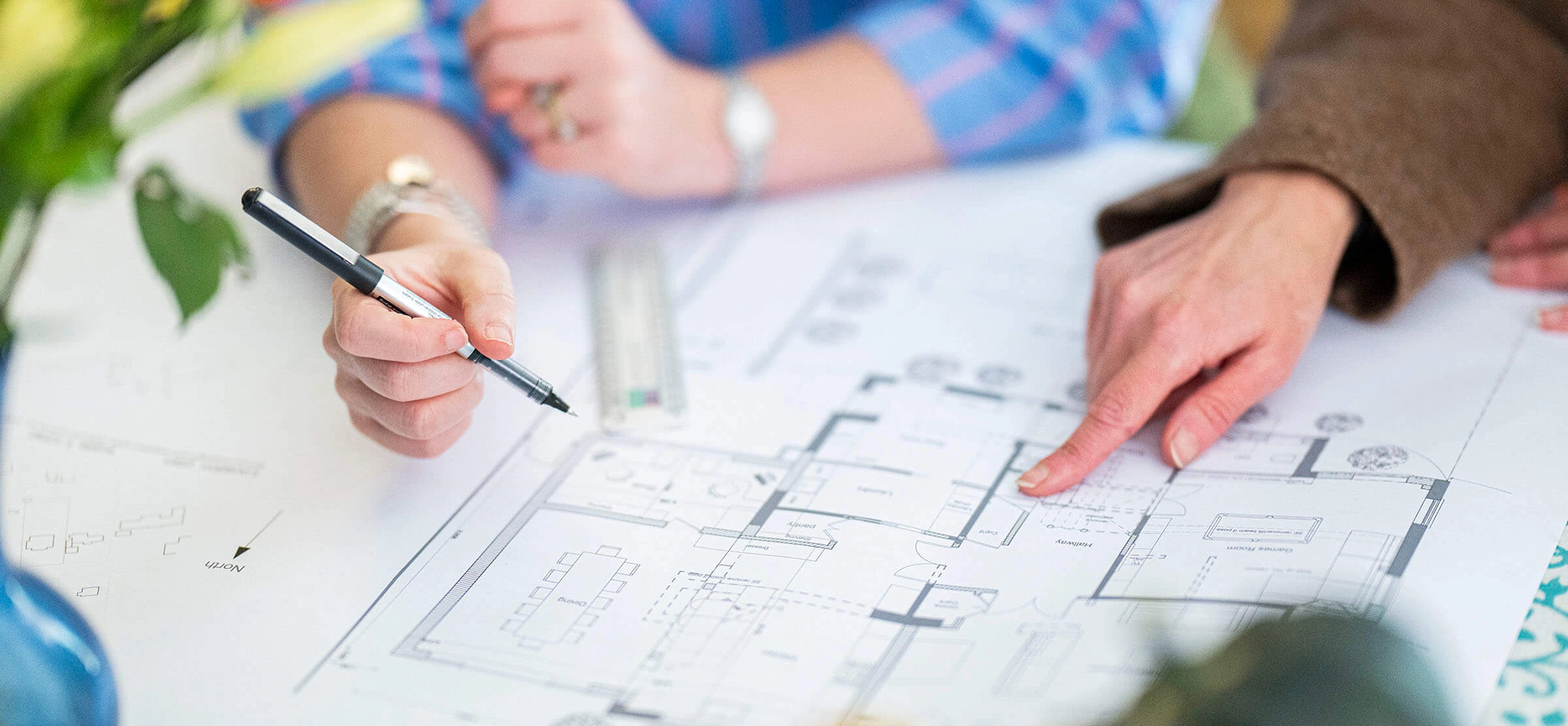
Architectural practices take time. From initial brief to completed build, projects unfold over years – which means the portfolio takes time to build.
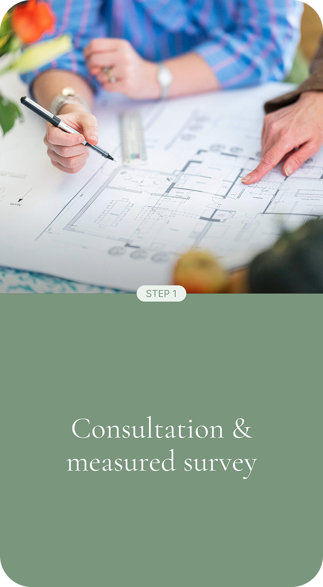
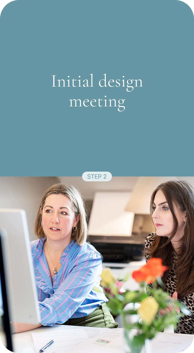
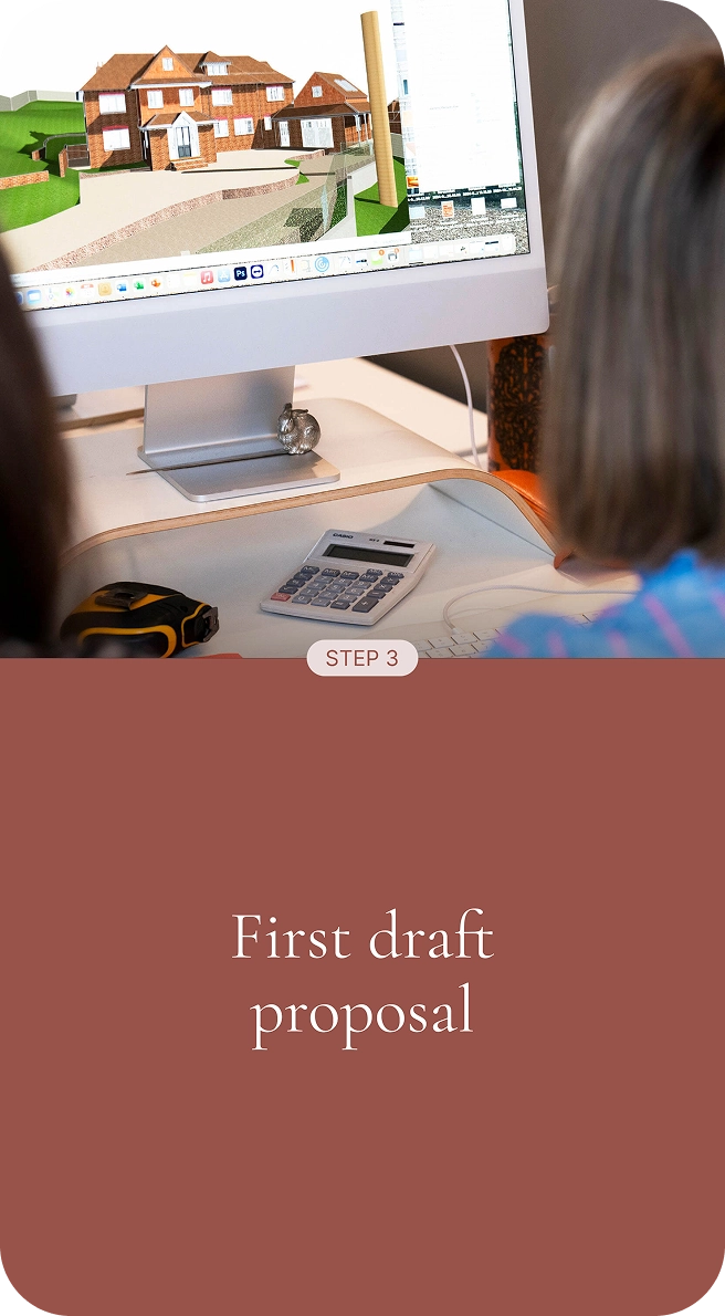
The new website needed to show the context around each project, the process of working with the practice, and what it’s actually like to work with Aleksa. The logo needed to be refined in a way that captured the elegance and calm authority she brings to every project. And from an SEO perspective, the site needed more content and optimisation to work in its favour.
The brief was clear: evolve, don’t overhaul. Retain the brand equity that existed, but bring it into alignment with where the practice had arrived.
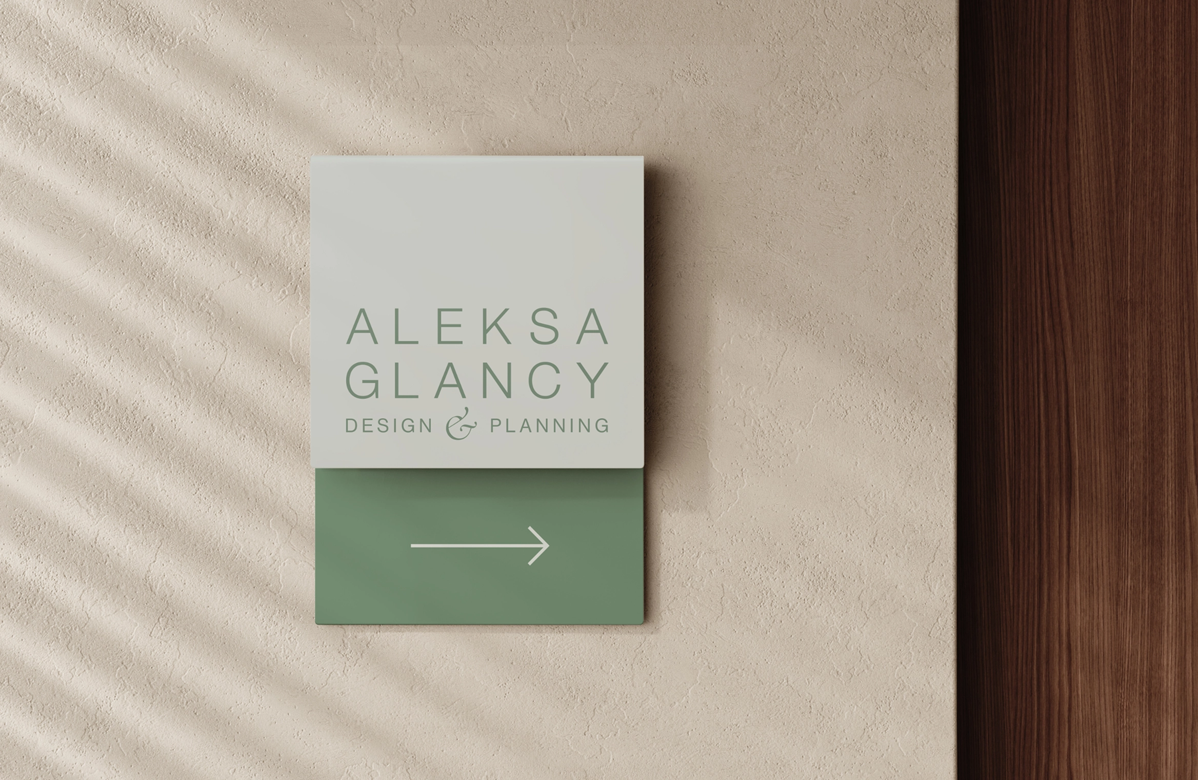
Evolving the identity
We treated the existing identity as raw material. There was something worth keeping – we just needed to refine it.
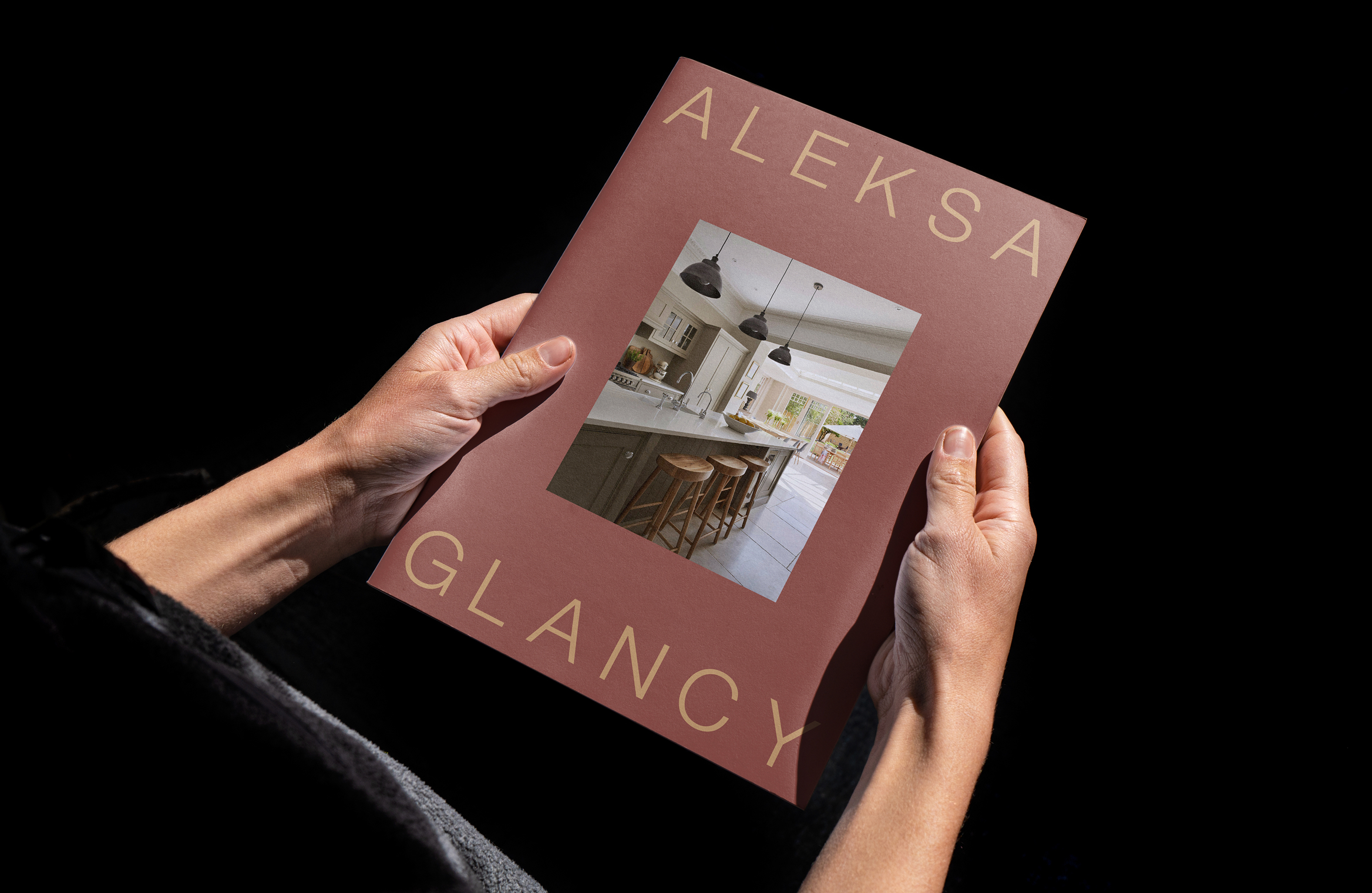
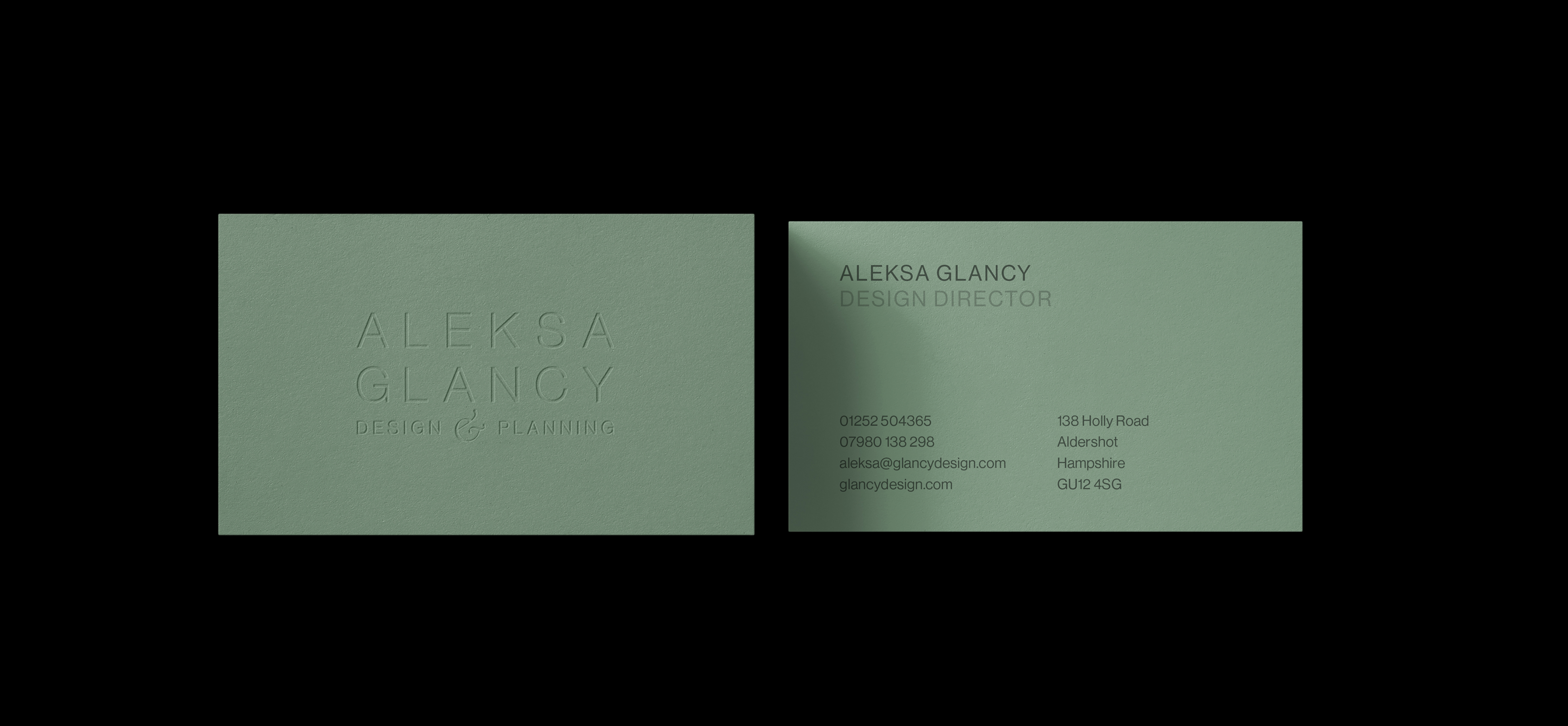
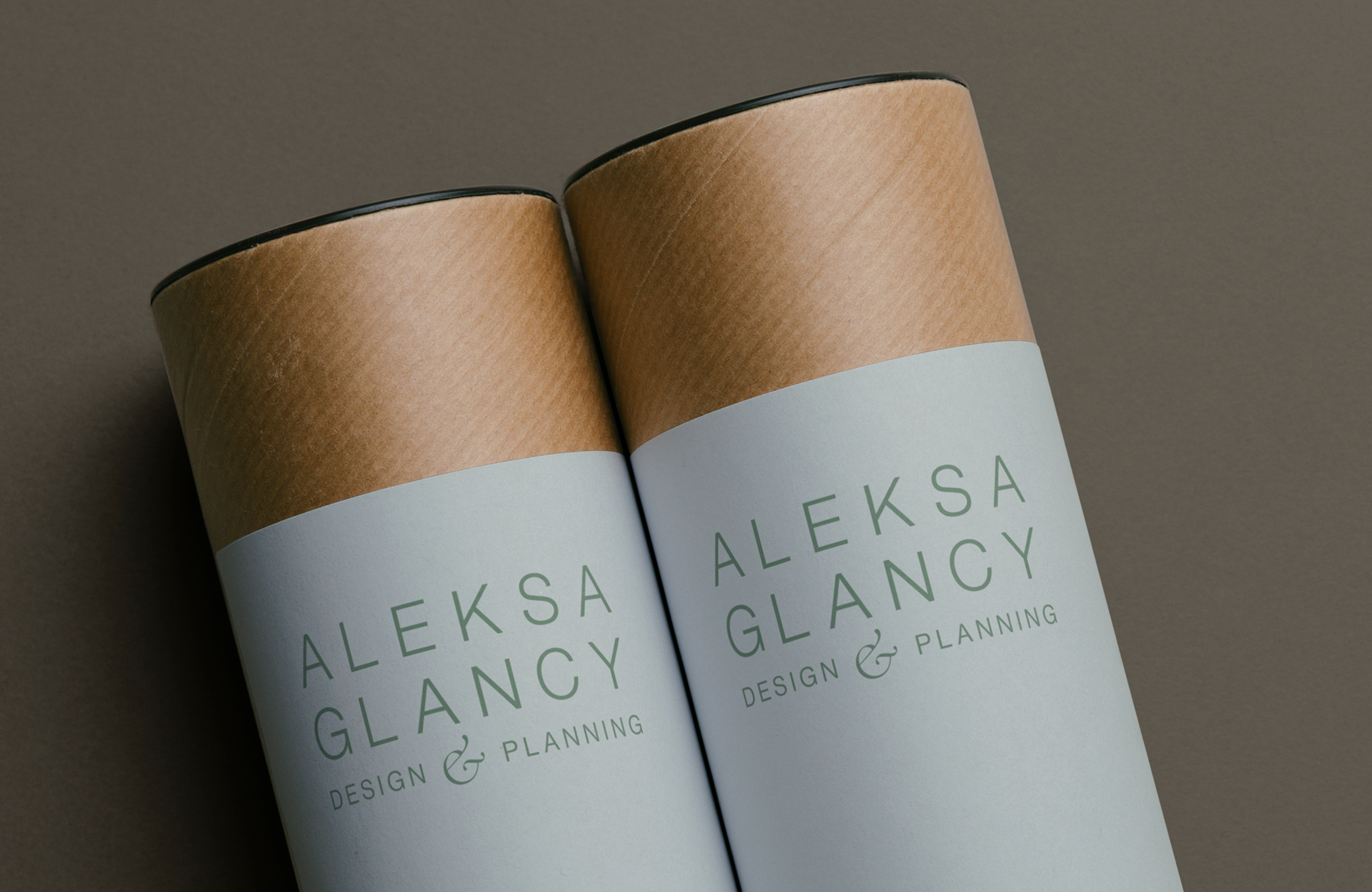
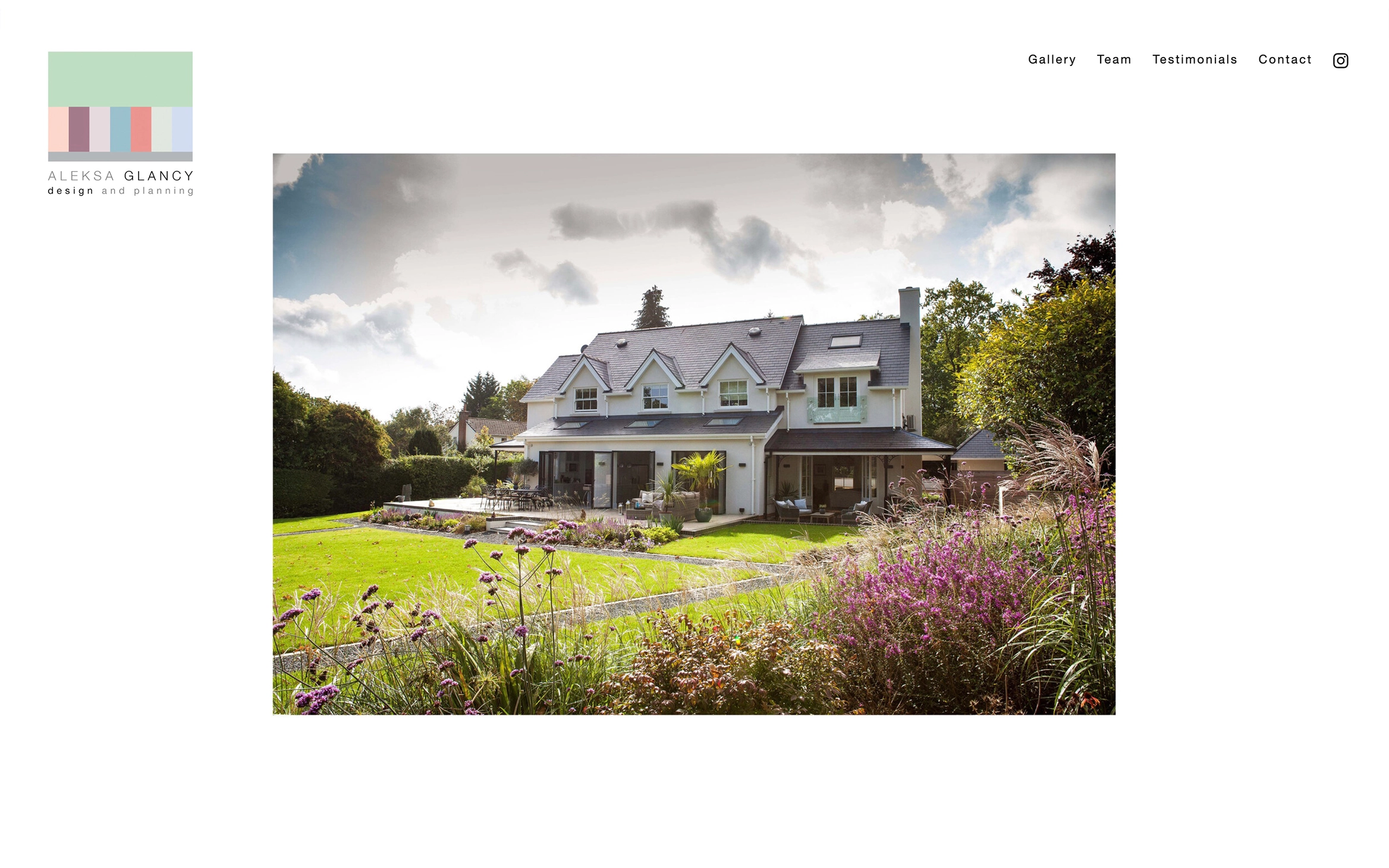
The resulting wordmark strikes a careful balance. The bespoke lettering for Aleksa Glancy is given visual weight and prominence, with Design & Planning sitting more quietly beneath. The individual characters were adjusted to sit as a considered unit, and the ampersand was drawn and refined to give it a distinctive quality that lifts the whole mark without drawing attention to itself.
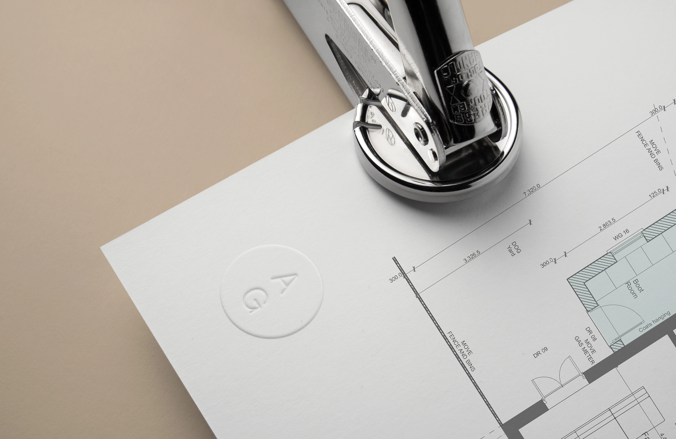
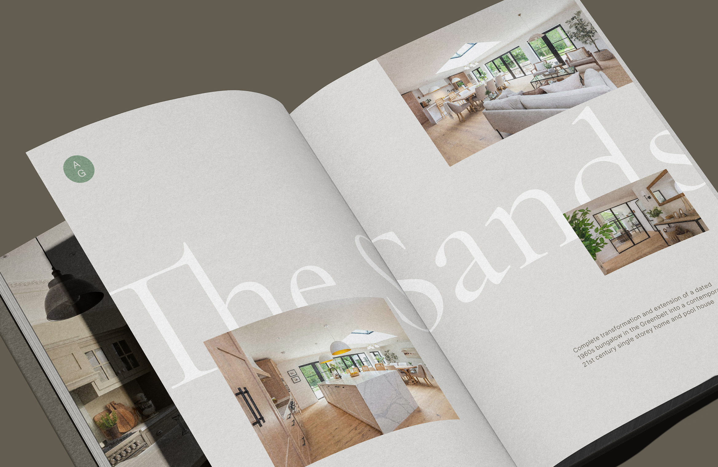
The monogram – a paired A and G – distils the identity down to its simplest, most flexible form, used across social media templates and stationery.
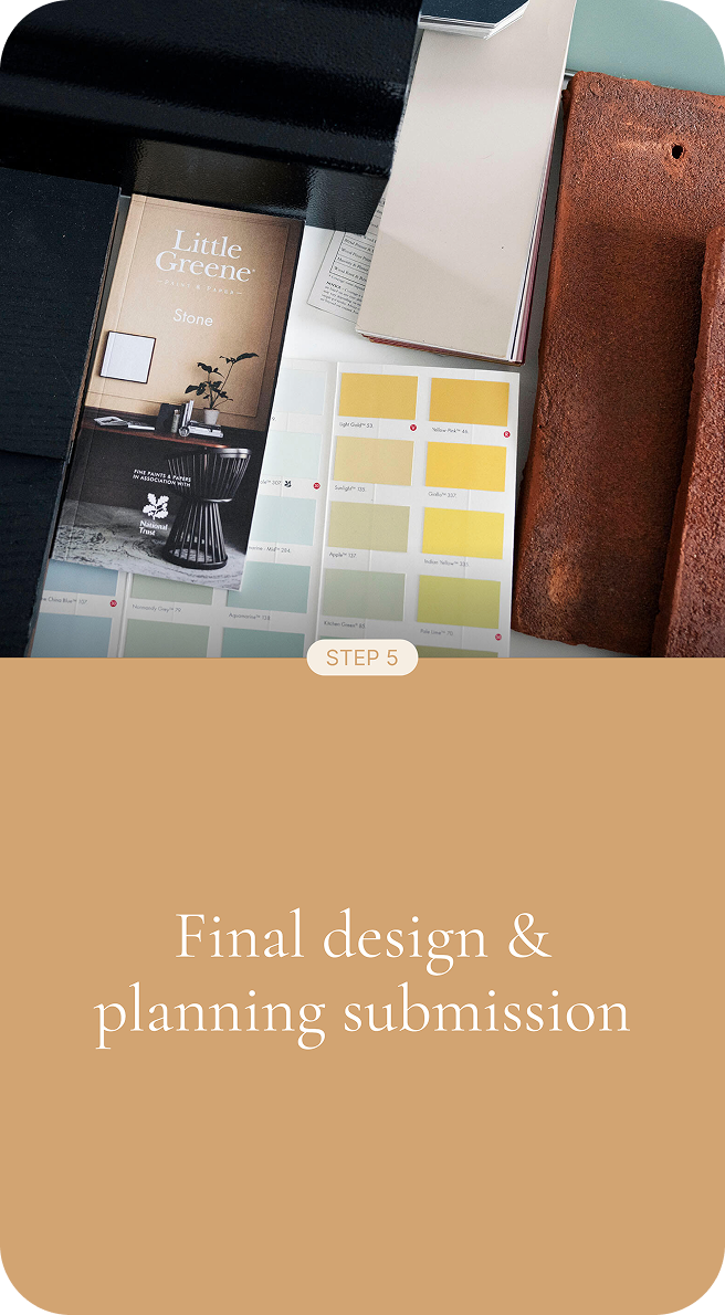
The colour palette draws on the materials and tones that run through Aleksa’s projects: warm, earthy, considered. These work in harmony with the photography of the properties themselves – the colours feel native to the spaces Aleksa designs, not imposed on top of them.
Typography pairs Cormorant Garamond – an elegant, classical serif with genuine warmth – with Inter as the body and utility face. The combination has the range to feel refined and contemporary at once: neither fusty nor clinical.
Creating a digital home
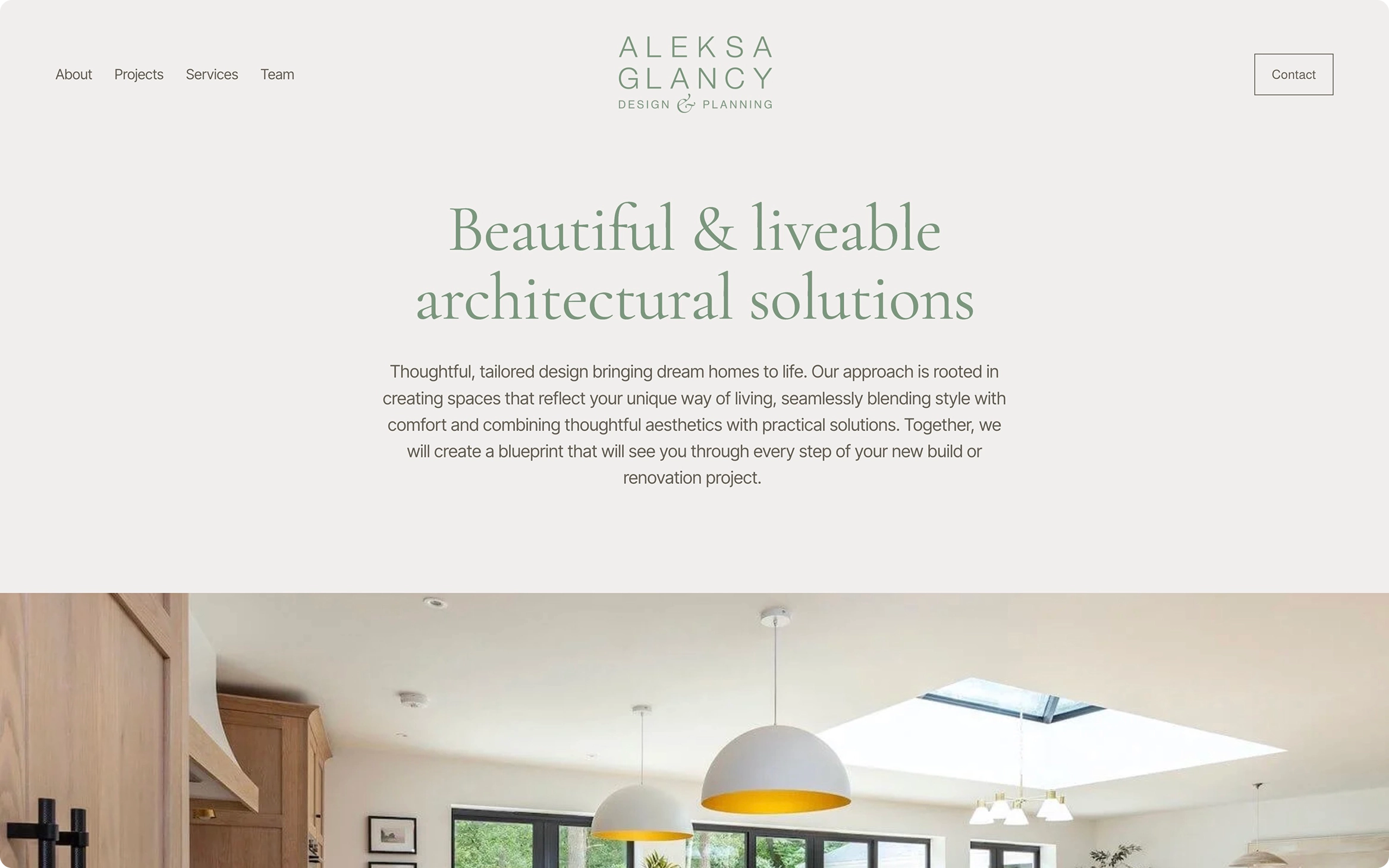
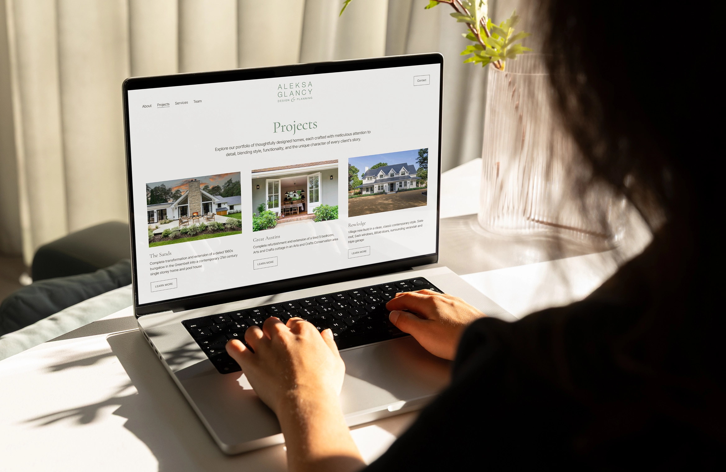
The website was built to do one thing above all else: invite people in and let them understand, naturally and gently, what it feels like to work with Aleksa.
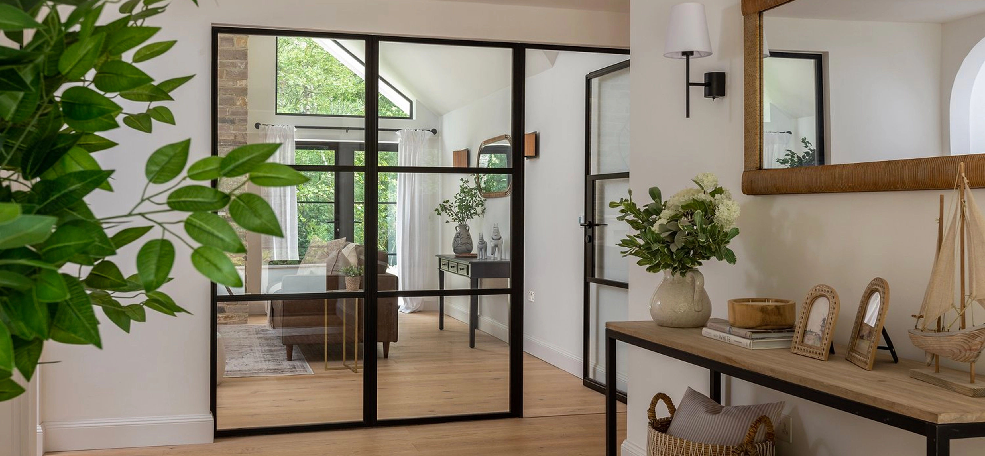
The result is a site which quietly sells, and where the brand identity doesn’t compete with the architecture. The photography leads. The colours, typography and layout support it. As you move through the site – even before you reach the project pages – there’s a sense of how Aleksa works: calm, considered, attentive to detail.
A Services page was added with SEO in mind, giving the site both a practical function (explaining what Aleksa offers) and the structural foundation it needed to perform better in search.
Building SEO visibility into the foundations
The previous site had almost no SEO infrastructure: no service pages, a gallery architecture that created duplication, and nothing to support SEO performance for either Aleksa’s name or her location. As part of the project, we implemented redirects from the old site, updated the Google Business profile, and set up analytics tracking for the first time – giving Aleksa a clear view of how her site performs and a foundation to build from.
Growing recognition, reach and traffic
By the end of the first full year after launch, the impact was clear. But perhaps the most telling figure is the amount of traffic arriving directly.
With more than 80% of visitors navigating straight to the site, people are coming back by name, not by accident – a strong signal of growing brand recognition. For a practice built on reputation and relationships, it’s exactly where you want the numbers to be.
And that momentum has continued. By June 2026, traffic was already up a further 19% year-on-year, continuing a steady upward trend.