Accelerating the transition to a cleaner future: digitally empowering a game-changing brand
Copperman Consulting are the largest, most experienced SAP BPC/BW consultancy in Europe. The business specialises in the complete end to end implementation of SAP Enterprise Performance Management software, from solution design through to technical installation, build and roll out.
When they came to us, the brand identity and website looked tired and lacklustre in equal measure. While business was doing very well, their existing customers were starting to feel indifferent towards the same drab styling of the business, and prospects were mistrusting of their abilities.
Customers were increasingly in danger of being lured away by emerging competitor brands who looked the part (but could not deliver). So Copperman decided to evolve their image to reflect their success, having earned their position as the market leader in Europe.
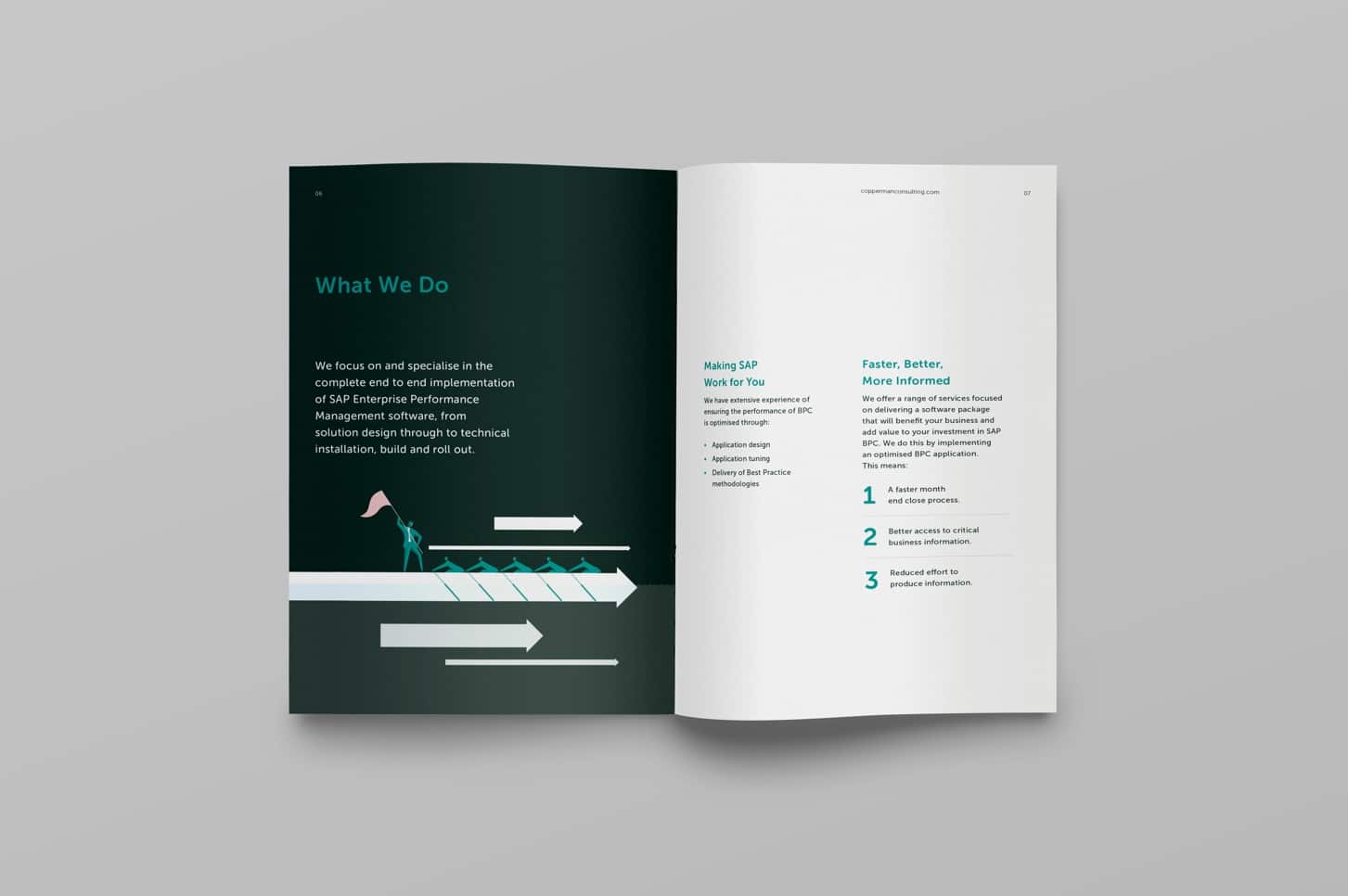
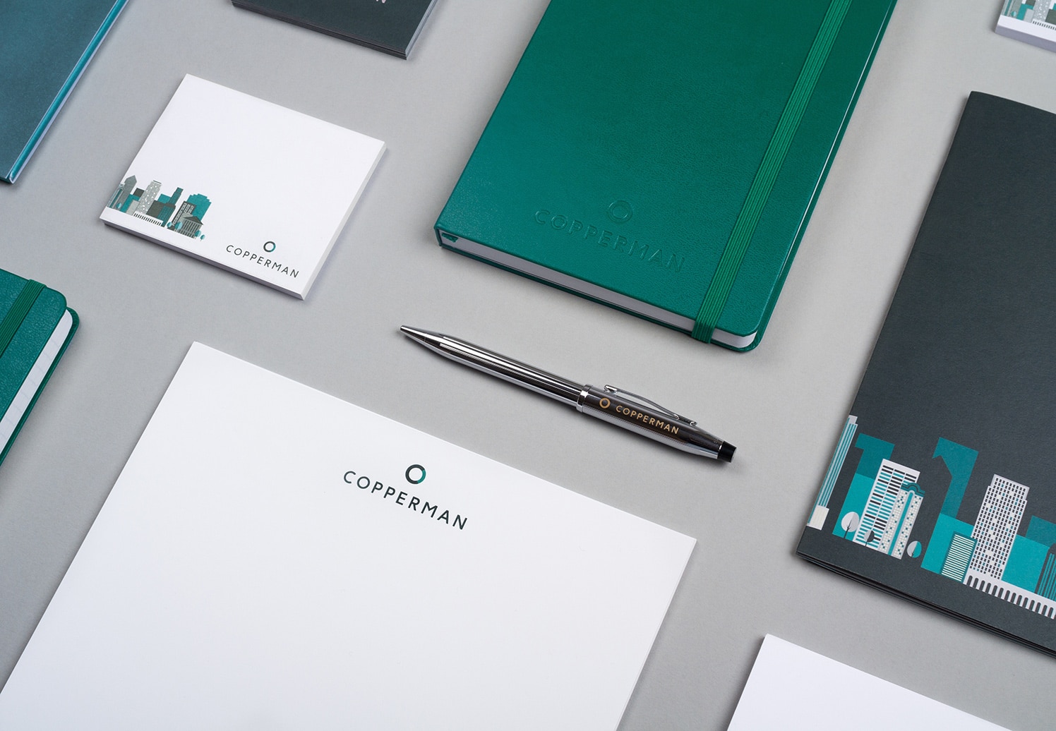
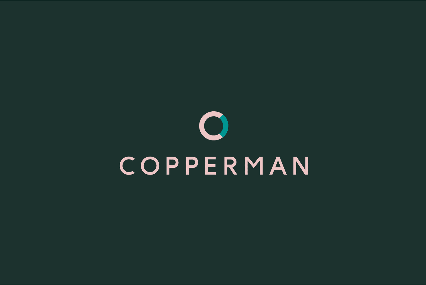
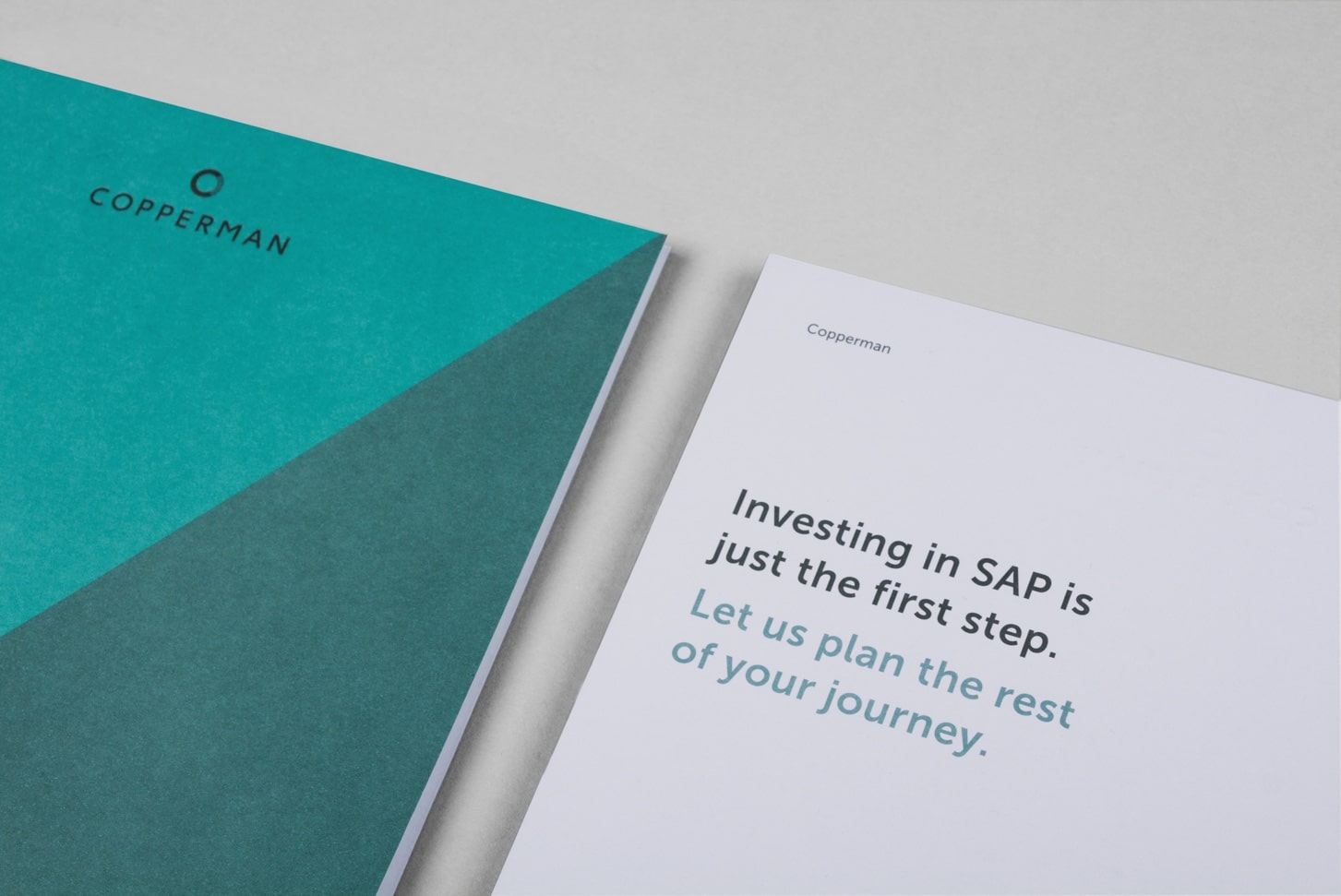
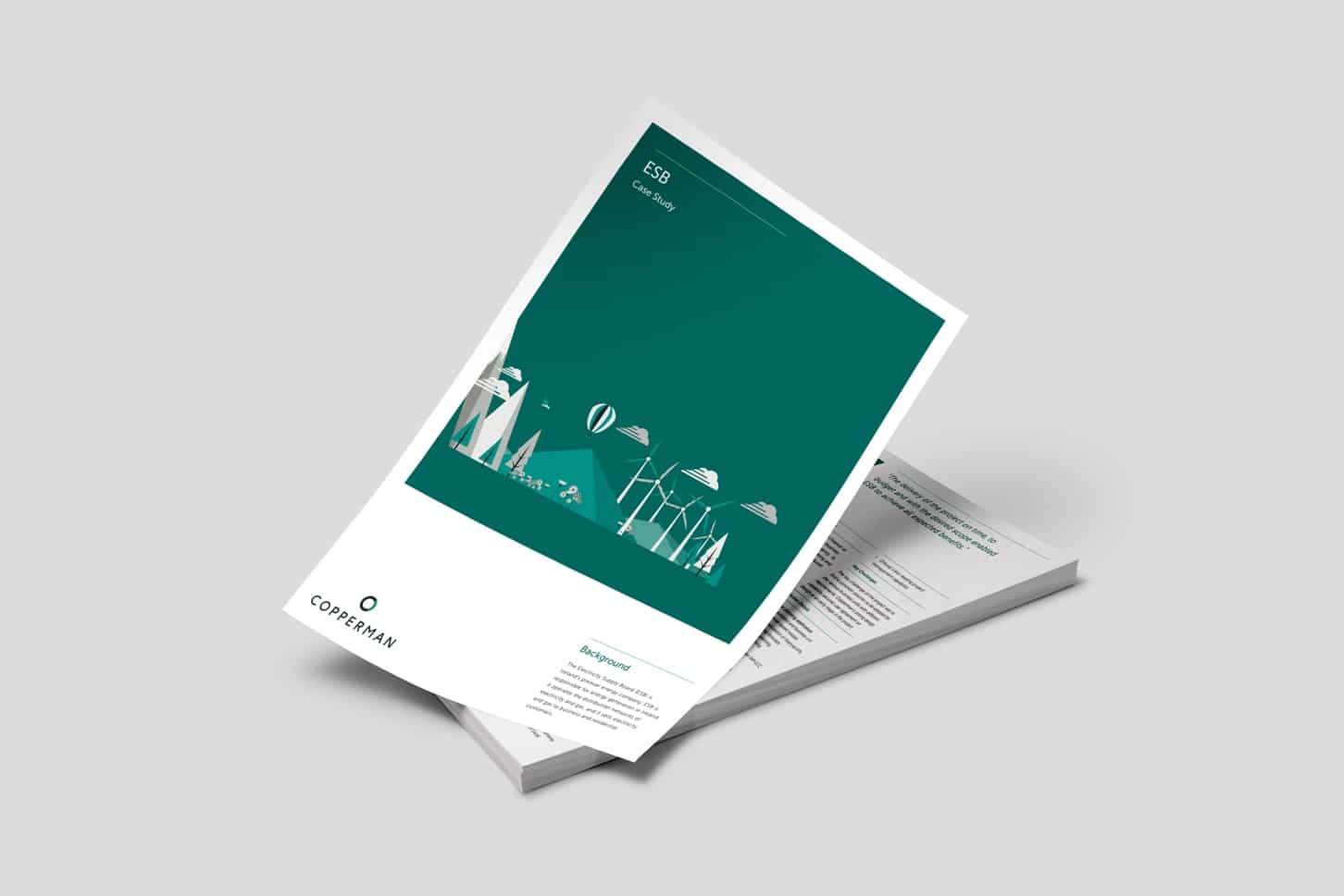
The project started by curating a new identity and developing a contemporary marque and suite of illustrated graphical assets to reflect their modern approach. This was complemented by a colour palette of traditional rich greens to represent the financial aspect of the business, and a soft pink which whilst nodding to finance, also brought some distinctiveness to their colour palette.
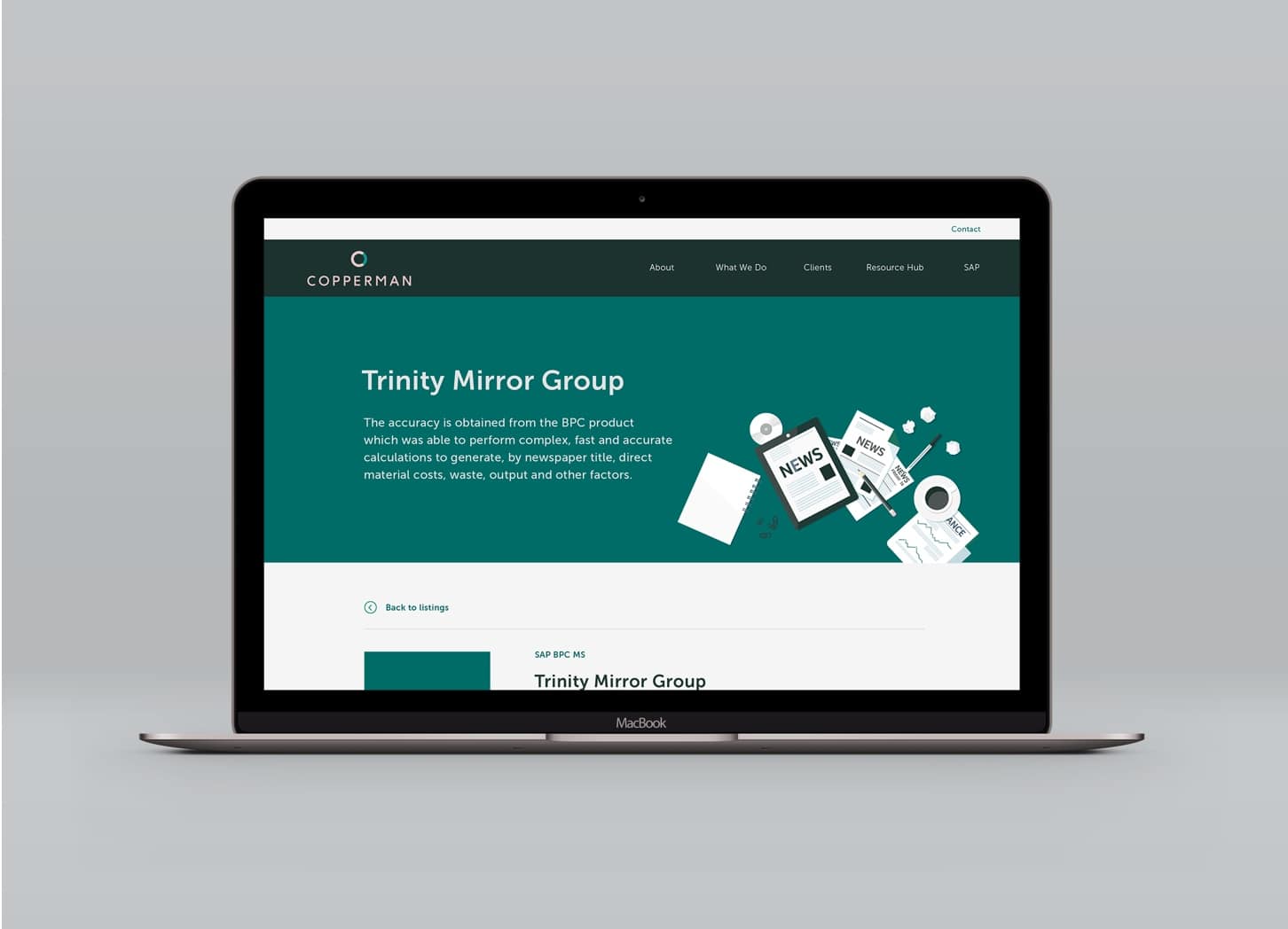
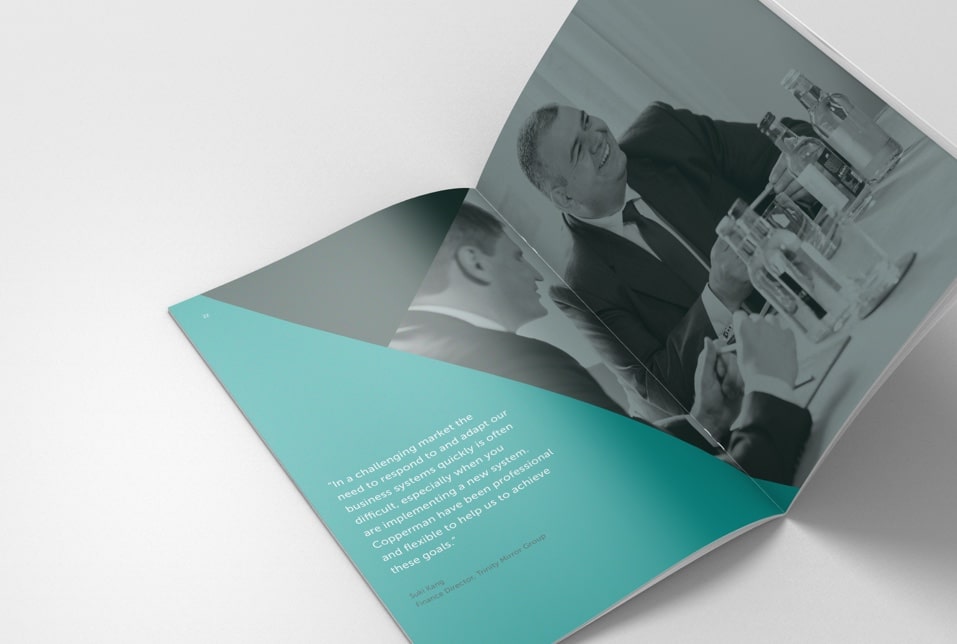
Following the creation of the brand identity, we delivered a website within the same unique style to showcase their offering beautifully across all devices. This was delivered in conjunction with a suite of branded materials including a sales brochure, presentation template, event signage and merchandise.
The materials were then proudly unveiled at an internal launch event held in a 5* hotel.
The business image has been transformed with the brand development exercise and the resulting online presence. Recruitment has become easier and staff report a renewed sense of pride working for the business.
Leaders of the business are also significantly more confident in pitch scenarios. Now equipped with a suite of beautifully-designed materials, presentations now exceed the impressions made by their competitors when it matters.
“We approached this project with the goal of radically improving customers’ perception of our business through its appearance. Because of this, it’s been quite a subjective body of work despite it being a significant investment for us as a business.
The purpose of the rebrand, the new website and supporting brand materials was to give us a competitive edge and for these pieces of collateral to combine to build a stronger overall identity for Copperman. That meant we needed an attention-grabbing and professional brand that made an impression from first sight right up to the point that we entered the room.
This wasn’t an exercise in increasing our awareness or the number of ‘qualified leads’ we received because the nature of our industry and the way business is won is complex. Instead, the success of the new look and feel would be measured firstly by the engagement of our team and secondly, our clients and business partners.
Facing increasingly turbulent and competitive waters ahead of us, we needed our employees to feel a powerful and reinvigorated sense of pride in our name and the brand they represented. As such, we knew that we’d have a happier and more productive team and ultimately, happy clients as well. But beyond the impression it needed to have amongst employees, we also wanted to be able to measure the positive impact of the new brand in the reactions of our clients and the extent to which it influenced their decision-making. This would include their early experience of navigating the new website to get to know us, the response we got when handing over business cards or running through presentations in the boardroom.
The result of Salad’s overhaul has been incredible and we’ve felt the immediate effect. Rarely have we been so impressed by a business partner in all of our 10-year history. In what is typically a sea of atrociously dry and dull brand communications, Salad has exceeded our expectations to deliver us an identity that is effortlessly slick. As just one example, we recently walked into the London-based offices of a global corporation and our brochures were extremely well received.
Our confidence in Salad grew very quickly once we had visibility of the quality of their output, to the point where our decision making was effortless. It was such a fantastic experience working with Salad. When we finally got our new website up and running, the feedback we received from our clients and business partners about the logo, the colour scheme and web content was overwhelmingly positive. We couldn’t have asked for more.”
