Revitalising a brand with a focus on accessible sustainability, customer service and integrity
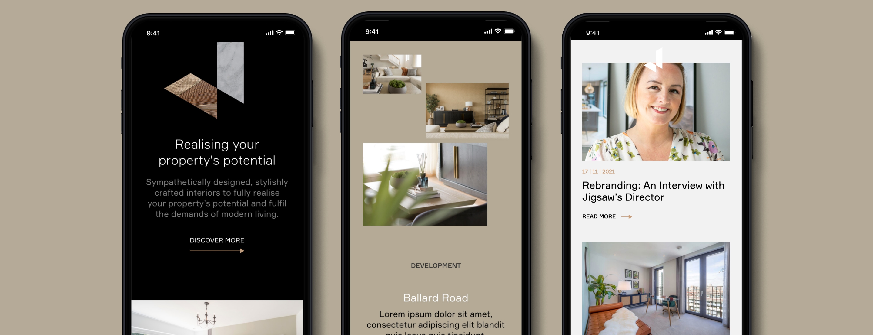
Jigsaw is a leading Interior Architecture & Design practice partnering with ambitious clients to create intuitive, aspirational interiors.
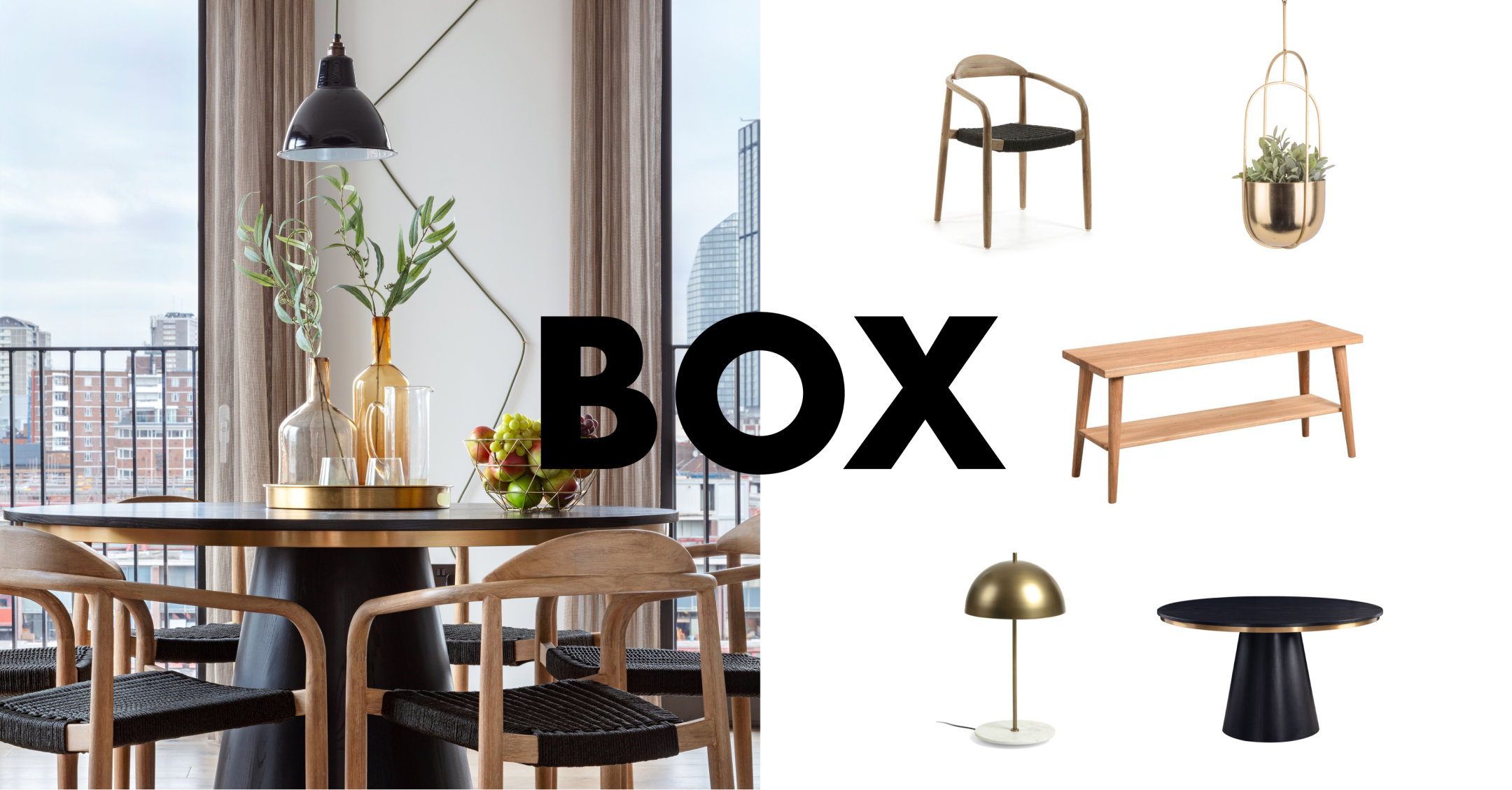
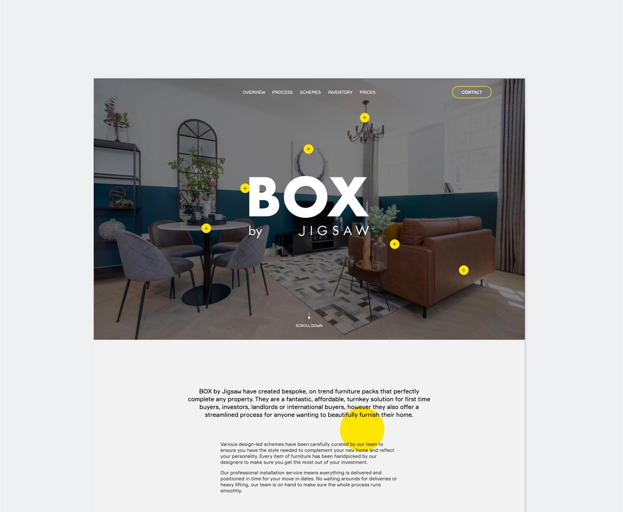
Having struggled to develop a cogent standalone offer for furniture packs, to quickly and cost-effectively furnish properties for rent or sale, Jigsaw approached us for help. They were struggling not only to communicate the value their team delivered, but how to convincingly extend their offer and further elevate the value of their working processes.
In these early stages, we knew we’d found a meaningful connection and shared way of thinking, based on a love of aesthetics, colour, light, space and layout.
Working collaboratively with their founder and creative director, as well as senior management, we co-created a brief to reconstruct the Jigsaw brand and develop a new visual identity and website that would communicate their offer in an authentic, accurate and compelling way.
With an established portfolio of highly credible clients and schemes, safeguarding their reputation was a key consideration, alongside the requirement to communicate the breadth of their offer, update the tired identity and develop a new, impactful website.

Initially we spent time in one-to-one sessions with Jigsaw’s founder and creative director Melissa Horne. Whilst Jigsaw is very much Melissa’s baby, her need to include a number of senior team members was immediately communicated. Discovery sessions and workshops followed to get under the skin of the business, its people, its clients and customers. Armed with the information we gleaned from all of these sessions, we crafted a brand platform rooted in the belief that better considered living spaces not only increase value financially, but emotionally, allowing better lives to thrive. We also investigated how best to incorporate Box by Jigsaw and maintain a similar sense of value to potential customers.
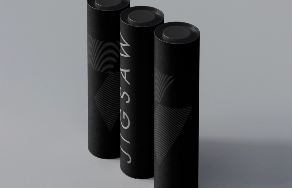
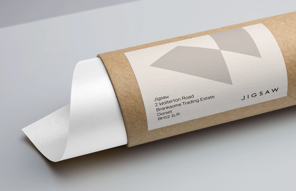
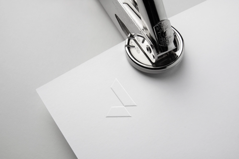
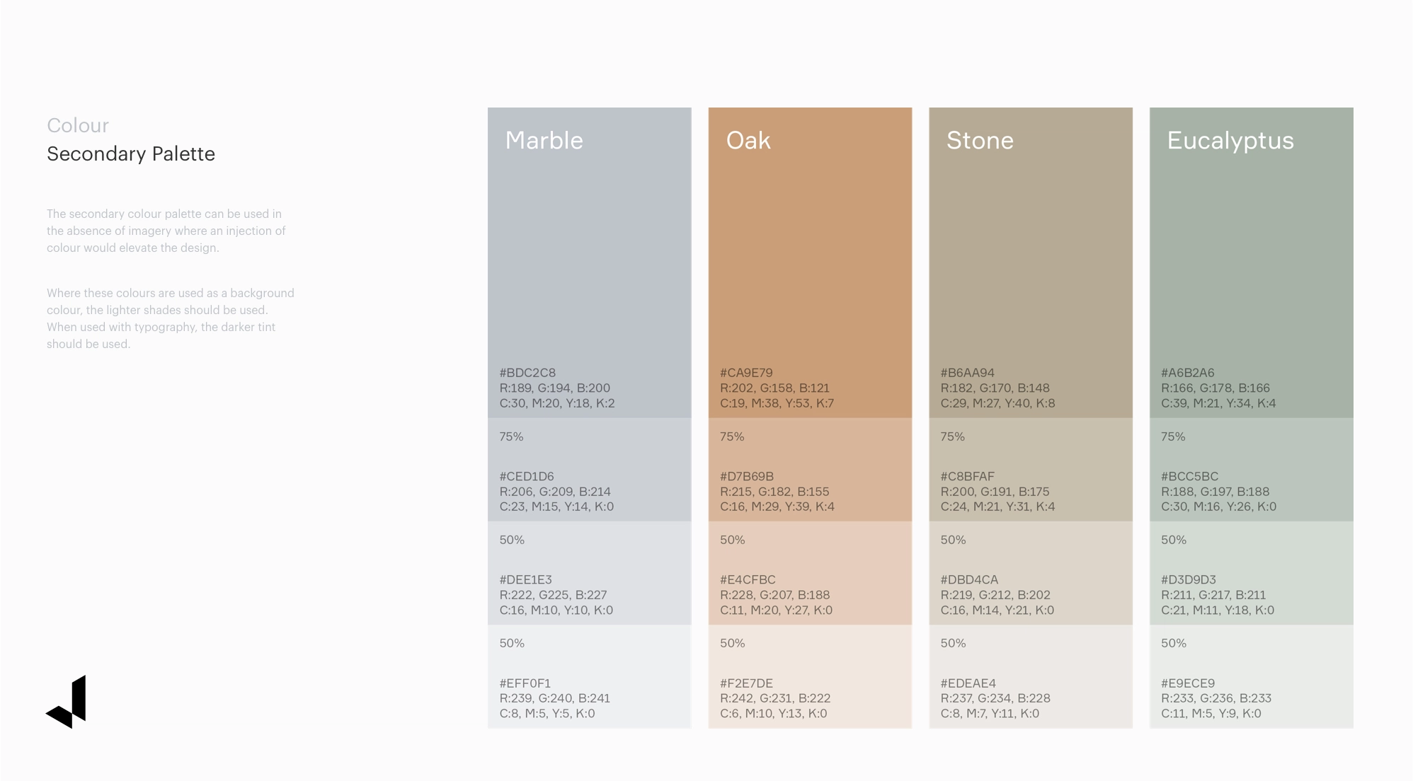
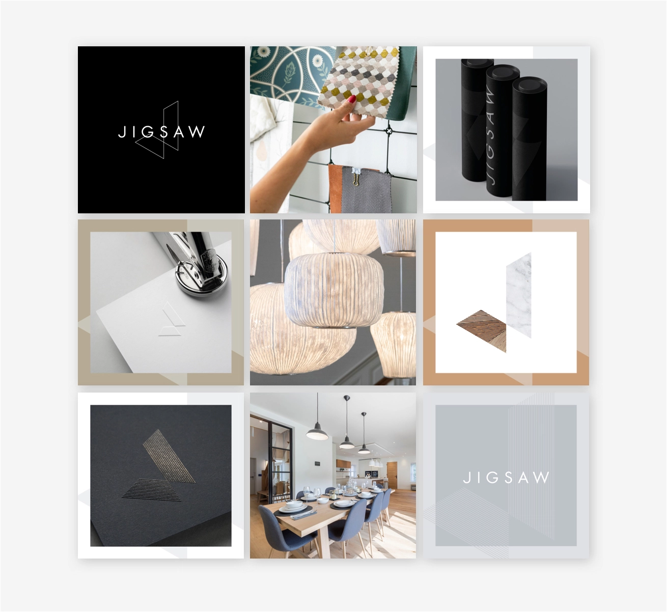
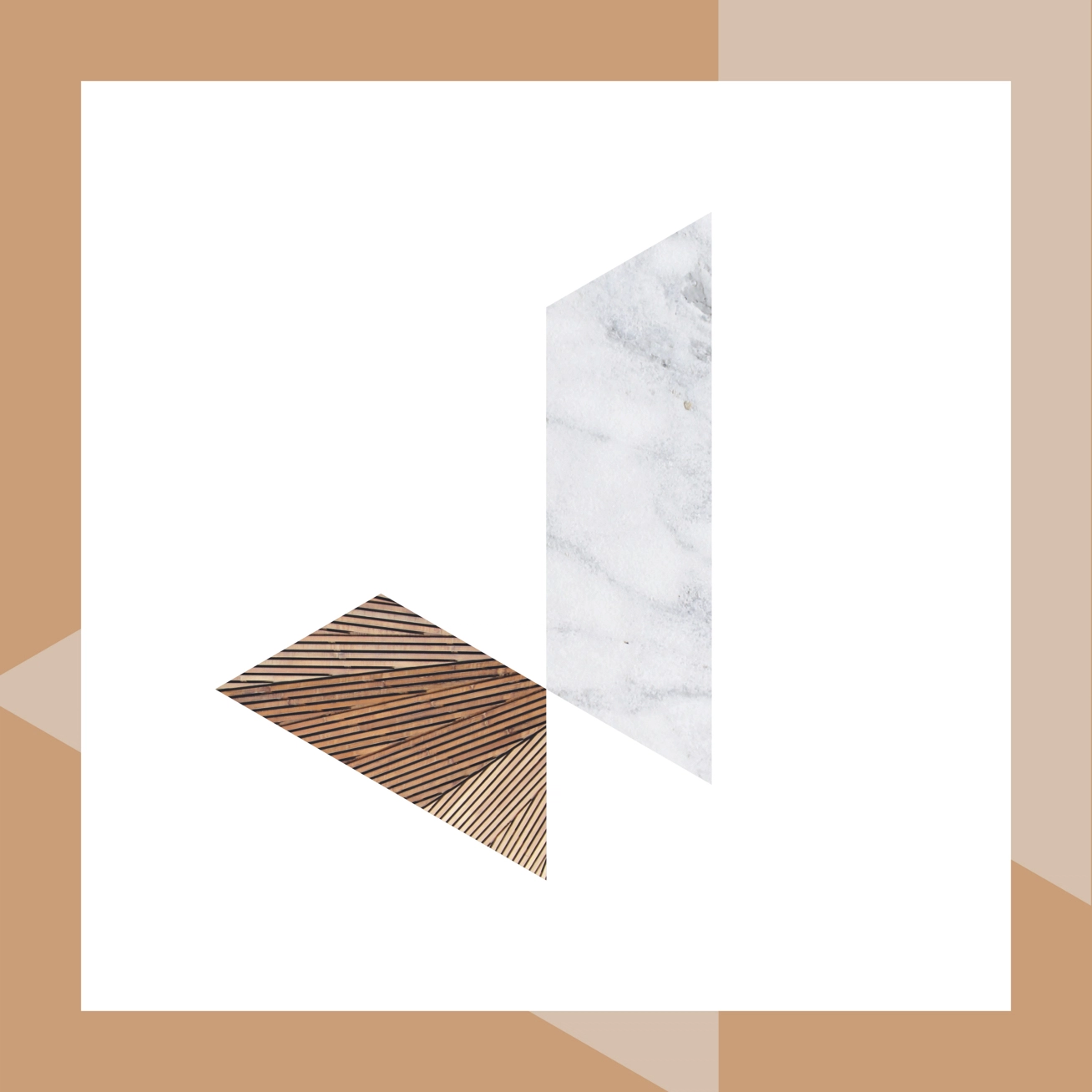
The development of the visual identity started with a desire not to move too far away from the existing iteration of a typographic ‘J’, drawn isometrically. Taking these cues we developed a new icon, a similarly isometric ‘J’ but signifying the moment you walk through an entrance in a new home, a threshold infused with light, colour and texture. An evolution of the existing word mark, allowing each letter to breathe, creates a sense of space and tranquillity, whilst retaining familiarity. A new colour palette made of individual elements of the trade, marble, oak, stone and the pastel green of eucalyptus, brings some sophistication which better reflects the capability of the team.
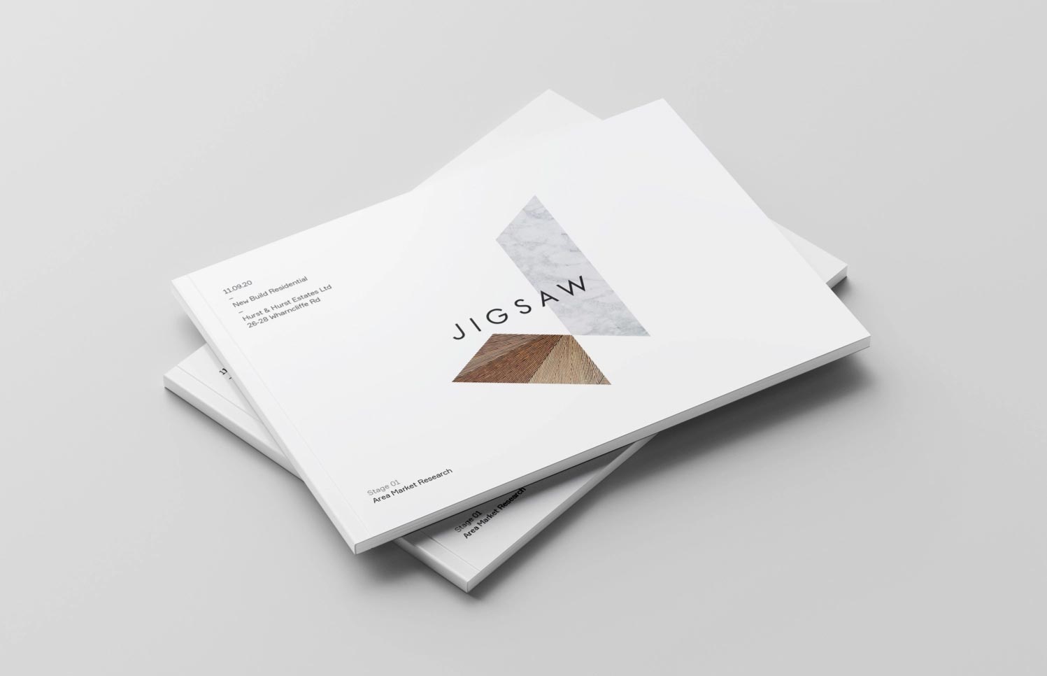
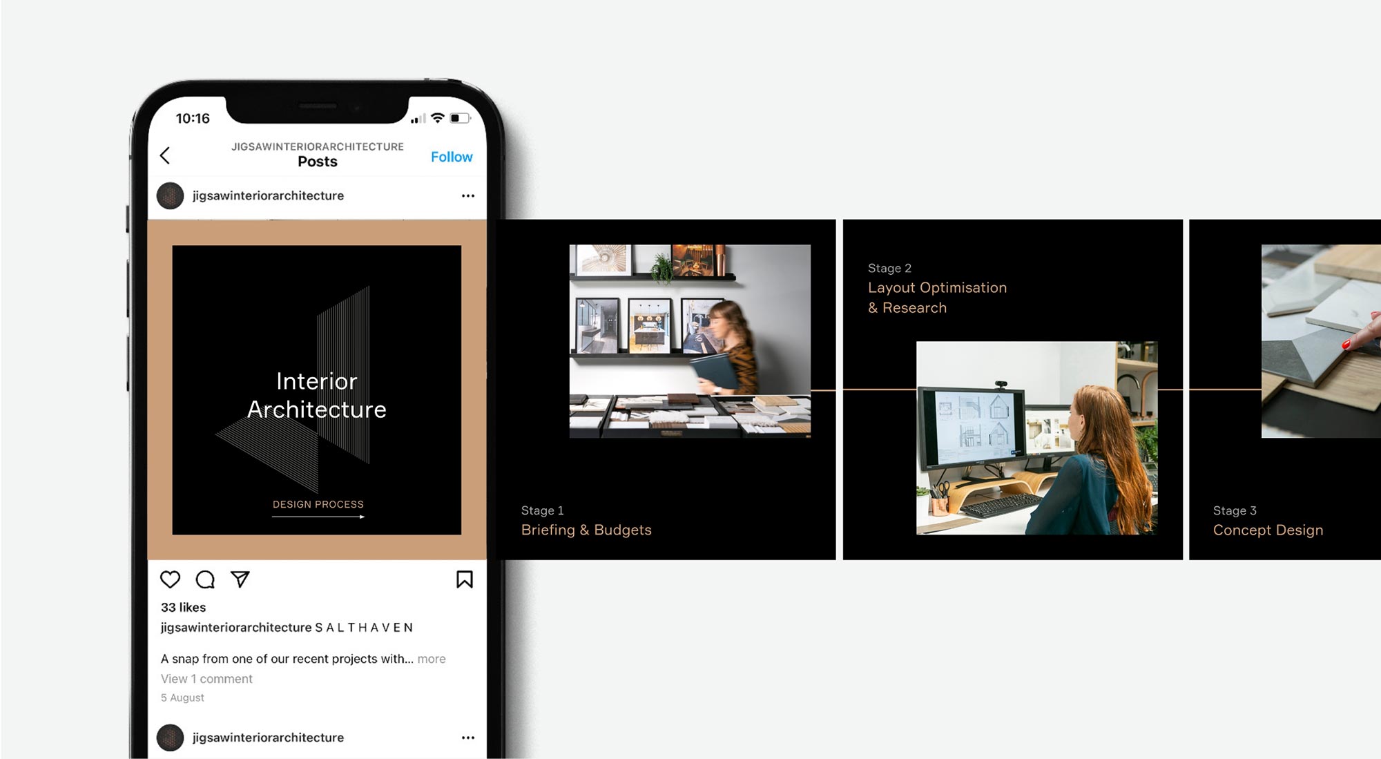
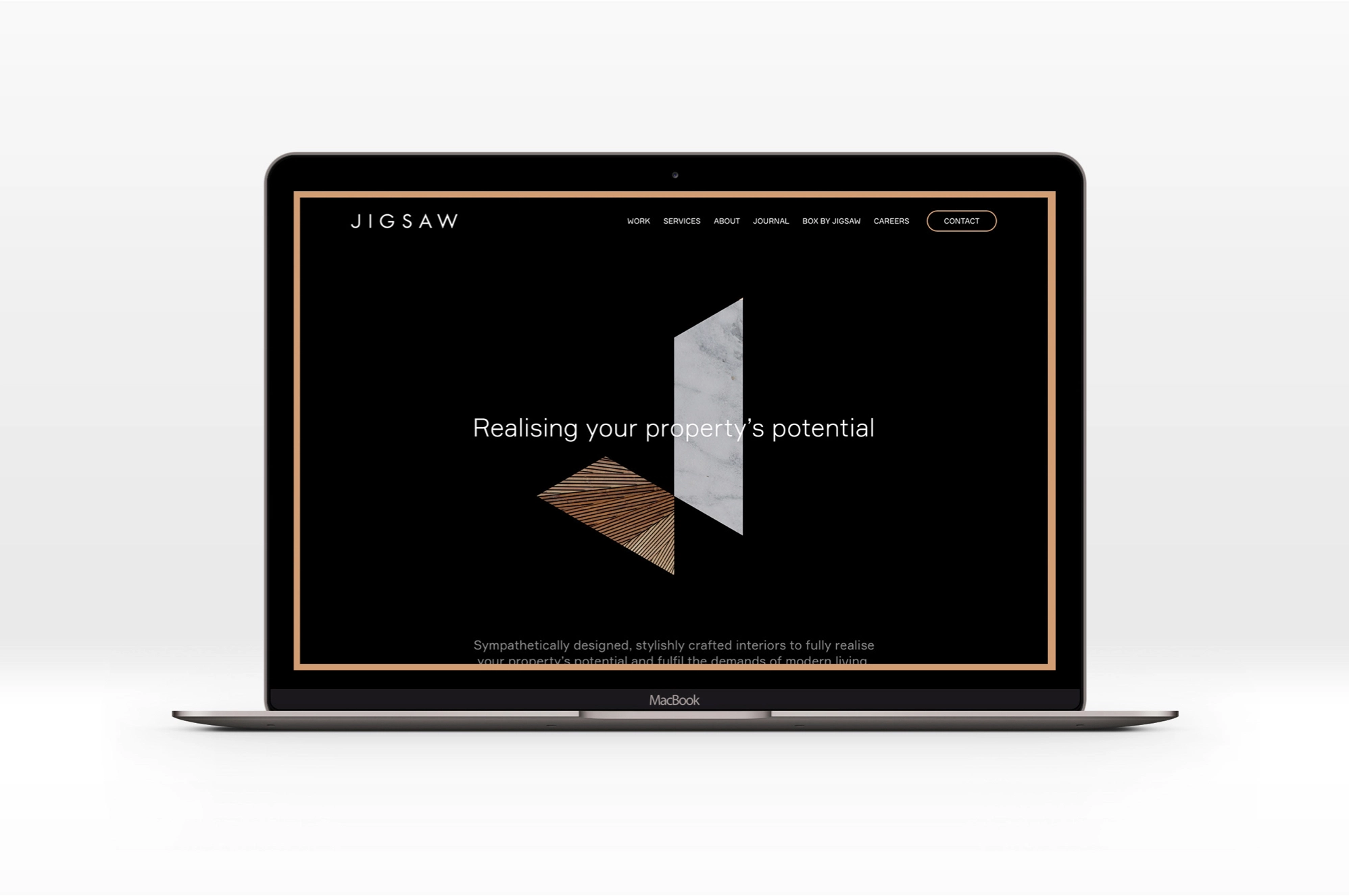
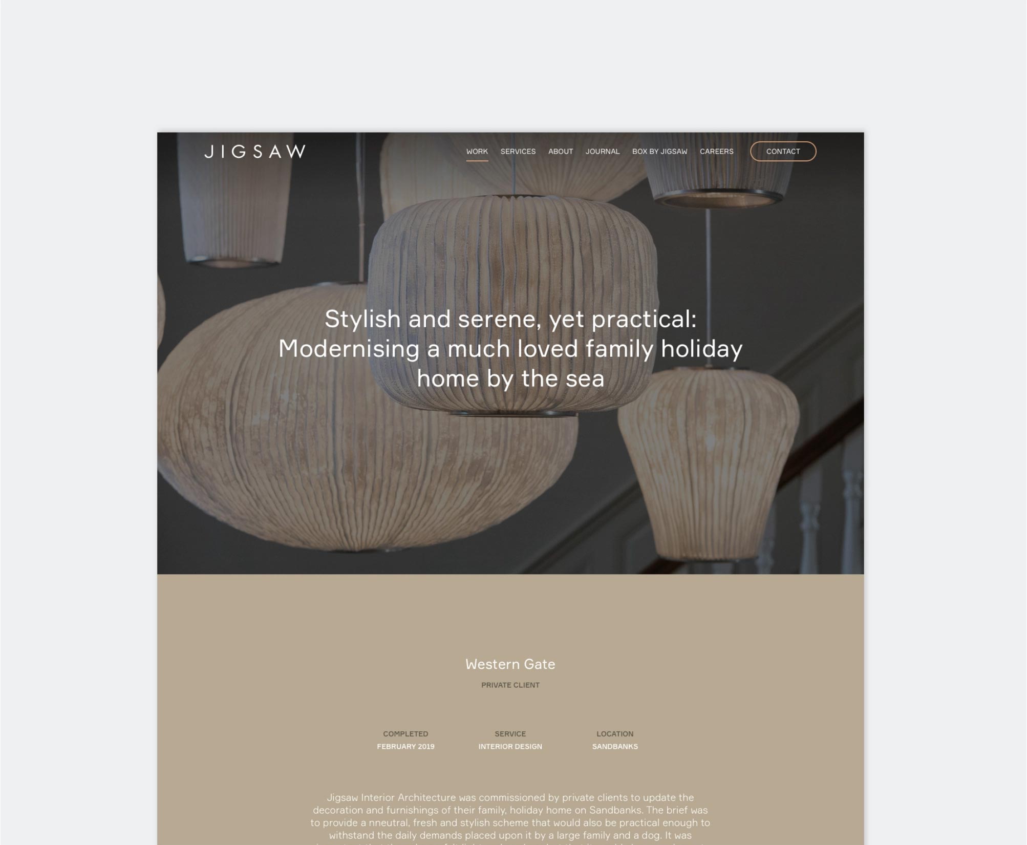
The Jigsaw website has been completely redeveloped, both in terms of the new visual identity and also structure and content. Based on our discovery and definition of three quite different audiences – residential clients, developers and commercial clients – the website creates seamless user journeys, and provides some much needed clarity in terms of the services Jigsaw supplies. Fully supported by an intuitive CMS, this is the first time that Jigsaw have had day-to-day control of their content.
“ We chose Salad as they seemed to really understand our processes and were like minded creatives. We trusted them and took their lead when they pushed us out of our comfort zone. We went right back to basics, what do we do & why do we do it? It was a very cathartic exercise and it helped me understand my team and my clients better. ”
