A new brand, identity and website for a purposeful business, advocating for sustainable, shared transport

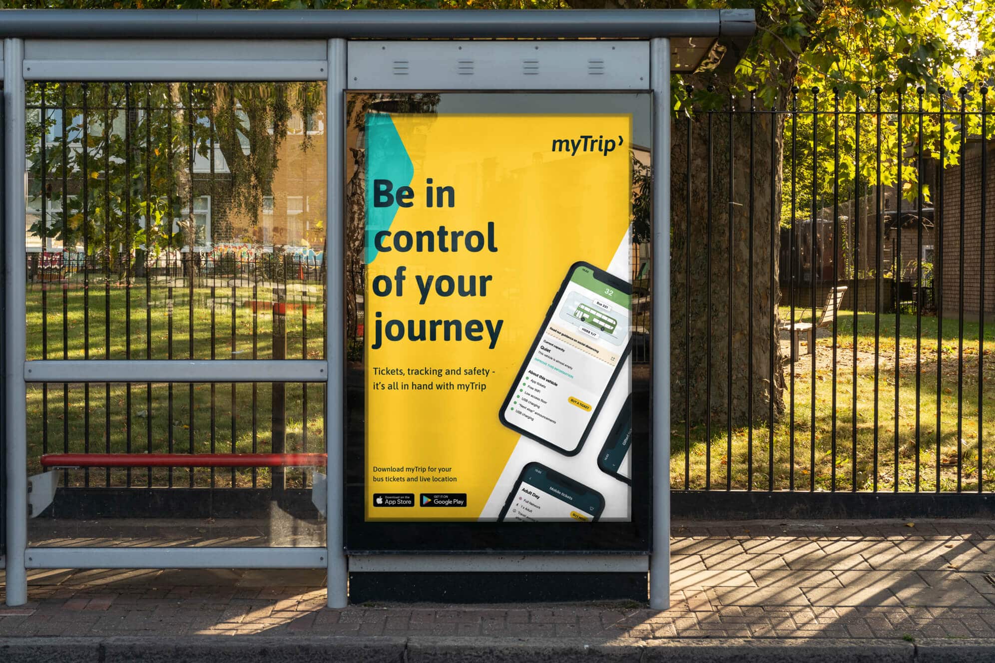
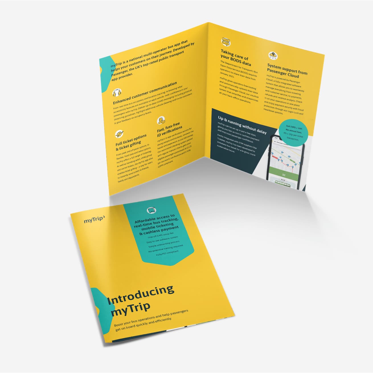
With the impact of COVID-19 hitting the bus travel sector hard, Passenger quickly responded with an innovative product designed to support bus operators during the crisis and beyond. myTrip is an affordable multi-operator mobile ticketing and tracking app for buses that gives passengers live bus times and enhanced covid relevant information, plus cashless ticketing.
Our brief was to develop the brand identity and create everything the business needed to launch in their marketplace and appeal to their target audience of both bus operators and passengers.
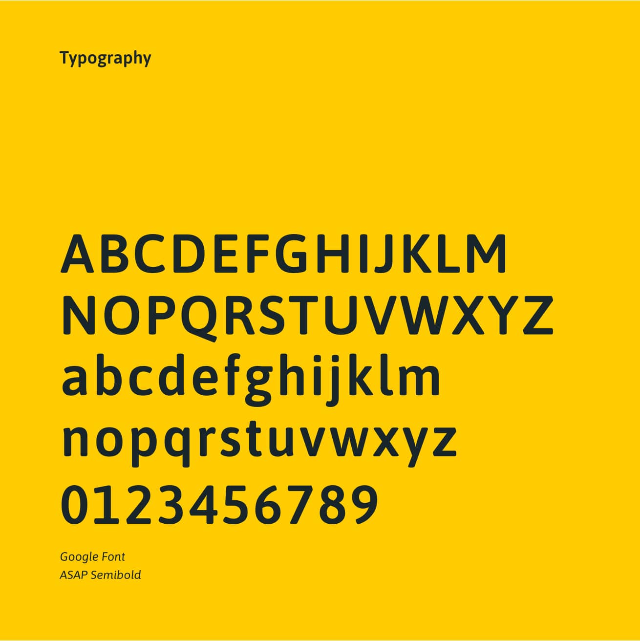
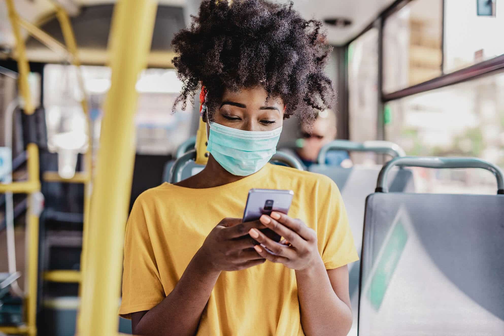
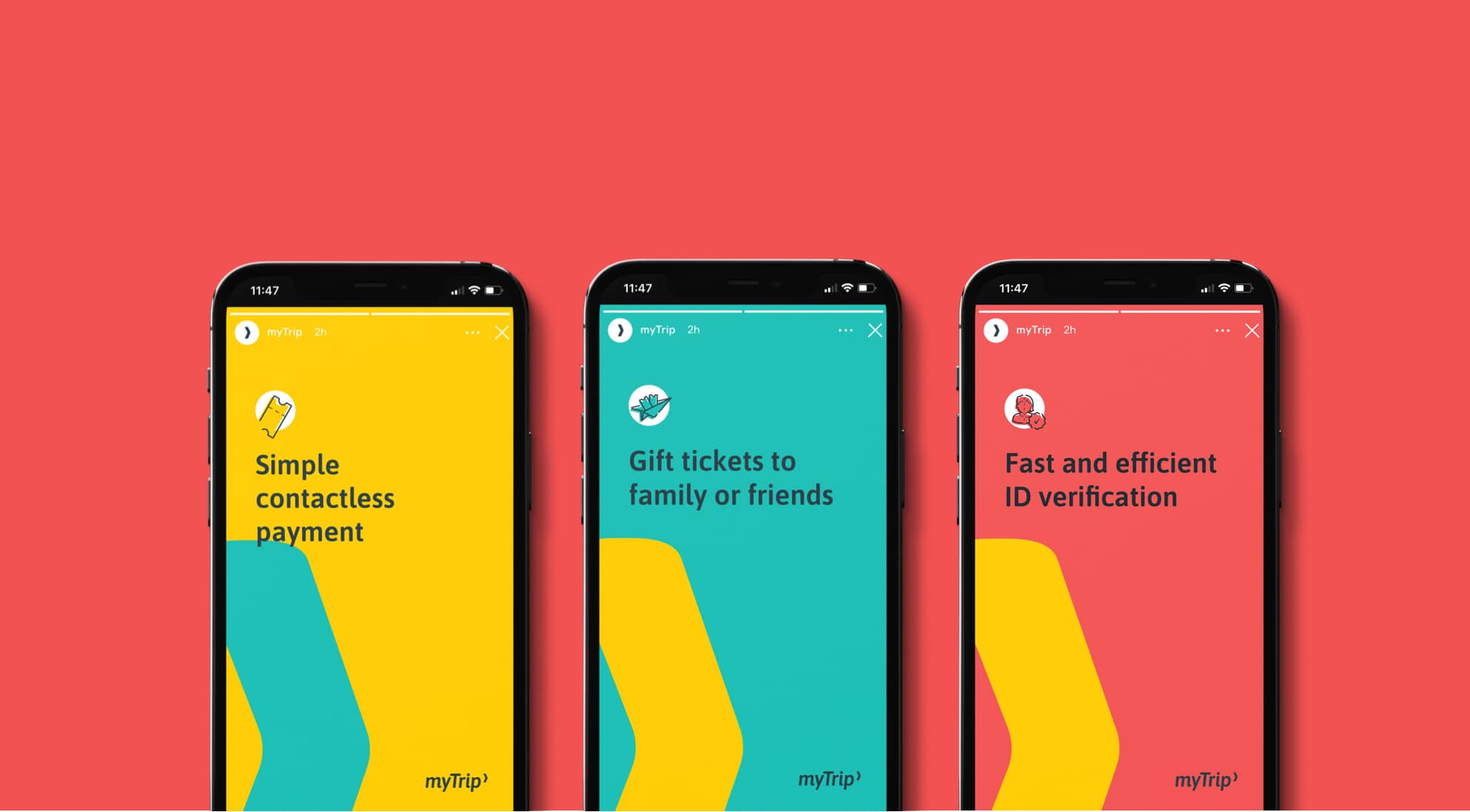
Given the urgency to get the product launched, it was essential we worked quickly and efficiently. While the brief was to develop a new identity, we felt the existing logo produced in-house, was strong enough to be evolved to form a fuller, more comprehensive visual brand identity.
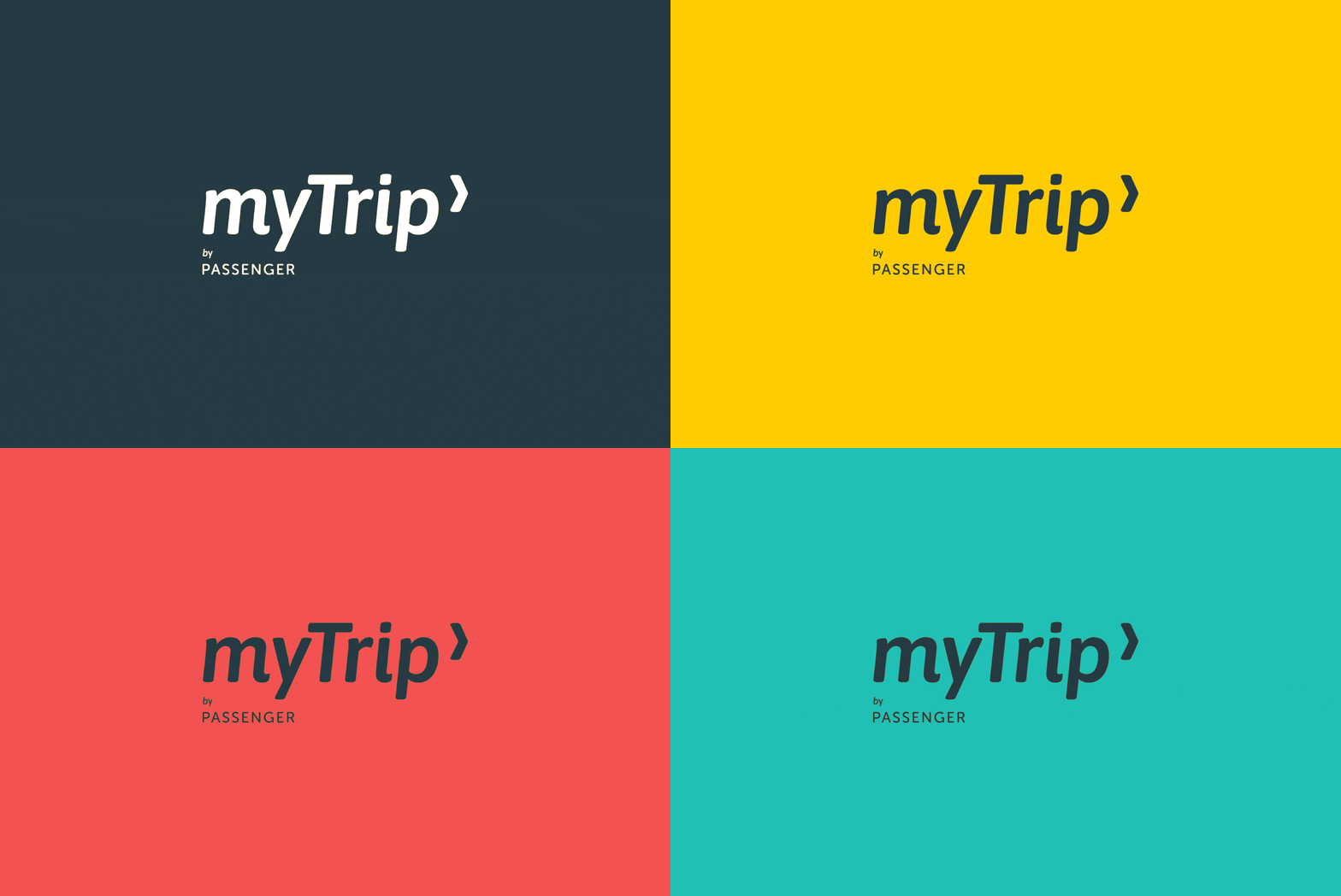
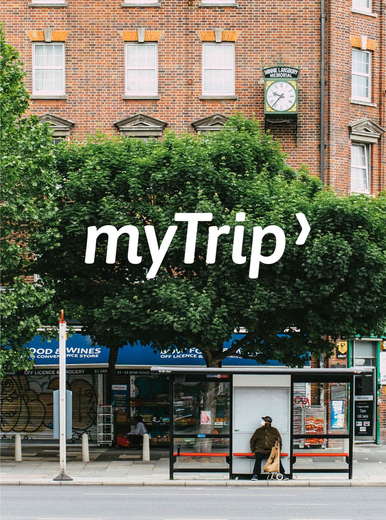
We made subtle enhancements to the logotype to create the bespoke wordmark and crafted the brandmark from the negative space of the letter ‘y’. The mark forms an arrow to show the direction of travel from a to b and creates a strong graphical device.
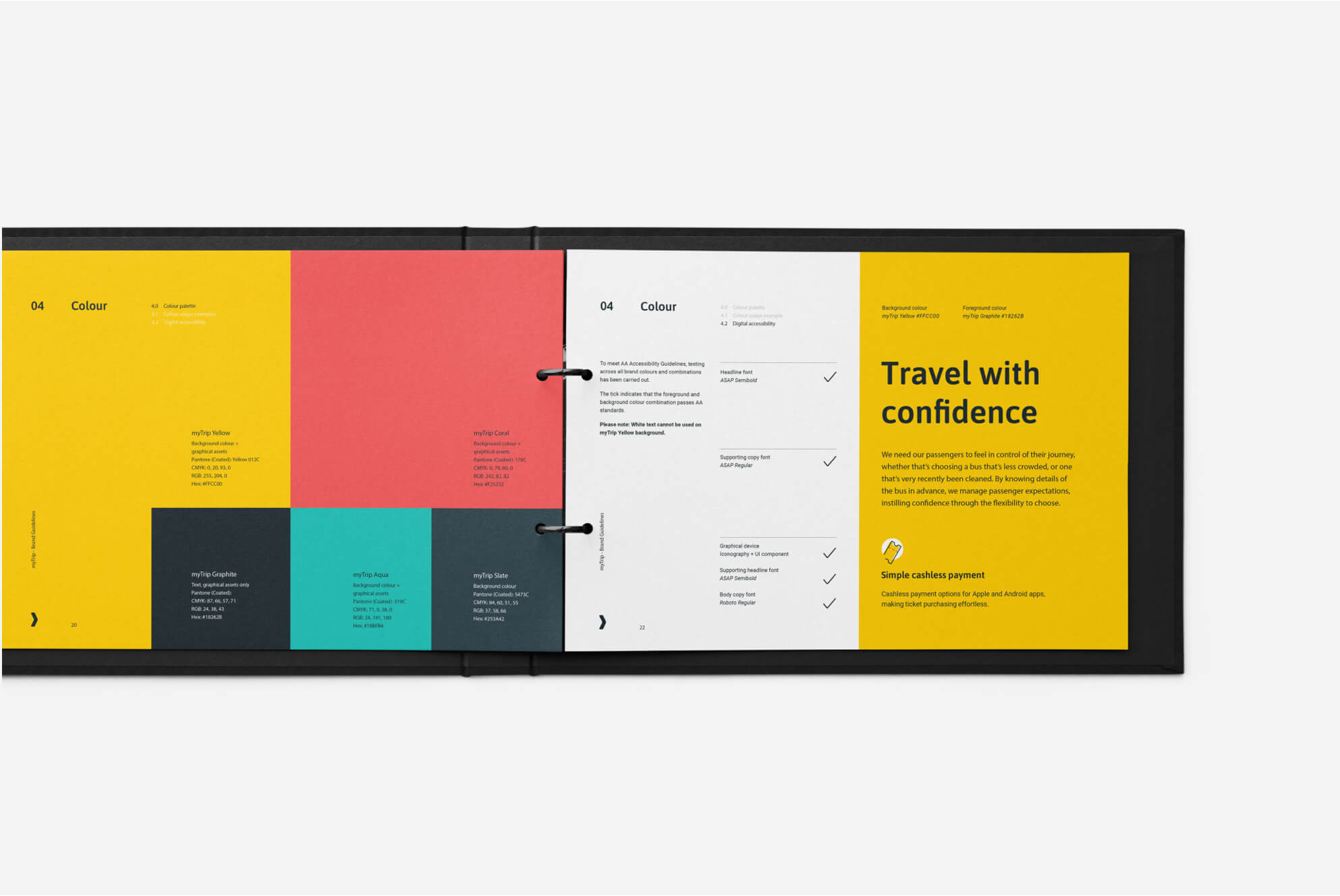
We developed the proposition alongside the tone of voice which ensures all messaging feels consistent and relevant, despite the two very different audience groups. To meet WCAG AA Accessibility Guidelines, testing across all brand colours, combinations and assets were carried out. The bold colour palette creates a striking and ownable visual style and allows for engaging content for both print and digital. All the components of the identity, including bespoke illustrations, are brought together in a comprehensive set of brand guidelines.

“Salad were an absolute joy to work with. Their enthusiasm for the project from the outset gave me confidence that what they could provide would be outstanding.
They fulfilled the brief perfectly, taking the bare bones of visual identity and sculpting it into a fully formed, clear and distinct brand. They listened carefully throughout the project, constantly taking on board feedback, each time running with it to improve and refine the final outcome.”
Less than 10 months after launch, myTrip have met 95% of their original target, and crucially, this represents 20% market penetration in under 12 months.
From the moment Salad pitched to us, we knew we were in a pair of creative, compassionate, safe and secure hands. From early on in the process Salad stood out and it came as no surprise that their established team delivered on every level.
Treading the fine line of being slickly organised and capable of delivering stunning creative work, they brought a phenomenal design focus to the project and absolutely elevated myTrip’s branding – producing considered, cohesive and finessed work.
Every member of the Salad team brought unique talents and perspectives to the project, and it was incredible to watch the threads of work weave together and myTrip emerge.
Salad produced a variety of deliverables in a very tight time frame (not limited to: branding, tone of voice guidelines, HTML email templates, illustrations and social media graphics). At all times they were approachable, open to suggestions and able to work flexibly with us.
Bethan Hopkins, Marketing Manager
