Why your website is quietly going out of date
Read more
Many businesses believe they know how their customers move through their website. It’s easy to get wrong, but not because the business doesn't understand its customers. Rather, navigation gets built from the inside out: from what the business wants to say, not what the visitor is trying to do. The two rarely match, and the mismatch is where most navigation problems start.
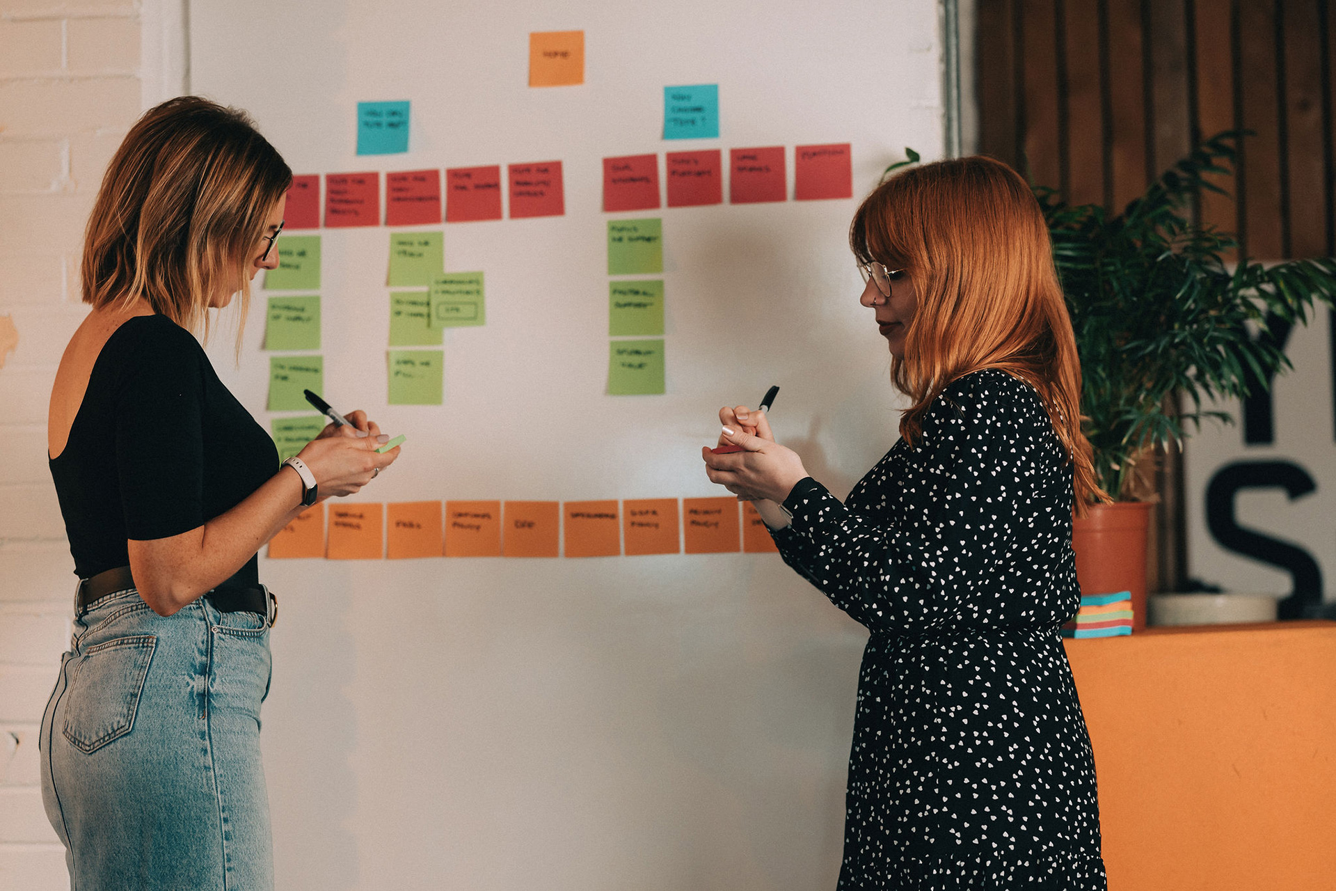
Navigation looks like the easy part of a project. Decide the sections, name them, put them in order, done. In practice, it’s one of the hardest problems in digital work, because it asks a business to set aside what it knows about itself and build around what a stranger, arriving with a specific need, actually wants to click on.
Most navigation starts life as a sitemap, and a sitemap is really an org chart wearing a different hat. It reflects departments, services, and the order in which the business thinks about itself. None of that is wrong exactly, but it’s not what a visitor is holding in their head when they land on the page.
A visitor arrives with a question, not a structure. What can you do for me? Am I in the right place? What happens next? A navigation menu built around internal logic answers none of these directly, and the visitor is left translating the business’s structure into their own need before they can do anything useful. Most give up before finishing the translation.
The pattern we see most often in new client conversations is not a business that thinks its navigation is fine, but one that knows something isn’t working and has already tried to fix it by rearranging labels or adding another link. The structure gets adjusted. The assumption underneath it never gets tested. That’s usually where the real problem is sitting, and it’s why the same confusion tends to resurface in a different order a few months later.
Better Cotton’s website had grown the way most content-heavy organisations grow: section by section, each one added for a good reason at the time, none of them designed against the others. By the time we came to it, the navigation had become complicated and convoluted, and users were working harder than they should to find anything.
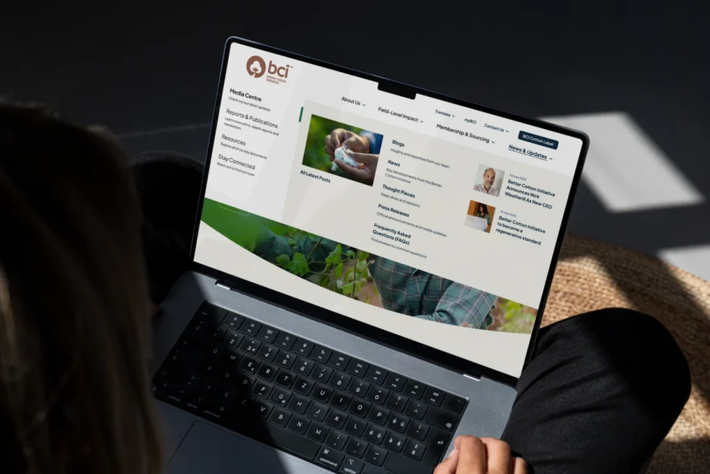
The fix wasn’t cosmetic. It came from properly auditing how the current site was actually being used, and rebuilding an understanding of what different visitors were there to do. That work led to a complete restructure and the introduction of a mega-nav, turning what had been a fragmented experience into something visitors could move through with intent rather than guesswork. The difference wasn’t better design. It was better evidence.
That’s the part that gets missed. Improving navigation isn’t primarily a design exercise. It’s a research exercise that happens to end in a design. Skip the research, and you’re just rearranging assumptions into a tidier shape.
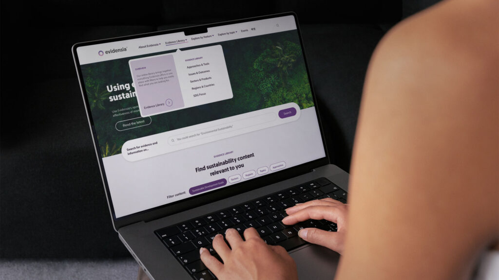
Evidensia’s challenge was slightly different. The content itself, a large evidence library serving researchers, decision makers and general readers, was genuinely valuable. The problem was that visitors couldn’t tell what they were navigating towards. Labels that made sense internally, to people close to the content, meant very little to someone arriving cold.
Confusion at this level rarely announces itself. Nobody emails to say the labelling was unclear. They simply leave. We redesigned the navigation to give users a clearer place to start their research journey, which meant translating internal terminology into language that matched what a first-time visitor was actually looking for.
Labels are doing more work than most businesses give them credit for. A single ambiguous word in a menu can be the entire reason someone leaves a website that would otherwise have answered their question in thirty seconds.
Tute is the clearest example of a different point entirely. Navigation isn’t something you get right once and leave alone. We built Tute’s site, and it’s been live and working for a while. It was designed well for the business Tute was at the time, serving a broad range of schools, local authorities and families.
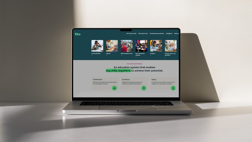
Since then, Tute has decided to focus on a narrower customer profile. And the navigation that made sense for a wide audience doesn’t make sense for a specific one. We’re revisiting the site now, not because the original work was wrong, but because the business’s understanding of its own customer has changed, and the navigation has to change with it.
Navigation works best when it’s treated as ongoing rather than finished. In reality, it’s a live reflection of how well you understand who you’re actually talking to, and that understanding shifts as the business does.
Ask most businesses how their customers move through their website, and you’ll get a confident answer. Ask them when they last tested that answer against real behaviour, and the confidence tends to drop. That gap, between what you believe and what you can prove, is where navigation quietly fails.
None of this is about tearing up a navigation and starting again for its own sake. It is about finding out whether the structure in front of you was ever built around the right visitor, before deciding what to change.
A designer can rearrange a menu. A partner asks why it was built that way in the first place, and whether the assumption behind it still holds. That distinction sounds small, but in practice, it decides whether the fix lasts or just relocates the problem.
That kind of clarity takes more than an internal debate. It takes proper research into how people actually move through the site, and the willingness to be wrong about something you were confident about. It takes a little longer at the front end. It is almost always worth it.
If your navigation feels harder to defend than it used to, or you’re not sure it was ever tested against real behaviour, that’s worth looking at before the next redesign starts. Get in touch, and we’ll show you how our audits help build navigation around user intention, not business belief.