Eight years, four events, one partnership: what it really means to be Team England’s digital home
Read more
A round up of some of our favourite business cards and why they continue to be so important.
First impressions count and no more so than when introducing your brand to potential new clients or customers. This is where your business card plays an important role in reflecting the quality of your product or service and has to communicate a lot more than just your contact details.
The success of platforms like Linkedin have threatened to make the well-established tradition of exchanging business cards a redundant ritual. Although the speed and ease at which you can now make new connections through social channels has been transformed, the emphasis has shifted to quantity rather than quality. Those who still understand the value of a well crafted business card will continue to reap the benefits of a lasting impression.
A quote found in an early GF Smith brochure highlights the importance of quality which is critical when making your first impression.
“Quality in printing is not an extravagant indulgence. It is in fact a necessity of advertising that must pay its way. The more vital the need of returns from your printed matter, the greater the necessity that it possess the persuasiveness of quality.
You think of your printed matter as so many thousand pieces to be sent to a list.
But the list is compiled of individual Jims and Jacks or Bettys and Annes who see but one copy apiece. They do not know how large an edition you have printed. They do not know that such and such a printer would have done the job for less money.
They do not know, nor do they care, anything at all about the expenses, difficulties, or printing problems involved in getting out your printed matter.
They only know that in their hands is a booklet – one booklet.
They are either impressed or unimpressed.
In that one copy is your opportunity.
Make that one copy rise to it.”
The Persuasiveness of Quality – Strathmore Alexandra Japan (1929)
To demonstrate what can be achieved with a little investment we have pulled together a selection of some of our recent designs to showcase the print and finishing techniques available and how they can help to re-position your brand.
If you know your business card is failing to do the job properly, get in touch, we are always happy to help.
Selected examples:
Pro-Core
To provide a more tactile finish we worked with a paper stock called ‘Plike’ creating a business card as unique as the Pro-Core product itself.

Salad
For our own business cards we used a selection of colours to reflect our playful side. Each card has a different coloured reverse which is duplexed on to Gravure Embossed, Pale Grey Colorplan.

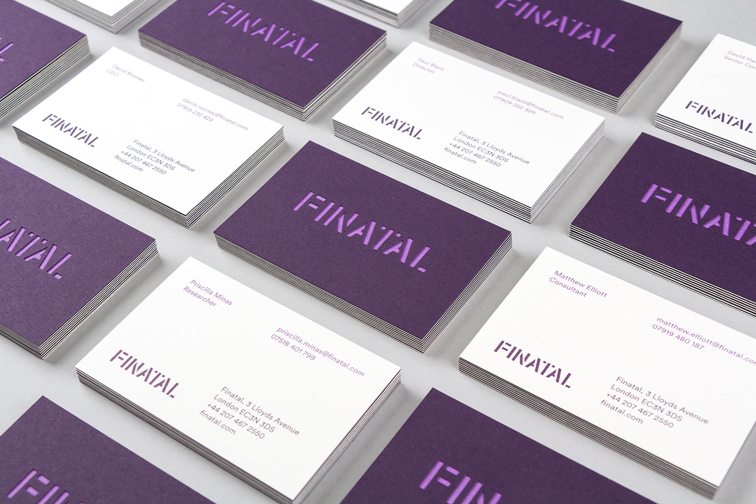
Finatal
Even by our standards, we pushed the boat out for the Finatal card. The combination duplexing the stock and die cutting the logo created depth and real stand-out.

Other selected examples…